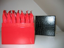
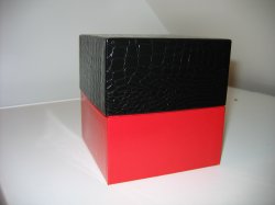
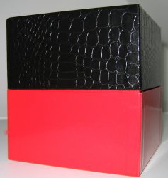
I like that you added texture to the top of the box. I understand you need to use that particular red, and you mentioned you may put the logo in red on the black croc skinned top?
Personally, I think that wouldn't look right. The logo would be distorted by the texture, and not crisp and clean lined. Also, if the logo is red on the black, I think that makes the entire package a bit too simplistic and coordinated.
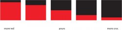
Perhaps you might try putting the logo on the bottom half on the side of the box? I'd also use a color you haven't presented yet. A shade of white would be highly visible.
As far as gender, at this point, I think it's too soon to call it. Once the logo is in place, you have room to manipulate whether or not it's overall effect is masculine or feminine based on the actual logo and the font, placement, and sizing of the logo. You could transform what you've showed us into something that leans more towards feminine, masculine, or retain this present "look", which I'd consider somewhere in between.
I think you did a good job, considering you had specific guidelines. Upon viewing, I wanted to touch this box and feel the texture. I'm not sure if it's just the flash, or if it's actual, but it looks shiny, and I love shiny stuff.
")
I'm female, and this box would attract me if you added a feminine touch (font/logo). I'd expect it to contain lingerie, cosmetics, or similar. But deep down, I'd be secretly hoping it was a special edition U2 handheld macbook.