Orange on black (black background, orange lettering) arguably provides the most visible distinction (contrast) between colours, perhaps even moreso than black with white text, or white with black text. Black background with light orange text works really well.
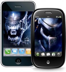
I agree that the iPhone does look better than the Pre, or any other smartphone out there. This is especially true of the original 2G iPhone. The 3G "upgrade" doesn't look as good with the black or white back lid.
However, the Palm Pre isn't ugly either. The photo was just taken under bad lighting, where the reflection of the light from above is shining off some of the keys. If an iPhone photo was taken under the same conditions, you'd see a reflection due to the shiny screen. Doesn't make the iPhone ugly, does it?
I don't like how bulgy the Palm Prē is. It looks like a cheap toy phone to me. The slide-out keyboard is stupid too because there's no chance of ever typing horizontally. It's going to be a hit, but we're not the audience that will go for it. I think LESS is more. I love the software keyboard on the iPhone and how it can morph into anything to adapt to any situation. Let's see Palm's keyboard do that.


