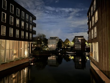
Are those buildings in Carlisle, PA?
Got a tip for us?
Let us know
Become a MacRumors Supporter for $50/year with no ads, ability to filter front page stories, and private forums.
iPhone 15 Pro 🌍 📱 Pictures Taken with iPhone 15 Pro and iPhone 15 Pro Max Photos up Thread 🌟 - Worldwide - (2023-2024) 📱 🌎
- Thread starter TheYayAreaLiving 🎗️
- Start date
- Sort by reaction score
You are using an out of date browser. It may not display this or other websites correctly.
You should upgrade or use an alternative browser.
You should upgrade or use an alternative browser.
We lived in Carlisle till just a couple years ago when we sold our house and moved to a smaller house.
Couple Photos from the Nevada Wolfpack game tonight Vs Loyola Marymount Lions 12-2-23
5x, ProRAW & Lightroom

Sunset, 1.5x camera

Sunset, 1.5x camera
Last edited:
Melbourne Museum Australia
Triceratops Bones
O honestly did not think I’d be impressed with the camera for this years iPhone but man, Smart HDR 5 has been so good.
That was my biggest complaint with previous iPhones, blown out highlights and crushed shadows. So so glad Apple fixed this with Smart HDR 5 🙌
That was my biggest complaint with previous iPhones, blown out highlights and crushed shadows. So so glad Apple fixed this with Smart HDR 5 🙌
The 15PM camera continues to surprise me every single day!
Awesome pics!!
those are awesomeThe 15PM camera continues to surprise me every single day!
I swear the exposure stacking looks worse than it used to. iPhone X and XS manage to merge exposures without looking like the subjects are stickers that are placed on the photo.
I think the main difference is that the previous versions of Smart HDR in the X, XS and 11 all took 1 or 2 exposures and merged them using light metering as the metric, i.e. if you took a photo that included a bright sky and a darker ground it would take 2 exposures and merge them where the sky meets the ground. However newer "Smart HDR" tries to make sure that people are exposed brightly, which means it stitches in brighter exposures for subjects of the photo, making the photo appear unnatural.
I think the main difference is that the previous versions of Smart HDR in the X, XS and 11 all took 1 or 2 exposures and merged them using light metering as the metric, i.e. if you took a photo that included a bright sky and a darker ground it would take 2 exposures and merge them where the sky meets the ground. However newer "Smart HDR" tries to make sure that people are exposed brightly, which means it stitches in brighter exposures for subjects of the photo, making the photo appear unnatural.
ProRAW plus Lightroom edits is definitely how the 15P and PM get their best photos. This is a beautiful shot with lots of dynamic range, but the trees and ground don't have the typical "halos" you see around other smart HDR shots, because ProRAW does less of that and in LR you can turn down the sharpening
Yes… and thank you.ProRAW plus Lightroom edits is definitely how the 15P and PM get their best photos. This is a beautiful shot with lots of dynamic range, but the trees and ground don't have the typical "halos" you see around other smart HDR shots, because ProRAW does less of that and in LR you can turn down the sharpening
Shot this morning after work - no post production.
Register on MacRumors! This sidebar will go away, and you'll see fewer ads.


