Become a MacRumors Supporter for $50/year with no ads, ability to filter front page stories, and private forums.

Are you a fan of iOS 11's Geriartric Design? (Bolder fonts, more white space, de-densification)


  • Total voters
    236
  • Poll closed .
I have massive problem with it. Worse this really is an effective way to convince me to Samsung.

The worst experience for me apart from the big and bold text is the App update page in the App Store. Like for real?

Move to Samsung then. The grass is not greener. Also, you spend how much time in the App Store?

It’s Beta 1, take it down a notch.
 
  • Like
Reactions: alecgold
As soon as I saw the new App Store I know I didn't like it. I can already tell from the design that it will probably result in me visiting the store less.

As far as the rest of iOS11, its not really different enough for me to care to be honest.
 
As soon as I saw the new App Store I know I didn't like it. I can already tell from the design that it will probably result in me visiting the store less.

As far as the rest of iOS11, its not really different enough for me to care to be honest.

In general, iOS 11 wastes a lot of precious screen real estate by using unnecessarily bold and large typography (I know which app I opened - no need to tell me again using a 60pt. font), rounded edges for notifications and cards, and excessive use of white space.
 
Just a crazy thought to throw in the mix ... if there were ... say ... a phone coming out with edge to edge displays including top/bottom ... is that space relatively clear in general (I realise it puts the name of the app back into the top bit once you scroll ... but it doesn't have to ...) could they slap a camera in the gap ...

Edit, actually silly idea ... as everyone would have to redesign their apps. Nah.
 
Yes, very clean and ‘concise’. (/s)

Settings---iOS-11-left-vs-iOS-right.jpg


Recents---iOS-11-left-vs-iOS-right.jpg


‘Clean’ is such a buzzword around here. About as meaningful as ‘stable’.
 
Yes, very clean and ‘concise’. (/s)

View attachment 702576

View attachment 702577

‘Clean’ is such a buzzword around here. About as meaningful as ‘stable’.
I am pretty sure the want to waste space on the current iPhones so that when the new iPhone comes out, which will have less bezels, you will say: oh! More screen real estate and my current phone is not able to display as much content, when it used to display almost as much in iOS 10 and older.
Apple is evil
 
I really hate these bold titles. Its ruining screen real estate. Ive been using messages long enough to know that the app is messages.
It's clear that iOS 11 is being geared toward the iPhone 8. But I do hope we'll see all this wasted space cleaned up a bit in the beta process. It's becoming annoying on my 7 Plus, and straight up maddening to use on an SE.
 
it's all a setup of iOS 12 so they can try and "wow" us again. not a fan.
 
I don't understand the repeated obsession apple has with adding even more wasted space Coupled with bigger phones like the plus models it makes even less sense. Unless I'm approaching blind But even then I can crank up text size or use the bigger icon mode on home screen.. why do this apple?

Why on earth does the messages app have that huge banner reading messages above it? I would know it's messages just from looking at the chat list. Or clicking the icon on my home screen labeled messages

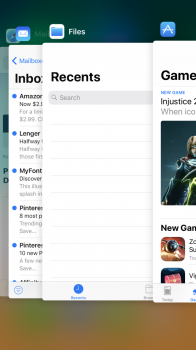
They're really taking design cues from Apple Music app. Like something a lot of people don't like, stretched out to other parts of the OS.
[doublepost=1496765258][/doublepost]
it's all a setup of iOS 12 so they can try and "wow" us again. not a fan.

I think that's giving them too much credit. This will be a tenth anniversary shipping os. And they've used same phone design going on 3 generations and a fourth with 7s, and same icon look for 4 generations of OS going on a fifth. Now is the time to step it up

A lot of people don't find johnny ive's flat iOS 7 to be as timeless as Apple and him do

Or the soap bar design. I like it but I don't love it. It could be way better. It is a direct response to android, type design..

iPhone 4 and 5 and honestly 3GS ergonomically come to mind, as legendary. iPhone 4 is the
Height though just such an incredible break through in what a phone design can be in 2010
 
Last edited:
I think making the apps more recognizable in the app switcher is part of the reason.

Aesthetically, I really like it. But I really enjoy Swiss design, and Swiss design is all about oversized headlines.
 

Attachments

  • IMG_0020.PNG
    IMG_0020.PNG
    470 KB · Views: 251
I think making the apps more recognizable in the app switcher is part of the reason.

Aesthetically, I really like it. But I really enjoy Swiss design, and Swiss design is all about oversized headlines.


Thats what icons are for. If its not broken why fix it?

I also hate the app shelf in messages. It didn't bother me previously, but now its in the way. Im not into the gimmicky fun for two days features. They should add an option to disable it.
 
I actually think I know the answer to this design change.

Initially, I thought Apple decided to make the initial encounter with an app bold, so the app or the tab of an app you are in is repeated. But then when you scroll through the app, this information is removed. But then I realized that the bold font goes back to the top of the app again. Odd.
 
The bold title fonts should not look like tabloid headers. They are too large and too bold. It is like overcompensating for something.

They reminds me of 1995 webpages overusing h1 tags. And that is indicative of how the apps are starting to look like, webpages. Web apps! And if you have previous iOS history, you know that those are fraught with poor usability.
 
  • Like
Reactions: redbeard331
I like it but it needs to be more consistent. So for example why does iTunes Store still not adhere to the new design?
If you notice the iTunes icon has changed to a movie star icon instead of the music note. I think this is a clear signal, along with lack of tvOS 11 news, that 4K in iTunes is coming and iTunes is going to get a big redesign and maybe even a name change.
[doublepost=1496814354][/doublepost]
As soon as I saw the new App Store I know I didn't like it. I can already tell from the design that it will probably result in me visiting the store less.

As far as the rest of iOS11, its not really different enough for me to care to be honest.
For the AppStore it will actually make me want to visit it more. Before I never went to the store because it was always the same apps. I remember the old days when I would go to the top charts daily and see different and new apps. Nowadays it’s always Facebook, Netflix, clash of clans, etc. these mega apps have taken over the store and Apple is trying to refresh it and bring a bigger focus to smaller developers and new apps.
 
  • Like
Reactions: Knowlege Bomb
Register on MacRumors! This sidebar will go away, and you'll see fewer ads.