Got a tip for us?
Let us know
Become a MacRumors Supporter for $50/year with no ads, ability to filter front page stories, and private forums.
Portfolio design, critique needed
- Thread starter shamrock593
- Start date
- Sort by reaction score
You are using an out of date browser. It may not display this or other websites correctly.
You should upgrade or use an alternative browser.
You should upgrade or use an alternative browser.
I think if you're going to be using this for possible jobs and whatnot...you should have a link or download available in .pdf format of your resume/list of works/or something that explains a little more indepth of your capabilities as a graphic artist.
")
Great starting point though.
Great starting point though.
I think its too cluttered and the overall layout is far too complex. More like a magazine than a webpage.
I'd really minimize the clutter and astoun your (potential) customers with the actual portfolio pictures than a cluttered webpage.
My professoer of typography has a page which shows what I mean with clutterless:
http://grossmannstudio.de/
It's easy to make a cluttered (flash) page because it's so tempting to use all these posibilities. But the trick is not to.
Doc
I think its too cluttered and the overall layout is far too complex. More like a magazine than a webpage.
I'd really minimize the clutter and astoun your (potential) customers with the actual portfolio pictures than a cluttered webpage.
My professoer of typography has a page which shows what I mean with clutterless:
http://grossmannstudio.de/
It's easy to make a cluttered (flash) page because it's so tempting to use all these posibilities. But the trick is not to.
Doc
Thats a very well designed site your professor has, i love the simple elegance of it and it works well yet doesn't seem uninteresting though a very minimal design.
Though for a professor of typography using a serf font here and in a few other places he should know better as its not very screen readable and to accommodate dyslexic people like my self and a huge amount of the worlds population its always advised to use a sans serf font to make it easier to read any large bodys of text, on and off screen.
its always advised to use a sans serf font to make it easier to read any large bodys of text, on and off screen.
thats not entirely correct.
serif typefaces are generally understood to be easer to read for blocks of text for print. on the web there is more of a debate. the main place a sans might be an advantage is at tiny sizes where the counters and the bracketing of the serifs may get filled in by ink.
i agree with you tho - that page you link to is tougher to read than it should be. the reason why that particular page is hard to read is because the leading is way too tight and the measure is way too wide, and i could swear the text is tracked in a bit (even tho i do not think it is, it looks like it).
Thats a very well designed site your professor has, i love the simple elegance of it and it works well yet doesn't seem uninteresting though a very minimal design.
Though for a professor of typography using a serf font here and in a few other places he should know better as its not very screen readable and to accommodate dyslexic people like my self and a huge amount of the worlds population its always advised to use a sans serf font to make it easier to read any large bodys of text, on and off screen.
This becomes rather difficult for me to explain now because my mother language is German and I lack English typography vocabular but serifs are ment to stabilize and lead the eye better through a line of text because they highlight the base line the text is written on. Sans serifs text can start to "swim" more easily (according to our typo professor) Personally I hardly notice a difference in readability.
For my own webpage I'm currently researching how to better control the typography, which is really hard in the web. Even with css.
Another thing I might add:
In the last sememster I studied at the Kansas City Art Institute (KCAI) which also has an Design Department (additionally to animation, film, fiber...) and I noticed that American Design work always tends to be a bit more intense or lets say cluttered compared to European design. So the thread starter might be totally ok with his/her web page and it might only appear a bit too "colourfull" to an European audience
My main point is that for a huge amount of people that are dyslexic like myself serf fonts are totally unreadable on screen and print. The cause me to start reading one word and quickly end up on a completely different line of text because the serfs cause the normal person to follow the lines but a dyslexic person follows the serfs in unpredictable patterns.
ok, but in the recent years serif fonts in general became a bit "outdated" and therefore less utilized. so thats good for you.
there are a lot of companies here in Germany which had logos with serifs and they updated their logos and removed the serifs.
there are a lot of companies here in Germany which had logos with serifs and they updated their logos and removed the serifs.
I think if you're going to be using this for possible jobs and whatnot...you should have a link or download available in .pdf format of your resume/list of works/or something that explains a little more indepth of your capabilities as a graphic artist.
Great starting point though.
Thanks, I really like that idea. Though for the moment it's just personal.
I think its too cluttered and the overall layout is far too complex. More like a magazine than a webpage.
I'd really minimize the clutter and astoun your (potential) customers with the actual portfolio pictures than a cluttered webpage.
My professoer of typography has a page which shows what I mean with clutterless:
http://grossmannstudio.de/
It's easy to make a cluttered (flash) page because it's so tempting to use all these posibilities. But the trick is not to.
Doc
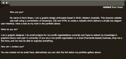
Which design are you referring too? I have updated my website since the two websites posted earlier. Also, Flash is a big no-no from me, I'm using JS for the animation on the home page here:
http://fionnbreen.com
I'm really happy with the above design, though there are a couple of things wrong with it:
- not tested in IE6 yet
- small hiccup in FF2
- divs don't work as I would like them too on smaller screens.
This is how it should look:

I'm planning on making the screen caps of the designs in the green bar open a full screen version in a new window.
I think it's good that the background is so subtle now and I also like the typography but the point I made with the too "magazine-like" layout is still unsolved.
I still think your layout grid is too complicated especially for a website.
update:
looking at the latest jpg you posted the issue is solved, visiting the link with the lates safari browser running on a mac the issue is unsolved
I still think your layout grid is too complicated especially for a website.
update:
looking at the latest jpg you posted the issue is solved, visiting the link with the lates safari browser running on a mac the issue is unsolved
I think it's good that the background is so subtle now and I also like the typography but the point I made with the too "magazine-like" layout is still unsolved.
I still think your layout grid is too complicated especially for a website.
update:
looking at the latest jpg you posted the issue is solved, visiting the link with the lates safari browser running on a mac the issue is unsolved
Can you please post a screen shot of what you are seeing? And what resolution are you using?
I'm aware that if you resize and reduce your browser width it will cause the lines on the sides to break the text and footer. This is yet to be solved. I don't understand how this causes a 'magazine-like' though.
Thanks
Your page sure is coming along! I am by no means any where near these other posters in knowledge/ability, but i'll throw in my 2 cents...
I dont think that shade of green compliments the background especially well, something about it turns me off slightly, maybe a slightly more muted colour? It detracts from the work you are displaying...
Your company name: I like when i see minimalistic designs, and hence my suggestion. Maybe scale it down to 50% of its size. It will still be obvious who the company is, but not as much ' in your face'.
I attached a screen shot regarding the text block. The alignment seems a bit off...
Hope i was somewhat helpful...
either way, good job!
Attachments
When I wanted to make the screenshot for you I noticed it's correct (identical to your picture) now.
I think its too cluttered and the overall layout is far too complex. More like a magazine than a webpage.
I'd really minimize the clutter and astoun your (potential) customers with the actual portfolio pictures than a cluttered webpage.
My professoer of typography has a page which shows what I mean with clutterless:
http://grossmannstudio.de/
It's easy to make a cluttered (flash) page because it's so tempting to use all these posibilities. But the trick is not to.
Doc
Love the site, it's simplicity at it's best.
(Adding it to my bookmarks now...)
I like the way the simple overall look draws attention to the pictures and drawings. On a overfilled page they would be kinda invisible but here they are just gorgeous

OP - your site layout seems far too too staid for a graphic designer, and the rendering of some of the elements is not as consistent and clean as you'd see in a top-notch Flash site.
Please don't take this personally, but this site design, as clean and simple as it is, is actually quite boring to look at.
IMO, you should be doing something adventuous and fun in Flash (or advanced AJAX) for your own website.
Please don't take this personally, but this site design, as clean and simple as it is, is actually quite boring to look at.
IMO, you should be doing something adventuous and fun in Flash (or advanced AJAX) for your own website.
OP - your site layout seems far too too staid for a graphic designer, and the rendering of some of the elements is not as consistent and clean as you'd see in a top-notch Flash site.
Please don't take this personally, but this site design, as clean and simple as it is, is actually quite boring to look at.
IMO, you should be doing something adventuous and fun in Flash (or advanced AJAX) for your own website.
Thats how opinions can drift apart
For me it is still slightly too detailed with the edges (indents). For you it's already too boring.I'm too tired now to write more but you, the thread starter, should hide your mailto link on your startpage. It is machine-readable which isn't good.
Register on MacRumors! This sidebar will go away, and you'll see fewer ads.