Become a MacRumors Supporter for $50/year with no ads, ability to filter front page stories, and private forums.

Jessica Lares

macrumors G3
Original poster
Oct 31, 2009
9,612
1,057
Near Dallas, Texas, USA
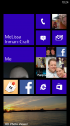
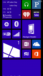
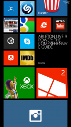
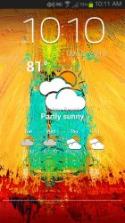
Come on, I know I'm not the only one here with a Windows Phone. :p

Be sure to cut it in half if it needs to be. Haha. To take a screenshot, it's the power button and then the Windows logo.

Phone: Nokia Lumia 520

Amazing Weather HD
HeaderTiles

wp8-1.png
wp8-2.png
 

scott craft

macrumors 6502a
Feb 10, 2011
697
143
Louisiana
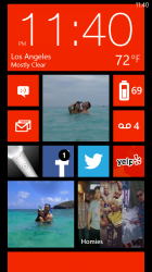
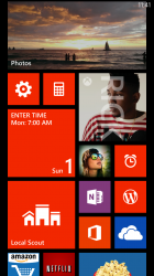
Here's mine, Verizon HTC 8X.


I posted this from my tablet and I'm not seeing my pictures, is it me or did I mess up somehow?
 

Attachments

  • wp_ss_20130901_0003.png
    wp_ss_20130901_0003.png
    561.2 KB · Views: 201
  • wp_ss_20130901_0004.png
    wp_ss_20130901_0004.png
    155 KB · Views: 237
Last edited:

scott craft

macrumors 6502a
Feb 10, 2011
697
143
Louisiana
Thanks, the calendar is Chronos calendar. Now I'm on the computer and I see I need to resize the pictures, they are way to big.
 

animalx

macrumors 6502
Apr 1, 2013
474
330
Come on, I know I'm not the only one here with a Windows Phone. :p

Be sure to cut it in half if it needs to be. Haha. To take a screenshot, it's the power button and then the Windows logo.

Phone: Nokia Lumia 520

Amazing Weather HD
HeaderTiles

wp8-1.png
wp8-2.png

I'm sorry but that just looks messy to me.
 

imaginex20

macrumors 68000
Jun 17, 2009
1,513
721
Come on, I know I'm not the only one here with a Windows Phone. :p

Be sure to cut it in half if it needs to be. Haha. To take a screenshot, it's the power button and then the Windows logo.

Phone: Nokia Lumia 520

Amazing Weather HD
HeaderTiles

wp8-1.png
wp8-2.png

What's the mind mapping software you're using? I used to work at Mindjet, which makes Mindmanager
 

Technarchy

macrumors 604
May 21, 2012
6,753
4,927
Come on, I know I'm not the only one here with a Windows Phone. :p

Be sure to cut it in half if it needs to be. Haha. To take a screenshot, it's the power button and then the Windows logo.

Phone: Nokia Lumia 520

Amazing Weather HD
HeaderTiles

wp8-1.png
wp8-2.png

I know I'm in the minority in this section of the forum, but I really like the way Windows Phone looks.

It's incredibly clean looking and easy on the eyes.
 

Jessica Lares

macrumors G3
Original poster
Oct 31, 2009
9,612
1,057
Near Dallas, Texas, USA
I'm sorry but that just looks messy to me.

It just looks that way. It's kinda like having Apex Launcher, with Notifier. And then some widgets. Then your drawer is a list that you can swipe into. I had like 100 apps in my drawer on Android, and the way it's setup on here is much better when you compare it.

What's the mind mapping software you're using? I used to work at Mindjet, which makes Mindmanager

I've used that before too. Right now I'm using FtsMind, it's very simple, but then it gets it done. Plus, it kinda fits in with what I use on my Mac, which is Delineato Pro.

I know I'm in the minority in this section of the forum, but I really like the way Windows Phone looks.

It's incredibly clean looking and easy on the eyes.

Definitely! Don't let Windows 8 put you off either, this is really nice! I LOVE the camera apps too. Tapatalk is great on it too, much better than the Android version.
 

Jibbajabba

macrumors 65816
Aug 13, 2011
1,024
5
It just looks that way. It's kinda like having Apex Launcher, with Notifier. And then some widgets. Then your drawer is a list that you can swipe into. I had like 100 apps in my drawer on Android, and the way it's setup on here is much better when you compare it..

That's probably because there aren't even 100 WP Apps :p
 

animalx

macrumors 6502
Apr 1, 2013
474
330
It just looks that way. It's kinda like having Apex Launcher, with Notifier. And then some widgets. Then your drawer is a list that you can swipe into. I had like 100 apps in my drawer on Android, and the way it's setup on here is much better when you compare it.

If you think that is set up better, then that is certainly your prerogative, but I would definitely beg to differ. That just looks like a jumble of randomness. It looks quite crowded and cluttered. To me, it just looks messy. Of course this is only my opinion, and my take on it.
 

scott craft

macrumors 6502a
Feb 10, 2011
697
143
Louisiana
Definitely! Don't let Windows 8 put you off either, this is really nice! I LOVE the camera apps too. Tapatalk is great on it too, much better than the Android version.

I find Tapatalk on WP isn't nearly as good as the android version, I actually prefer Board Express which isn't very good either.
 

Liquorpuki

macrumors 68020
Jun 18, 2009
2,286
8
City of Angels
If you think that is set up better, then that is certainly your prerogative, but I would definitely beg to differ. That just looks like a jumble of randomness. It looks quite crowded and cluttered. To me, it just looks messy. Of course this is only my opinion, and my take on it.

Most homescreens look cluttered to anyone not the user. I pick up my girl's iPhone 5, I have to ask her where Safari is almost every time because to me it looks like she's got a billion apps scattered between a million folders.

Anyway you wanna see a cluttered WP startscreen, look at mine. Fortunately I laid it out so I know where everything is
 

Attachments

  • WP_20130901.png
    WP_20130901.png
    555.9 KB · Views: 176
  • WP_20130901 1.png
    WP_20130901 1.png
    596.3 KB · Views: 163
  • WP_20130901 2.png
    WP_20130901 2.png
    274.7 KB · Views: 153

animalx

macrumors 6502
Apr 1, 2013
474
330
Most homescreens look cluttered to anyone not the user. I pick up my girl's iPhone 5, I have to ask her where Safari is almost every time because to me it looks like she's got a billion apps scattered between a million folders.

Anyway you wanna see a cluttered WP startscreen, look at mine. Fortunately I laid it out so I know where everything is

You're definitely right, that too looks like a bunch of clutter too. I guess my issue is more of a Windows Phone issue, there home screens tend to just look junky. In my opinion they just look like a thrown together mess of tiles. This in itself is a big reason I won't use one as a daily driver.
 

Liquorpuki

macrumors 68020
Jun 18, 2009
2,286
8
City of Angels
You're definitely right, that too looks like a bunch of clutter too. I guess my issue is more of a Windows Phone issue, there home screens tend to just look junky. In my opinion they just look like a thrown together mess of tiles. This in itself is a big reason I won't use one as a daily driver.

I honestly suggest trying it out. You can't really tell from a static screenshot what you're looking at because the WP tiles relay info and are cycling through different states. In my last screenshot, one of the tiles even looks warped because it's in the process of flipping. Looks chaotic but since the owner places every and sizes every tile into the grid, it makes perfect sense to him/her.
 

laserfox

macrumors 6502
Jan 21, 2008
296
0
new york
[IMG said:
https://dl.dropboxusercontent.com/u/2654676/wp_ss_20121118_0007.png[/IMG]animalx;17822452]You're definitely right, that too looks like a bunch of clutter too. I guess my issue is more of a Windows Phone issue, there home screens tend to just look junky. In my opinion they just look like a thrown together mess of tiles. This in itself is a big reason I won't use one as a daily driver.

it doesn't have to be cluttered. here's mines...

wp_ss_20121118_0007.png
 

scott craft

macrumors 6502a
Feb 10, 2011
697
143
Louisiana
You're definitely right, that too looks like a bunch of clutter too. I guess my issue is more of a Windows Phone issue, there home screens tend to just look junky. In my opinion they just look like a thrown together mess of tiles. This in itself is a big reason I won't use one as a daily driver.


It can look as simple or as cluttered as the owner wants it to be. My android home screen looks cluttered also because I want as much as possible on one screen. On both phones I can find what I want fairly quickly though since they are arranged like I want them.
 

sviato

macrumors 68020
Oct 27, 2010
2,432
430
HR 9038 A
I feel like MS should implement wallpapers somehow. For instance, make the icons a bit transparent with a wallpaper in the back and the part of the wp that's covered by an icon would be blurred (like how the background looks when you pull down the notification center in ios7).

I know a lot of time isn't spent on the home screen but it's a nice little thing to see from time to time.
 

animalx

macrumors 6502
Apr 1, 2013
474
330
it doesn't have to be cluttered. here's mines...

wp_ss_20121118_0007.png

I'm sorry but that looks just as cluttered as the others. I'm more of a minimalist, so a bunch of tiles on a screen just looks cluttered to me. I understand that some people may like it, and that's really okay, but for me it's just too messy looking.
 

Prototypical

macrumors 6502
Apr 22, 2011
416
60
Nebraska
I'm sorry but that looks just as cluttered as the others. I'm more of a minimalist, so a bunch of tiles on a screen just looks cluttered to me. I understand that some people may like it, and that's really okay, but for me it's just too messy looking.

WP7/8 has always been about function over form. It may not be the prettiest of the major OS options, but (IMO) it's the easiest to get what you need and get on with your life.

Even then - the white / purple is really quite subtle and beautiful to me.
 
Register on MacRumors! This sidebar will go away, and you'll see fewer ads.