Got a tip for us?
Let us know
Become a MacRumors Supporter for $50/year with no ads, ability to filter front page stories, and private forums.
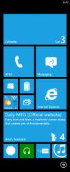
Mobile OSs Post a screenshot of your Windows Phone Start screen!
- Thread starter Jessica Lares
- Start date
- Sort by reaction score
You are using an out of date browser. It may not display this or other websites correctly.
You should upgrade or use an alternative browser.
You should upgrade or use an alternative browser.
I bought a 520 to try WP8 late last month. I liked it. I use it all the time as my in-car GPS and media player. I downloaded some games to it as well and because of the 4 inch screen it is nice to look at, read, play games, and of course as my GPS. I think I might pick up the 925 next and actually give it a proper try for a couple of months. The iPhone 5s/c is not coming here for a couple of months it seems so I think now is the perfect time to try WP8 as my main operating system for an extended period of time.
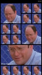
So I've recently changed mine to a different layout I'm pretty happy with. I ditched the Internet Explorer app with UC Browser, the built-in mail app with the MetroMail beta, and then I'm using the new InNote app for doodling and noting stuff.
The top tile is Super Calendar and then Vieather for weather.

Much less clutter than what I started with.
The top tile is Super Calendar and then Vieather for weather.

Much less clutter than what I started with.
So I've recently changed mine to a different layout I'm pretty happy with. I ditched the Internet Explorer app with UC Browser, the built-in mail app with the MetroMail beta, and then I'm using the new InNote app for doodling and noting stuff.
The top tile is Super Calendar and then Vieather for weather.
Image
Much less clutter than what I started with.
Very nice!
I feel like MS should implement wallpapers somehow. For instance, make the icons a bit transparent with a wallpaper in the back and the part of the wp that's covered by an icon would be blurred (like how the background looks when you pull down the notification center in ios7).
.
Ahhhhh! but adding a wallpaper and that much transparency would destroy the little performance illusion that Microsoft has created.
It's really really easy to draw and push these (mostly) two-colour tiles around the screen whilst keeping it nice and smooth.... something completely different when you add a lot of transparency and things like wallpapers and high colour, high detail icons...
Register on MacRumors! This sidebar will go away, and you'll see fewer ads.


