Nice, especially the original Batman & Robin!Been enjoying these
Got a tip for us?
Let us know
Become a MacRumors Supporter for $50/year with no ads, ability to filter front page stories, and private forums.
Post custom watch faces for Apple Watch [Merged]
- Thread starter JGayle007
- Start date
- Sort by reaction score
You are using an out of date browser. It may not display this or other websites correctly.
You should upgrade or use an alternative browser.
You should upgrade or use an alternative browser.
This beautiful model just happens to be my daughter. I know she is all grown up now but to me she will always be my baby girl! I am so proud of her. Not only does she model but she just earned her master's degree and is pursuing a doctorate!!

I love how the Apple Watch doesn't try to stop you from using the same complication multiple times on the same face, so you can end up with this useless beauty/monstrosity:

All these "custom dials" are fine, whatever, but I'm still hoping Apple will launch a face store with actual customization, not just wallpaper. Real dials made by designers, not just Gundam wallpaper.
I've always said they could add an ambient light sensor somewhere around the screen, and with some simple effects, imitate the direction of ambient light as you move your wrist.
If I can do this in Photoshop, Apple could do it on the watch.

I've always said they could add an ambient light sensor somewhere around the screen, and with some simple effects, imitate the direction of ambient light as you move your wrist.
If I can do this in Photoshop, Apple could do it on the watch.

Heres mine...View attachment 584442
“Exterminate!” Brrrr after 39yrs that image and specific sound still give me the chills and creeps!
When on <10% gonna look like how much time you have left...I love how the Apple Watch doesn't try to stop you from using the same complication multiple times on the same face, so you can end up with this useless beauty/monstrosity:
View attachment 788305
Are there any links to custom watch faces for the apple watch or if you don't mind sharing your custom watch faces pics, that would be appreciated. Thanks.
Attachments

Moderate customisation so far but I like it. Has everything I need (for now). I'd like the option to add Friend Finder in place of the LON clock face...
This is what I'm trying out right now:

And this is my weather face:

I wish I could add a barometric pressure complication with trend arrow, feels like temperature, and a link to RadarScope on this face. It would also be nice if we could customize the text above the hourly forecast as it's redundant. Also I guess the current conditions are on there twice because the forecast shows the NOW weather on the left, but I wish I could customize that forecast strip to instead show the forecast for today on the left with the high and lows, as well as the next four days. Then I could get rid of the top temperature complication which shows the high and low and replace it with something else. Having a weather face fulfills a fantasy of mine from when I was a boy and obsessed with watches that let you measure the temperature and other things because I was really into meteorology (and still am to a certain extent).
And this is my weather face:
I wish I could add a barometric pressure complication with trend arrow, feels like temperature, and a link to RadarScope on this face. It would also be nice if we could customize the text above the hourly forecast as it's redundant. Also I guess the current conditions are on there twice because the forecast shows the NOW weather on the left, but I wish I could customize that forecast strip to instead show the forecast for today on the left with the high and lows, as well as the next four days. Then I could get rid of the top temperature complication which shows the high and low and replace it with something else. Having a weather face fulfills a fantasy of mine from when I was a boy and obsessed with watches that let you measure the temperature and other things because I was really into meteorology (and still am to a certain extent).
Why does that Walkie icon look pixelated and low-quality?This is what I'm trying out right now:
View attachment 791497
And this is my weather face:
View attachment 791499
I wish I could add a barometric pressure complication with trend arrow, feels like temperature, and a link to RadarScope on this face. It would also be nice if we could customize the text above the hourly forecast as it's redundant. Also I guess the current conditions are on there twice because the forecast shows the NOW weather on the left, but I wish I could customize that forecast strip to instead show the forecast for today on the left with the high and lows, as well as the next four days. Then I could get rid of the top temperature complication which shows the high and low and replace it with something else. Having a weather face fulfills a fantasy of mine from when I was a boy and obsessed with watches that let you measure the temperature and other things because I was really into meteorology (and still am to a certain extent).
[doublepost=1538527446][/doublepost]
I made this one. PM me if you would like it...

Note: I am not affiliated with the Miami Dolphins. The Miami Dolphins logo is the copyright of Miami Dolphins, LTD and is subject to and protected by United States and international copyright and other intellectual property laws and rights.
/QUOTE]
You took that wallpaper and this post way too seriously. You're not selling their logo and maybe 300 people will see your post. They don't care, lol.
Last edited:
IDK, maybe they messed up the aliasing? It’s trickier to do on bright colors against dark backgrounds, especially when black is black on OLED and the Apple Watch PPI isn’t as good as the iPhone. It’s not as noticeable on the wrist but I wouldn’t be surprised to see them fix it up soon.Why does that Walkie icon look pixelated and low-quality?
[doublepost=1538527446][/doublepost]
I've always wanted a complication entitled "Medical Insurance Remaining."
What was your battery when you took this? Cheers.I love how the Apple Watch doesn't try to stop you from using the same complication multiple times on the same face, so you can end up with this useless beauty/monstrosity:
View attachment 788305
Dolphins jersey number font as the clock numbers. Attention to detail.
I tried out the greyscale and quite like it ... colours can be pretty AND distracting
https://imgur.com/lkD8B89
Interestingly, if you screenshot this it posts as the original colours.
https://imgur.com/lkD8B89
Interestingly, if you screenshot this it posts as the original colours.
AgreeI tried out the greyscale and quite like it ... colours can be pretty AND distracting
https://imgur.com/lkD8B89
Interestingly, if you screenshot this it posts as the original colours.
I saw this face on Reddit - obviously it would be better with the dial activity info flipped, and I added the corner stuff, but yeah. Wouldn't it be great if Apple would let people give them money for new watch faces? lol

I’d like this one...

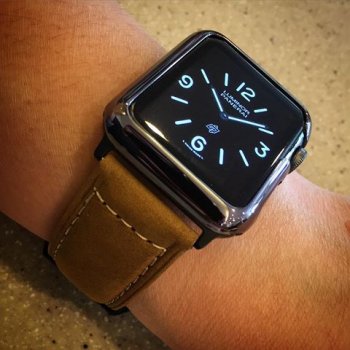
it should be ”banerai” or ”panery”, then it would be perfect!
I finally got my nike+ series 4 on tuesday and i spent forever fiddling around with complications and designs for various watch faces. The watch faces I’ve tried are infograph, modular, infograph modular, photo, timelapse, astronomy, motion, vapor, water, siri, and solar.
My conclusion is that most of these current watch faces are really not that great.
Infograph is horrendous by default—it can look pretty good paired down, but I prefer digital time over analog anyways.
Modular and its infograph variant are very bland and not particular customizable. Photo and timelapse both are pretty decent but aren’t particularly interactive—they have very little depth to them.
Astronomy is cool; I just think neither Moon, Earth, or the Solar System display options have the kind of particular facially attractive quality in them that I look for; Motion is much the same.
Vapor and Water are super cool—absolutely gorgeous; I just can’t read their analog readout efficiently enough. A shame; if they provided a digital readout for these faces, I’d be all over them.
Siri has an attractive color scheme and digital readout, (I’ve noticed that the newer digital watch faces have a much nicer, bold styling to them when compared to the ‘legacy’ digital faces) but it’s a bit cluttered and claustrophobic, if that makes sense.
That leads me to Solar, my current favorite face. While Solar is a bit too minimal, it has this very cool interactive and dynamic quality to it—it’s minimalist, stark nature is pretty effectively curtailed with cool animating and shifting style. My main problem with Solar is how difficult it is to hit the touch target for the two complications—even more so than the other watch faces with this complication layout. It’s frustrating.
But yeah, my conclusion over the past day and a half of owning an Apple Watch is that the watch face and complication selection is frustratingly limited and inconsistent design and customization-wise. They really need to go through and rethink the whole gallery in watchOS 6.
Last edited:
Register on MacRumors! This sidebar will go away, and you'll see fewer ads.


