Become a MacRumors Supporter for $50/year with no ads, ability to filter front page stories, and private forums.

Designer Dale

macrumors 68040
Original poster
Mar 25, 2009
3,950
101
Folding space
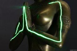
I was going to respond to a thread about photographers fearing art, but decided to show photography as the art it can be instead. Join me?

9tm6.jpg


Dale
 
agreed with OP

* three of these submitted to the MR weekly photo contest
 

Attachments

  • 10965739315_ec50158af3_o.jpg
    10965739315_ec50158af3_o.jpg
    741.8 KB · Views: 105
  • 11239531603_296686a0be_o.jpg
    11239531603_296686a0be_o.jpg
    766.2 KB · Views: 120
  • 11347016805_82197d7084_o.jpg
    11347016805_82197d7084_o.jpg
    666.8 KB · Views: 105
  • 10713219633_9aea8502e7_o.jpg
    10713219633_9aea8502e7_o.jpg
    547 KB · Views: 113
Last edited:
Seeing possibilities on a dull day

I took this photo of the West Pier in Brighton on a foggy day with the sea almost pond-like in its stillness. It looks like a B&W photo but you can just see a red buoy through the gap in the far structure. That's how dull the day was.


PierOriginal by Parkin Pig, on Flickr

I knew at the time exactly what I was going to do with it when I got home, and the results turned out just as I originally envisioned:


AquaPier by Parkin Pig, on Flickr

Just a simple colour gradient - make your own mind up whether or not it's art.
 
Sometimes the surroundings are such, that you feel like you are submerged into art on every level. Case in point: old European art hubs, like Venice, and many others:


Grand Canal by FriskyFreeze, on Flickr

The whole city feels like a museum and it's way too easy to photograph this architectural art and put your own spin on it. The photo above, for example, was shot in infrared, hence the sharp contrast and the particularly dark colour of the water.
 
Last edited:
Yup..... Here's 'nother one ...

h1a812.jpg

I took this photo of the West Pier in Brighton on a foggy day with the sea almost pond-like in its stillness. It looks like a B&W photo but you can just see a red buoy through the gap in the far structure. That's how dull the day was.


PierOriginal by Parkin Pig, on Flickr

I knew at the time exactly what I was going to do with it when I got home, and the results turned out just as I originally envisioned:


AquaPier by Parkin Pig, on Flickr

Just a simple colour gradient - make your own mind up whether or not it's art.

One of the things that strikes me about this photography as art argument is that it usually comes from traditional media artists who have a blank canvas to work with and are free to create with the media they choose to work in. As photographers we, for the most part, are limited to working with what the world presents to us. Light, framing and color are the tools for us to create with.

someoldguy: Great use of color and framing. Love the detail and lines in the flower petals.

Parkin Pig: Framing of linear lines can make or break a photo and this one works. I love the contrast between the horizontals of the structure in the water and the pier leading out to it at a diagonal line. Nice feel of movement created by your framing of the scene. I played with the first image in PhotoShop and kicked up the contrast a lot to give it a bit of a Kodalith feel and liked what I came up with. You might want to play with the contrast and see if you like that better, too.

Thanks for joining in.

-------------------------------------------------------

A serious dip into the archive. Film from 1971.

emje.jpg


Dale
 
Last edited:
I played with the first image in PhotoShop and kicked up the contrast a lot to give it a bit of a Kodalith feel and liked what I came up with. You might want to play with the contrast and see if you like that better, too.

I had a play around with the contrast and I see what you mean. It gives a more desolate, and slightly sinister feel. By doing that you've also made a good point about the art aspect of photography: when I was on the beach I could actually see the blue tinted version, whereas you came up with the high contrast version almost instantly (from a photograph taken on a distinctly low-contrast day). It's not just about a literal interpretation of what exists, it's how we see it, and isn't that the essence of art?
 
I took this photo of the West Pier in Brighton on a foggy day with the sea almost pond-like in its stillness. It looks like a B&W photo but you can just see a red buoy through the gap in the far structure. That's how dull the day was.

[url=http://farm3.staticflickr.com/2854/11353449554_405cb4c208_b.jpg]Image[/url]
PierOriginal by Parkin Pig, on Flickr

I knew at the time exactly what I was going to do with it when I got home, and the results turned out just as I originally envisioned:

[url=http://farm8.staticflickr.com/7318/11353411166_557345d045_b.jpg]Image[/url]
AquaPier by Parkin Pig, on Flickr

Just a simple colour gradient - make your own mind up whether or not it's art.
Well I think so. The first B&W is ok, but the blue version transforms it into something wonderful.
 
Well I think so. The first B&W is ok, but the blue version transforms it into something wonderful.

Thanks for the kind words. It was one of those 'right place, right time' moments - the sky was totally featureless, and the horizon rendered almost invisible. A dull day which provided an unexpected opportunity.
 
Register on MacRumors! This sidebar will go away, and you'll see fewer ads.