Love the iTunes skin - how? What?Following the trend - macOS Ventura Graphite wallpaper style
Thanks for the idea, @adamlbiscuit
View attachment 2015796
Become a MacRumors Supporter for $50/year with no ads, ability to filter front page stories, and private forums.
Post Your Desktop: June 2022
- Thread starter AZhappyjack
- Start date
- Sort by reaction score
You are using an out of date browser. It may not display this or other websites correctly.
You should upgrade or use an alternative browser.
You should upgrade or use an alternative browser.
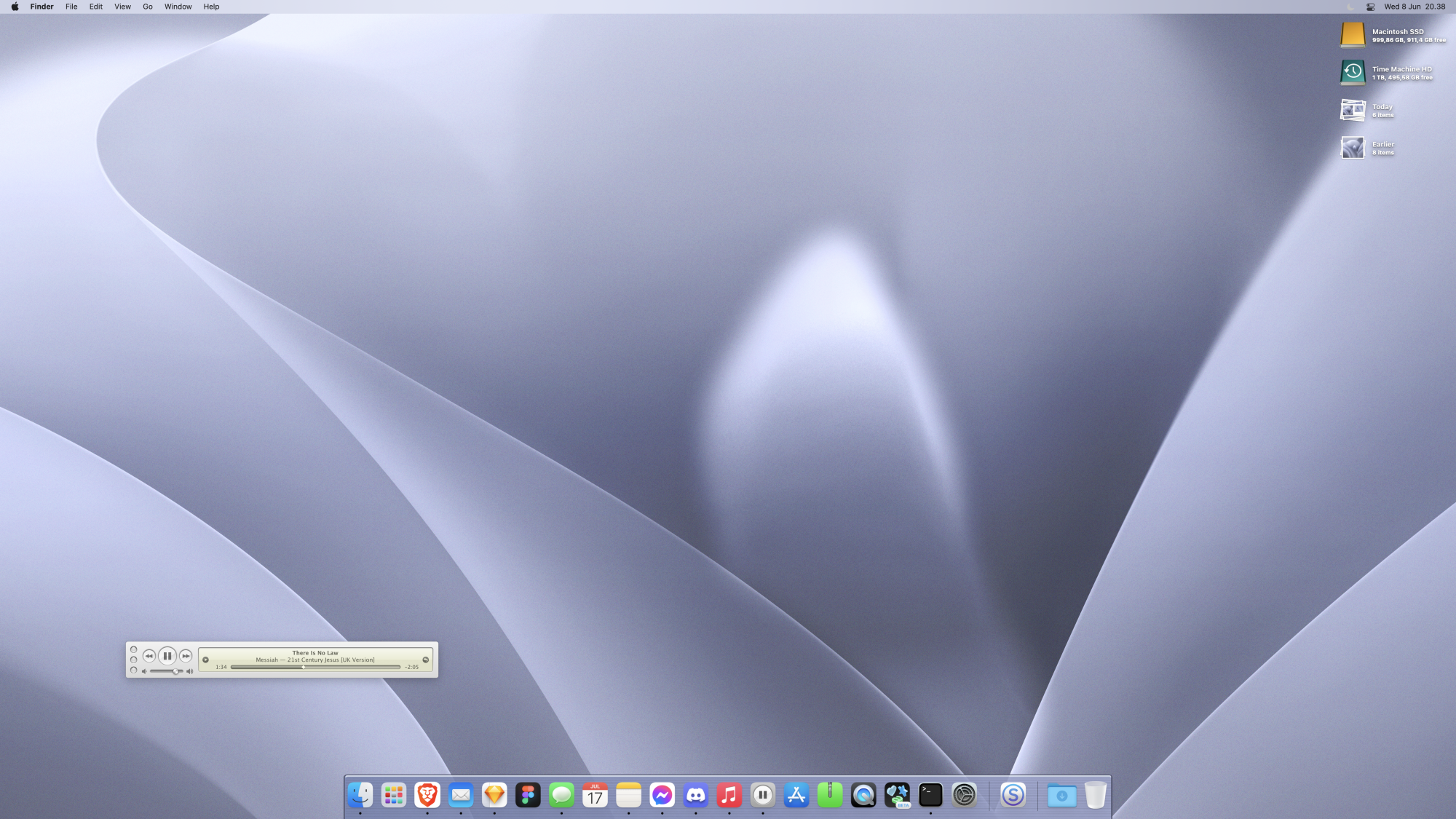
It is this oneLove the iTunes skin - how? What?

Music MiniPlayer for macOS
A replica of the classic iTunes MiniPlayer to control Apple Music on modern macOS.
marioaguzman.github.io
wallpaper edited-ed to better fit with my cDock theme IMO
@Killa Aaron and also @Corentin back !!! Hurray.. where's @Psychopulse ? A return to what was ~10 years ago
Prob stick with this for rest of month... maybe not... lol!
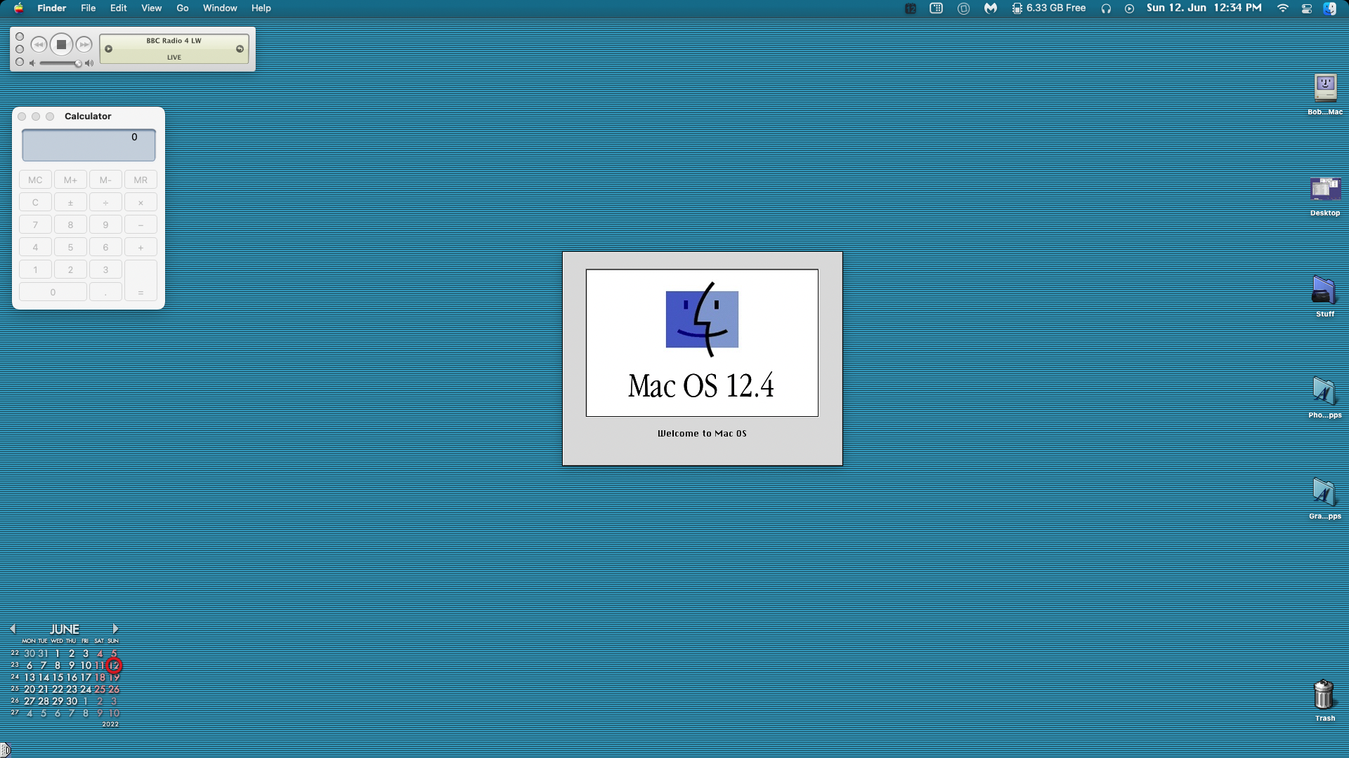
can you share the wallpaper, please?Ventura Beta 1 View attachment 2017254
Ventura's wallpaper looks really nice on this colour.
It would be great if this was a dynamic desktop that went through a day/night cycle.View attachment 2013141
using this image for desktop.
It would be great if this was a dynamic desktop that went through a day/night cycle.

Minimal Forest [FIXED] - Dynamic Wallpaper Club
Looking for Dynamic Wallpapers for macOS? Download "Minimal Forest [FIXED]" on dynamicwallpaper.club or create your own.
Like so?
You are a god. Thanks very much!
Minimal Forest [FIXED] - Dynamic Wallpaper Club
Looking for Dynamic Wallpapers for macOS? Download "Minimal Forest [FIXED]" on dynamicwallpaper.club or create your own.dynamicwallpaper.club
Like so?
I like it... would you please share?
I found the Venture wallpapers herecan you share the wallpaper, please?
Ventura's wallpaper looks really nice on this colour.

Download the new macOS 13 Ventura wallpaper - 9to5Mac
Apple announced at WWDC 2022 the next version of the Mac operating system, which is called macOS Ventura (or macOS...
 9to5mac.com
This old-fashioned picture is fantastic. Would you share it with me?
Ha... I made these pinstripes originally as folder backgrounds...This old-fashioned picture is fantastic. Would you share it with me?
just set them to tile
Last edited:
Yes, i have them, im on macOS13 db1...but the purple one its not default.I found the Venture wallpapers here

Download the new macOS 13 Ventura wallpaper - 9to5Mac
Apple announced at WWDC 2022 the next version of the Mac operating system, which is called macOS Ventura (or macOS...9to5mac.com
Im going to post my mod soon on my devart im currently away from my 💻.Yes, i have them, im on macOS13 db1...but the purple one its not default.
How do you use them as folder backgrounds, I cannot set them to repeat, they just end up in the top left cornerHa... I made these pinstripes originally as folder backgrounds...
View attachment 2020333 View attachment 2020334 View attachment 2020335 View attachment 2020336
just set them to tile
And your desktop is amazing, what did you use to customize the menu bar?
Yes... you'll have to set them as your wall paper, screen shot then crop out the icons and stuff to make as folder backgrounds. They're not big enough on their own.How do you use them as folder backgrounds, I cannot set them to repeat, they just end up in the top left corner
And your desktop is amazing, what did you use to customize the menu bar?
I tend to use solid colours for folders.
menubar apple is applied with photostickies app.
Glad you like!
@bhtwo you always showcase the best retro Mac desktop.. you're very good in keeping the Classic MacOS style even on modern macOS'
Have you tried experimenting with other folder background styles seeing that Finder always tiling backgrounds from a fixed position. My solution has always been to create a rather wide background that's white with a fade and then a little graphic in the top before the folders appear. Similar to the older Gaia themes for shapeshifter - these DMG files had fun extras in them.
Have you tried experimenting with other folder background styles seeing that Finder always tiling backgrounds from a fixed position. My solution has always been to create a rather wide background that's white with a fade and then a little graphic in the top before the folders appear. Similar to the older Gaia themes for shapeshifter - these DMG files had fun extras in them.
Last edited:
Hi Allan... Thanks, but I sort of gave up with background images for folders. Too much of a faff.@bhtwo you always showcases the best retro Mac desktop.. you're very good in keeping the Classic MacOS style even on modern macOS'
Have you tried experimenting with other folder background styles seeing that Finder always tiling backgrounds from a fixed position. My solution has always been to create a rather wide background that's white with a fade and then a little graphic in the top before the folders appear. Similar to the older Gaia themes for shapeshifter - these DMG files had fun extras in them.
Register on MacRumors! This sidebar will go away, and you'll see fewer ads.


