Got a tip for us?
Let us know
Become a MacRumors Supporter for $50/year with no ads, ability to filter front page stories, and private forums.
Post Your Desktop: March 2023
- Thread starter iAssimilated
- Start date
- Sort by reaction score
You are using an out of date browser. It may not display this or other websites correctly.
You should upgrade or use an alternative browser.
You should upgrade or use an alternative browser.
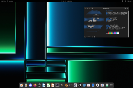
Oooh! That's a nice desktop picture, I love it! Are you running Linux?
Oooh! That's a nice desktop picture, I love it! Are you running Linux?
Yes, KDE neon, mainly because of the ability to use a geforce 980 ti with the 5,1's great hardware while maintaining an up-to-date OS.
Goodbye Big Sur, hello Monterey, plus decided to give Dock on the left a second chance.
One of my favourite backgrounds - especially as a surfer 😁View attachment 2169141
Goodbye Big Sur, hello Monterey, plus decided to give Dock on the left a second chance.
And that dock on the left won't last long 😆
NICE wallpaper! And theme, too! What application/"extension" did you use to get the other theme for macOS?
Glad you likeNICE wallpaper! And theme, too! What application/"extension" did you use to get the other theme for macOS?
it's not really a theme, just stock apple (Monterey)
I used Photostickies for the aqua apple icon and cd case
Control strip is Menustrip.
Looks great! How did you get an opaque menu bar while still having a translucent dock? Are you on an Intel or Apple Silicon Mac?View attachment 2169141
Goodbye Big Sur, hello Monterey, plus decided to give Dock on the left a second chance.
Using Lickable Menu Bar to add a Gradient like in Leopard-Mavericks, and rotating through some of my favorite classic OS X Wallpapers when I wake my Mac up.

Lickable Menu Bar + Boring Old Menu Bar.Looks great! How did you get an opaque menu bar while still having a translucent dock? Are you on an Intel or Apple Silicon Mac?
If you do not feel like paying for BOMB, take the desktop background of your choice and add white strip on top of it that is of the same height as your menu bar.
Also if you like bigger text of menu bar items, go Accessibility -> Display -> Menu bar size - set to “Large” (this does not increase the menu bar’s height, just makes text bigger)
Thanks!Lickable Menu Bar + Boring Old Menu Bar.
If you do not feel like paying for BOMB, take the desktop background of your choice and add white strip on top of it that is of the same height as your menu bar.
Also if you like bigger text of menu bar items, go Accessibility -> Display -> Menu bar size - set to “Large”
Indeed, what I love about it is how it doesn’t make anything on desktop hard to see or read, yet it’s a photo, not an abstract image.One of my favourite backgrounds - especially as a surfer 😁
And that dock on the left won't last long 😆
As for the dock, I must tell you, it already broke the record for time spent on the left side. 😁
I thought this was - well just was. Transparency is achieved with just Aqua.car file and some trickery with CoreAnimationArchives and colors

Almost Crystal Clear! One of my all time favourite themes.I thought this was - well just was. Transparency is achieved with just Aqua.car file and some trickery with CoreAnimationArchives and colors
View attachment 2172494
I am just wondering, do you use with dock hidden or showing (this size)?
Also awesome wallpaper, do you have the source?
Any benefits so far compared to Bigsur? my only gripe is with onedrive changed mechanics was almost unusable.View attachment 2169141
Goodbye Big Sur, hello Monterey, plus decided to give Dock on the left a second chance.
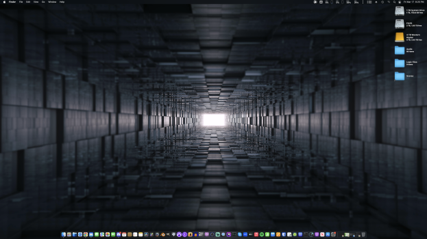
Nothing fancy, my brand new M2 Pro Mac mini with my brand old 5K2K-monitor

No particular benefits, Monterey was mostly iterative update. I like that there is now "Show button shapes" option in Accessibility (what a sad state of matter, from slightly annoyed I am becoming slowly agitated that I even have to do such things, and what's even more depressing deterioration of the user interface continues, it keeps getting worse and worse).Any benefits so far compared to Bigsur? my only gripe is with onedrive changed mechanics was almost unusable.
*I guess Quick Note deserves a mention, but it could have been so much better. Good idea, poor execution.
Last edited:
Thanks! I always have the dock showing unless I’m full screen for some reason. Send me a DM I’ll send it over later.I am just wondering, do you use with dock hidden or showing (this size)?
Also awesome wallpaper, do you have the source?
On my main monitor - quite an interesting, but also somewhat minimalistic wallpaper. Can't remember where I found it though—it's been in my collection for awhile now. On my second monitor, I think I found that one on Backiee.
Image #1 - main monitor
Image #2 - second monitor
Image #1 - main monitor
Image #2 - second monitor
Attachments
I've been using GNOME for about a week so far just so I could have a more level and experienced point of view when I talk about it, after having not really used it much at all since the GNOME 3.0 transition. I can't say I love it, but in this current state it could be worse, for sure. That's not to say I don't have criticisms or do like how it depends on systemd or how the main Wayland compositor is basically modelled after it, but I can at least use it and be happy enough with it.


Register on MacRumors! This sidebar will go away, and you'll see fewer ads.


