Become a MacRumors Supporter for $50/year with no ads, ability to filter front page stories, and private forums.
Post your desktop - September 2016
- Thread starter An_Excelent_Username
- Start date
- Sort by reaction score
You are using an out of date browser. It may not display this or other websites correctly.
You should upgrade or use an alternative browser.
You should upgrade or use an alternative browser.
Same here Jessica. Dark/black interfaces never last too long. White is the new "pro" LOLI am back to using the white menubar and dock. My eyes can't take the white against black interfaces anymore.
https://interfacelift.com/wallpaper/details/4004/the_black_and_white_rocky.html
View attachment 650586
How do you know which icons are for which app unless you move your cursor over the icon?
… back to using the white menubar and dock. My eyes can't take the white against black interfaces anymore. …
Same here Jessica. Dark/black interfaces never last too long. White is the new "pro" LOL
I tried the black menu bar for a while at the weekend, found it harsh, reverted to white. Sierra, which I guess is the same as El Capitan for the blackness of its menu bar.
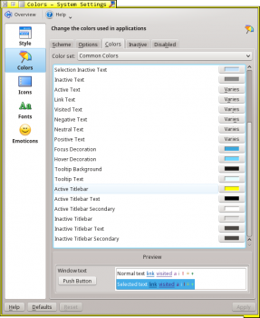
When I use KDE (screen shots below) there's a panel, which is vaguely like Apple's Dock, and I prefer the darkness. Out of the box, the panel is at either the top or bottom of the screen (I can't recall which) and shallow. I prefer it to the left, and wide, with:
- kickoff (application launcher)
- pager (virtual desktops, nine)
- application-specific launchers
- task manager – wide enough to show a reasonable amount of text from the title bar of each window
- clock
- system tray.


People might cringe at my preference for yellow – active title bar, active window border and Firefox active tab. I choose it because the highlights and delineation help me with orientation/reorientation. (I'm often away from, then returning to the computer; and I multitask a lot in both situations.)

How do you know which icons are for which app unless you move your cursor over the icon?
I've been using that same icon set across multiple systems for the last 6 or so years. At this point I easily have what each icon opens memorized.
I'm about to clean my desktop and thought the mess was worthy of documentation. Feel free to play desktop I Spy with me and find:
- A file name that clearly doesn't describe the file's contents
- An obscenity
- Clones
View attachment 653536
I'm about to clean my desktop and thought the mess was worthy of documentation. Feel free to play desktop I Spy with me and find:
- A file name that clearly doesn't describe the file's contents
- An obscenity
- Clones
I was bored, so:
1. cyan
2. f*ck.irs
3. (don't care)
@AngerDanger I imagined that Turkey Trot might be a metaphor for something obscene but no, the twisted imagination is nothing more than a result of my 1970s childhood surrounded by double entendre.
Rockin with the best of both worlds. First screenshot is of my beloved MB and second is a new XPS 13 I just picked up (OS X inspired ;D).
![Screen Shot 2016-09-17 at 5.38.24 PM[3750132].png Screen Shot 2016-09-17 at 5.38.24 PM[3750132].png](https://spy.macrumors.com/attachments/screen-shot-2016-09-17-at-5-38-24-pm-3750132-png.654135/)

Taken about 10 minutes walk for the house back in early August.

I love the water texture.Taken about 10 minutes walk for the house back in early August.
View attachment 655654
I love the water texture.
Yeah I really like that about it too, I was testing out Microsoft Pix on my 6S that day - have been very impressed with the photos is produces.
2010 iMac September 2016 - now if he was protecting my 27" iMac none of the Yahoo crap would have come down on me. 

Register on MacRumors! This sidebar will go away, and you'll see fewer ads.


