Got a tip for us?
Let us know
Become a MacRumors Supporter for $50/year with no ads, ability to filter front page stories, and private forums.
iPad Post your iPad Wallpapers
- Thread starter Lsmachado
- Start date
- Sort by reaction score
You are using an out of date browser. It may not display this or other websites correctly.
You should upgrade or use an alternative browser.
You should upgrade or use an alternative browser.
Here’s my current one.
I like your set up. I prefer all my apps to the dock as well, gives me quicker access to multi-task.
Where's yours? 👀😂Yes! I’m currently on my iPhone, but as soon as I’m back at my desk I’ll post my iPad’s wallpaper!
Nearly a week later-I’m not back at my desk.Where's yours? 👀😂
Jk. Here’s mine plus a bonus picture of my iPad.
I used it to make a few emojis then deleted it and turned back off 3rd party sites.View attachment 952344
How can i make an emoji similar to that?
How can i make an emoji similar to that?
I followed the instructions in this thread that start on page 1.
where can I find this? looks great.
I googled this term and it came up right away when I was looking for it earlier. “purple fluorescent 4k wallpaper” - First saw it on the r/unixporn reddit channelwhere can I find this? looks great.
I have a bunch of devices and I like to theme them differently to set them apart. When I first purchased my 9th gen iPad, I gave it a Jupiter 2 theme (from the 1960's TV series "Lost in Space"). I wanted to mix it up a bit and the result...
"Think iPad". It is a play on the classic IBM ThinkPad logo, inserting an "i" to capture "iPad" in the name. (it helped that the "P" was already capitalized)
This is the homescreen in portrait mode.
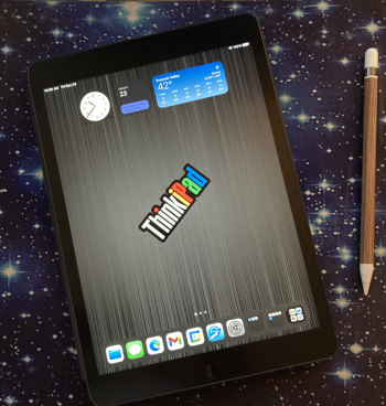
Here it is in landscape with the Apple Smart Keyboard Cover attached.

Here is the lockscreen. Although I love the monochromatic world map that is a classic ThinkPad wallpaper, it is a bit too busy for a homescreen image...but it is fine for the lockscreen.
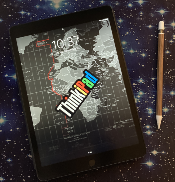
Here's the back skin. I like a minimalist approach to covers and protection. I don't need much... a smartcover for the front, and a thin clear skin on the back (to improve grip and avoid minor scratches).
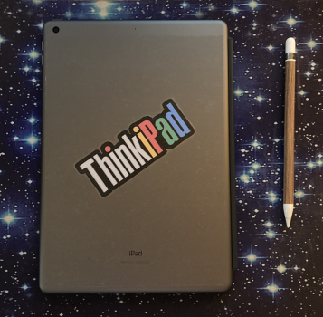
"Think iPad". It is a play on the classic IBM ThinkPad logo, inserting an "i" to capture "iPad" in the name. (it helped that the "P" was already capitalized)
This is the homescreen in portrait mode.

Here it is in landscape with the Apple Smart Keyboard Cover attached.

Here is the lockscreen. Although I love the monochromatic world map that is a classic ThinkPad wallpaper, it is a bit too busy for a homescreen image...but it is fine for the lockscreen.

Here's the back skin. I like a minimalist approach to covers and protection. I don't need much... a smartcover for the front, and a thin clear skin on the back (to improve grip and avoid minor scratches).

I like what you did with your PencilI have a bunch of devices and I like to theme them differently to set them apart. When I first purchased my 9th gen iPad, I gave it a Jupiter 2 theme (from the 1960's TV series "Lost in Space"). I wanted to mix it up a bit and the result...
"Think iPad". It is a play on the classic IBM ThinkPad logo, inserting an "i" to capture "iPad" in the name. (it helped that the "P" was already capitalized)
This is the homescreen in portrait mode.
View attachment 2132170
Here it is in landscape with the Apple Smart Keyboard Cover attached.
View attachment 2132168
Here is the lockscreen. Although I love the monochromatic world map that is a classic ThinkPad wallpaper, it is a bit too busy for a homescreen image...but it is fine for the lockscreen.
View attachment 2132171
Here's the back skin. I like a minimalist approach to covers and protection. I don't need much... a smartcover for the front, and a thin clear skin on the back (to improve grip and avoid minor scratches).
View attachment 2132169
Thanks! It's woodgrain peel-n-stick contact paper. Some guys swear by duct tape... me, woodgrain and clear contact paper. 😂I like what you did with your PencilLink?
Register on MacRumors! This sidebar will go away, and you'll see fewer ads.


