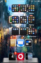
I'm like h1r0ll3r on the fonts. Don't change anything drastically, maybe just one size down or the same exact size font for the temps and date/time.
And I actually like the off-centered weather icon. But it's always a personal choice and can easily be moved around in the code.
The one thing I would probably change (if I'm lucky enough to get this widget on my device) is the HI and LO temps to something more indicative of what they are (HI a shade of red, LO a shade of blue). However, I wouldn't want it to stand out too much, so I'd go with a soft color of each.
I LOVE that weather icon, though! Very cool.
I agree with your post and then for balance, shade the date and time in matching colors. I would recommend putting the High at the top, current in the center and low on the bottom. But other then that, Lex...I am impressed, looks really good!!!


