Become a MacRumors Supporter for $50/year with no ads, ability to filter front page stories, and private forums.
Status
Not open for further replies.
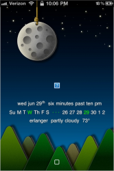
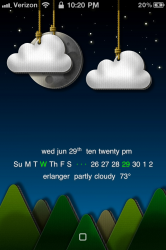
Awesome! Any idea where the dock is from :eek:

LOL--I had to stop and think for a second, because I'd intended to use one of the silver ones and never got around to loading it before I left earlier. There's no visible "dock" in this screenshot--I'm using Transparent Dock (4.2.1) from Cydia, because I'm still on that firmware version. I *think* it vanishes the stock dock without affecting the reflections, but for all I know anymore, I may have modded the reflections in some plist somewhere and forgotten about it! :D I'll double check that.
 
Yeah, it's like that for the cardboard widget as well.

Another question I have regarding the cardboard widget: Regarding the white outline I was talking about earlier, is there a way to get rid of it all together? The backgrounds are beautiful enough on their own, and it's a shame to have that white outline on it just because there's no service. I took a look through the code and tried messing around to no avail.

On a side note, I found that this widget can easily be modded for sb as well, using just three rows of icons (no iconoclasm or anything):

1. Make a new folder called something like "SB CardboardWeather"
2. Copy all the contents from the existing LS CardboardWeather into it.
3. Rename "Lockbackground.html" to "Wallpaper.html"

Then, in the file "main.css":

4. Under #topbar, change "margin-top: 240px" to "margin-top: 260px"
5. Under #datebar_line, change "padding-bottom: 30px" to "padding-bottom: 10px"
6. Put the new theme into winterboard, respring and whatnot, and voila!

Image

Again, tons of thanks to tadad1 for this wonderful theme and widget!


In the main.css add "display:none;" to the bottom of the "weatherIcon" section.
 
Hat tip to IrishVixen for the modded SB widget. :D I really like those weather icons, although I can't figure out why it's showing that it's partly sunny at almost 10 pm...lol. Not a big deal, though!

LS is LS A1 from the new dBar site. Very clean and simple...I like it! And I'm still going through my retro phase when it comes to icons. I just like the simple, semi-round icons of Touchit. The only annoying thing is how "Wednesday" is too big for the calendar icon and runs off the edges. Not a huge deal, but just one of those things that bugs me. If anyone knows how I can shrink that text down just a little, I'd appreciate the help. :D

Oh, and I love those wallpapers by MikaDesign. Very cool. I downloaded that set a couple of days ago when it was posted at MacThemes. IrishVixen, I was using the dark blue too until I saw your screen shot, so I thought I'd change it up just so it would look a little different from yours...lol.

cb9cc166.png
85a11049.png
 
Ok i started over with the theme as written and made the location and Celsius change and now it looks right.
 

Attachments

  • Photo Jun 29, 10 06 14 PM.png
    Photo Jun 29, 10 06 14 PM.png
    403.8 KB · Views: 68
  • Photo Jun 29, 10 20 37 PM.png
    Photo Jun 29, 10 20 37 PM.png
    448.4 KB · Views: 66
Hat tip to IrishVixen for the modded SB widget. :D I really like those weather icons, although I can't figure out why it's showing that it's partly sunny at almost 10 pm...lol. Not a big deal, though!

LS is LS A1 from the new dBar site. Very clean and simple...I like it! And I'm still going through my retro phase when it comes to icons. I just like the simple, semi-round icons of Touchit. The only annoying thing is how "Wednesday" is too big for the calendar icon and runs off the edges. Not a huge deal, but just one of those things that bugs me. If anyone knows how I can shrink that text down just a little, I'd appreciate the help. :D

Oh, and I love those wallpapers by MikaDesign. Very cool. I downloaded that set a couple of days ago when it was posted at MacThemes. IrishVixen, I was using the dark blue too until I saw your screen shot, so I thought I'd change it up just so it would look a little different from yours...lol.

Image Image

I didn't tweak the code specifically for weather vs. time as I've yet to figure out how, just confirmed that there were "night" icons in the set. Seems like a number of the weather widgets I've downloaded lately have the same issue--they don't show "night" until 11 PM or so. If anyone knows how to tweak that, I'd love to learn!

FYI--the temp may need tweaking as far as position goes; keep an eye on it as the icons change. I ended up moving mine another 5 pixels up just a bit ago.

As for your calendar issue, is there a plist with that theme? That's where you'd change the day size. As soon as I finish dinner, I'll see if I can find that info, if someone doesn't beat me to it! LOL

Edit--here's a post from a while back that has a plist example for changing the calendar icon day and date sizes. You'd need to play with it a bit to make things fit; I've had to do similar with EliteHD and one or two others I have. This is also where you'd change the text colors for those things, or add gradients--Lexs usually had a gradient added to the icon labels in the plists that came with her widgets, so that's another place to look for a plist you can adapt.
 
Last edited:
I didn't tweak the code specifically for weather vs. time as I've yet to figure out how, just confirmed that there were "night" icons in the set. Seems like a number of the weather widgets I've downloaded lately have the same issue--they don't show "night" until 11 PM or so. If anyone knows how to tweak that, I'd love to learn!

FYI--the temp may need tweaking as far as position goes; keep an eye on it as the icons change. I ended up moving mine another 5 pixels up just a bit ago.

As for your calendar issue, is there a plist with that theme? That's where you'd change the day size. As soon as I finish dinner, I'll see if I can find that info, if someone doesn't beat me to it! LOL

Edit--here's a post from a while back that has a plist example for changing the calendar icon day and date sizes. You'd need to play with it a bit to make things fit; I've had to do similar with EliteHD and one or two others I have. This is also where you'd change the text colors for those things, or add gradients--Lexs usually had a gradient added to the icon labels in the plists that came with her widgets, so that's another place to look for a plist you can adapt.

IrishVixen, apparently they change over to "night" icons at 10:00 pm, as just after I posted those screen shots, a crescent moon and cloud icon appeared...lol. I think they're just messing with me at this point! :D

And once that crescent moon appeared, it was slightly overlapping the temp, so I saw issue for myself before reading your post. I think I'm gonna move the temp down and over...just below and to the left of the "PM" (which I also changed the color of and added the gradient found in the clock).

I'll have to check and see if there's a plist with Touchit. Honestly, this will be my first endeavor into changing something in a plist, so it makes me slightly nervous. Of course, I can always change things back to stock if something goes horribly wrong. :rolleyes:

Thank you, as always, for the help and I'll update things once I get them figured out.
 
IrishVixen, apparently they change over to "night" icons at 10:00 pm, as just after I posted those screen shots, a crescent moon and cloud icon appeared...lol. I think they're just messing with me at this point! :D

I swear, my phone is possessed. It does stuff like that to me all the time. LOL

Position for the temp is located in the mini.css file in Private/Stylesheets. And don't fret about plists for themes, they're super easy to roll back if all you're doing is changing something small, like font size.
 
Or if you have your temp in the status bar you can just remove it from the widget and get something like this:

40ecfc16.jpg
 
Just found a bug in the code--midnight becomes 00! :eek:

To fix:

Find these lines (#61 & #63 if you're using a line numbering HTML editor):

Code:
 // Convert an hours component of "0" to "12"
  
   //currentHours = ( currentHours == 0 ) ? currentHours + 24 : currentHours;


Delete the commenting slashes from the second line to get this:

Code:
 // Convert an hours component of "0" to "12"
  
   currentHours = ( currentHours == 0 ) ? currentHours + 24 : currentHours;

I'll update the download file.

As for the temp, you can also move the weather icon over to the left a bit. Mine's now at 7px from the left (position is in mini.css).

zmulleni--that looks STUNNING. And LOL, but that was the dock I was thinking of that I never got around to using. Great minds... ;) And if I might ask--where did that silent status bar icon come from? I've experimented with a few of them, can't get one I like so far.
 
Last edited:
What do you think? Too boring?

Absolutely not. I actually REALLY like this! If it were me, though, I'd probably experiment with different wallpapers to try and find one that makes the circles "pop" more. On the wallpaper in the screen shot, they just kind of fade into the background.

BTW, where did this LS come from? :D
 
What font are you using?

Had to double check lol, it's called Diego.


IrishVixen - Great minds do think... lol. Yea Monty does some really nice work on those docks, and with all these new SB and LS being introduced I think my phone is struggling to keep up haha! It changes almost by the hour anymore lol. Oh well, it keeps me out of trouble.
: )
 
Last edited:
Absolutely not. I actually REALLY like this! If it were me, though, I'd probably experiment with different wallpapers to try and find one that makes the circles "pop" more. On the wallpaper in the screen shot, they just kind of fade into the background.

BTW, where did this LS come from? :D

i agree, i like simple.
 
Absolutely not. I actually REALLY like this! If it were me, though, I'd probably experiment with different wallpapers to try and find one that makes the circles "pop" more. On the wallpaper in the screen shot, they just kind of fade into the background.

BTW, where did this LS come from? :D


From me... I wanted them to fade in the background..But more contrast wouldn't be wrong either. Not sure what to do with it. Lack of creativity, I guess...
 
From me... I wanted them to fade in the background..But more contrast wouldn't be wrong either. Not sure what to do with it. Lack of creativity, I guess...

Oh no, it's hardly a lack of creativity. Heck, you designed it, so obviously you had some creativity going on. :D

I'm no designer, but maybe play around with some light shadowing on the circles, just to make them stand out a bit more? And I really like how you've shaded them to match the different colors of the wallpaper in the area where the circles are. That's pretty nice!

You could also try adding some light gradient to the numbers and letters inside the circles to make them stand out a bit more. I don't know...I'm just thinking out loud. :p
 
Or if you have your temp in the status bar you can just remove it from the widget and get something like this:

Image

I really like your status bar icons...what theme are they from? Especially your signal strength/3g/wifi icons. are those available by any chance? Really slick.
TIA!
 
Status
Not open for further replies.
Register on MacRumors! This sidebar will go away, and you'll see fewer ads.