Got a tip for us?
Let us know
Become a MacRumors Supporter for $50/year with no ads, ability to filter front page stories, and private forums.
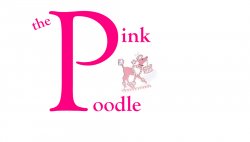
Quick Logo....
- Thread starter mocman
- Start date
- Sort by reaction score
You are using an out of date browser. It may not display this or other websites correctly.
You should upgrade or use an alternative browser.
You should upgrade or use an alternative browser.
- Status
- Not open for further replies.
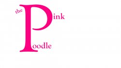
Ok, I see what you're trying to do, I don't know if I necessarily like the idea but I get it. To be better from a technical standpoint try increasing the size of the smaller letters. When that logo gets shrunk down to go on a business card, it will be very difficult to read.
Good luck and feel free to post any revisions for comment.
Good luck and feel free to post any revisions for comment.

Just messin around.
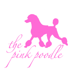
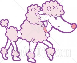
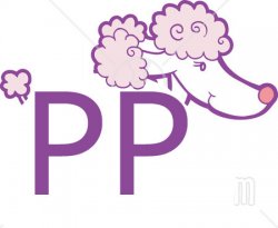
This is the first thing I saw in my head when at looked at the original. If you look closely it looks like the snout of a dog.
")
Just messin around.
that double 'p' looks very very familiar to me but I can't think what its from to me.
no offense, but these logos of yours arent getting any better.
maybe you could stick to grooming dogs, and pay someone that knows what they're doing to make a logo for you? there have been a few great options thrown out at you that caught my attention. you could start there.
shamrock's bubble logo is quite eye catching, btw.
maybe you could stick to grooming dogs, and pay someone that knows what they're doing to make a logo for you? there have been a few great options thrown out at you that caught my attention. you could start there.
shamrock's bubble logo is quite eye catching, btw.
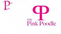
your font is too heavy....
Heavier logos, meaning more visual weight, tend to be remembered more. Thinner font lines aren't always better. Personally, I'd step away from the logotype mark approach and move towards a pictoral mark with a simple signature line.
likeavaliant no offense taken, just knew someone like yourself was just waiting to bash someone for trying something ourselves. Why do you think I posted it on here? Maybe for some direction which I appreciate........I do not claim to be a logo designer.......
Why not combine Chicoweb's logo with the idea from shamrock593 and make the 'P' into pink scissors....
I would mock it up but im in the middle of working on a website!
I would mock it up but im in the middle of working on a website!
likeavaliant no offense taken, just knew someone like yourself was just waiting to bash someone for trying something ourselves. Why do you think I posted it on here? Maybe for some direction which I appreciate........I do not claim to be a logo designer.......
You've got to understand that people on here often do this for a living and as such we offer advice for free (it's not normally). I kind of agree with him in that you haven't really improved with the designs that you've produced so far. We also see a lot of people who try to do a logo themselves and 9 times out of 10 it turns out rubbish because to put it bluntly making a logo is a lot harder than a few clip art images and some text or having photoshop, hence the reason why designers get paid to do the work.
Now have you actually taken any of the designs suggested into consideration, are you designing in black and white first (pink is not a good colour to start with when doing initial mockups - colour comes later). Have you got an overall company image that you adhere to, do you need to have the full name in the logo etc. There are so many things that need to be taken into consideration when doing a logo as this is usually the core of the corporate identity and has to say a lot about the business.
Now as a quick idea which came to me while I was typing this -
a (typical description) poodle is basically a head, 2 fluffy fur ball bits around the leg to body joints, legs and a tail. You could do a stylised poodle using the 2 'p's to represent the fluff ball bits with the legs and add in an outline + head and tail 'outlines'.
Images for reference to design below and note this is not by any means a finished idea but more to show what I'm trying to describe.
Attachments
as someone who does a lot of logos, here is my advice. (well, my real advice would be to hire someone, but you apparently don't think that a good, well designed logo is a good investment in your company, so i'll move on from that)
the name "The Pink Poodle" is a very literal word describing a dog. Everyone will get that, so i would stay away from other dog references in the logo. Focus on what your company actually does, and if you can, focus on what makes your company different. Think of things that represent grooming. Are you hi-end grooming? are you reliable and or fast? Do you use some special soap, shampoo, grooming technique? Figure out what you ACTUALLY do, and then design a logo around that idea. That doesn't mean be literal about it, it's ok to be abstract. Also, start with a pencil and a peice of paper. Get some ideas, if you can't draw, that doesn't matter. Atleast throw down ideas, phrases, quick, dirty, raw sketches. Put everything down that comes to mind. Then figure out what it all means, and design a logo.
Now, a marketing breif, company profile and some real skill would help you a WHOLE lot, but i don't know enough to know if you have any of that, so...good luck!
-je
as someone who does a lot of logos, here is my advice. (well, my real advice would be to hire someone, but you apparently don't think that a good, well designed logo is a good investment in your company, so i'll move on from that)
the name "The Pink Poodle" is a very literal word describing a dog. Everyone will get that, so i would stay away from other dog references in the logo. Focus on what your company actually does, and if you can, focus on what makes your company different. Think of things that represent grooming. Are you hi-end grooming? are you reliable and or fast? Do you use some special soap, shampoo, grooming technique? Figure out what you ACTUALLY do, and then design a logo around that idea. That doesn't mean be literal about it, it's ok to be abstract. Also, start with a pencil and a peice of paper. Get some ideas, if you can't draw, that doesn't matter. Atleast throw down ideas, phrases, quick, dirty, raw sketches. Put everything down that comes to mind. Then figure out what it all means, and design a logo.
Now, a marketing breif, company profile and some real skill would help you a WHOLE lot, but i don't know enough to know if you have any of that, so...good luck!
-je
Some of the best advice so far. My little tidbits...
Make a list of all things about your business as was already suggested. What makes you unique? What are some adjectives that best describe your work? Sophisticated, elegant, stately, quick, sleek? Think of a bunch that describe who your are and then try to figure out how to portray those visually. Make a positioning statement of what your business is all about, who your target audience is, your mission statement or purpose, etc. How can you show ALL of this visually? Figure that out in beginning.
PENCIL AND PAPER! Draw a very quick, rough sketch of every idea that runs through your brain. As my professor said yesterday, sometimes you have to give birth to all the ideas in your head, good and bad. Take the bad ones and toss them out. Just unload EVERYTHING. Once you get some good material, draw a nice detailed version with pencil and paper. Take it to a scanner after that and then produce it on the computer.
Remember, everything is made of points, lines, and planes. Some of the better logos are made of more solid planes. Think of the Apple, John Deere or old Cingular logo for examples. Again, more visual weight helps you to remember the logo better. Not always neccessary, but it's a big help in standing out.
Sometimes the more simple logos are the more powerful ones. It doesn't need to be complex. Just needs to get the message across as quickly as possible.
Those are a few quick suggestions I have. I don't have a lot of expirence in logo design, but I'm being taught by someone who has decades in the business with projects around the globe. Good luck, and keep up the effort!
This is the first thing I saw in my head when at looked at the original. If you look closely it looks like the snout of a dog.
I was thinking it looked a little more like something else... Sorry my mind is still in the gutter after that bucks night a few nights ago...
still working.......
don't use real photography in a logo. it's bad practice and not needed. I get the impression you aren't listening to anyones advice, which is frustrating since you are asking for it. Go back and read what EVERYONE has said. there is some good advice in there. But since you posted it, i'll critique it
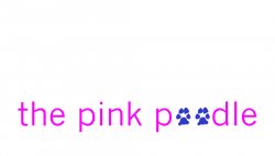
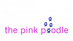
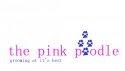
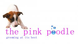
I'm ignoring the dog, because it's stupid. You need a more sophisticated font. You need a better pink colorgo richer or more pastel. Not so RGB intense/cheap looking. The bubbles are too blue... It's just not a good mix with the pink. Try a lighter blue and maybe lean more towards a light blue/green. The bubbles also need work, but this could be worked out with your font. I don't like the fact that the bubble that is replacing an "o" is a perfect circle and your "o" is clearly not a circle. It doesn't read or flow properly. Now, you're tagline also needs some work in my opinion. It really sounds like something you spent 5 minutes talking to your 4-year old about, and that's what y'all came up with. "Grooming at its best." really doesn't say anything to me, other than: "this is another generic dog grooming place that is attempting to tell me that they are better by using this boring phrase".
ok, there you go. and just for some reference. I've been a paid graphic designer/art director for 8 years. I've personally branded numerous companies from small mom-and-pop shops to multi-billion dollar companies. I'm not saying this to sound like a pretentious A*$, but just trying to qualify my suggestions. I just don't feel like you are taking this seriously. Designers go to school and work hard for a long time to be able to do what we do. It's not easy, and it's not always fun, but we work hard at it because bad design can be detrimental to a company. Especially a competitive field like dog grooming. people need a reason to come to you, and an ugly logo with a cute dog in it is not a reason.
-je
Thanks Jason for the advice. Right now I am not worried to much with color as I am with the actual logo itself. I really want to nail it first then worry about colors. The slogan I put under the pink poodle will not stay but that is just something to check the layout as "grooming parlor" might be there.
As far as not listening I am but maybe not understanding all the way. I posted it on here as everyone else just seeing what will work.
As far as not listening I am but maybe not understanding all the way. I posted it on here as everyone else just seeing what will work.
- Status
- Not open for further replies.
Register on MacRumors! This sidebar will go away, and you'll see fewer ads.