Become a MacRumors Supporter for $50/year with no ads, ability to filter front page stories, and private forums.

How do you feel about the bezels?

  • Not bothered by them

    Votes: 83 70.9%
  • Kind of bothered by them; I’m still keeping it

    Votes: 14 12.0%
  • Kind of bothered by them; considering a different/earlier model

    Votes: 3 2.6%
  • Very bothered by them; leaning towards keeping my old Watch, or upgrading to a different model

    Votes: 16 13.7%
  • Other

    Votes: 1 0.9%

  • Total voters
    117

mrat93

macrumors 68020
Original poster
Dec 30, 2006
2,333
3,348
I received mine (46mm) today — upgrading from S7 (45mm).

Gotta say: I’m not a fan. It feels like I’m downgrading from a Pro to a Plus model. I can’t say I was looking forward to the larger screen in general, but I don’t really see the benefit. I feel like this is encroaching on “too big”, for me at least.

At this point, I’m glad my S7 Titanium still has AC+. I might hang onto it and get it replaced once the battery dips below 80%. But I would also consider the S9 SS model.

Edit: Another complaint — an mrat93 original: The light reflection off of the crown is very different from my S7. No matter what angle I look at it from, or light coming from any direction, the reflection off of the crown looks like an asymmetrical scratch.
 
Last edited:

iToph

macrumors 6502
Oct 23, 2014
476
535
Just got my s10. It is an absolute shame to deliver a watch with these thick bezels. s9 had way slimmer bezels. What on earth is apple thinking with these updates? One step forward and two backwards?? for 899€ i have only one question: WHY.
 
  • Love
  • Like
Reactions: adam1080 and mrat93

the future

macrumors 68040
Jul 17, 2002
3,636
5,927
Total bezel is unchanged. Glass bezel bigger, metal bezel smaller.

IMG_3763.jpeg
 

profets

macrumors 603
Mar 18, 2009
5,162
6,313
I feel like this bezel issue is a bit overblown after using my Series 10 for a few hours today. If anything I feel like we're getting too much display and wouldn't mind seeing more of the case. (Maybe in a way I am complaining about the bezel, but more than the casing has been reduced and more glass is present). With the thinness and reduced case, I feel like when I glance at my wrist I just see a display sitting there (if that makes sense).
 

dmccombs

macrumors 6502a
May 13, 2013
713
1,747
Total bezel is unchanged. Glass bezel bigger, metal bezel smaller.

View attachment 2423486
I agree with your post, but I think the thing folks are complaining about is the total amount of black area surrounding the surrounding the screen image.

I personally dislike a big black area around the screen image when it is surrounded by a light watch bezel. To me it distracts from the screen image and the nice metal hardware bezel. For this reason, I kept my S9 SS. The S7-S9 SS models appeals to me more with the smaller black area around the screen. I can still see the metal SS bezel. LOL In short, in your picture, I prefer the S9 image to the S10.

I did "upgrade" to the S10 Jet Black, from my previous black alum watch. The big black area bugs me less since there is no disappearing light colored bezel. The s10 black watch goes from screen image to a black border, a simple to color setup. I do prefer the smaller black bezel area on black s9 watches, to the larger Jet Black S10 bezel area, but it's tolerable, IMO.

In short, I think the big S10 bezel looks tolerable on a black watch, but annoying on any lighter colored watch.
 

the future

macrumors 68040
Jul 17, 2002
3,636
5,927
I agree with your post, but I think the thing folks are complaining about is the total amount of black area surrounding the surrounding the screen image. I personally dislike a big black area around the screen image when it is surrounded by a light watch bezel.
Ok… I really don’t like the thicker glass bezel. I think the left half looks better than the right.

It is a different look for sure! I can totally see preferences being split on this.
 

profets

macrumors 603
Mar 18, 2009
5,162
6,313
Not an ideal comparison (9 v 10 would be more interesting), but for myself, something odd about the way the Series 10 sits and looks. Tried to get pics at as similar angle as possible.

And of course, its very subjective and personal preference.


u.jpeg s.jpeg
 

Simmias

macrumors regular
May 22, 2010
165
492
Just received my S10 Natural Titanium 46mm. Beautiful watch. Love the bigger screen. Don’t even notice the bezels. In every Apple launch, people pick something meaningless to harp on and complain about. “Omg the bezels! Did you see that one marketing photo?” “Omg the heat issue! People online say it gets warm.”

They even mentioned in the keynote that the glass curves down onto the sides - this does not equal bigger bezels. Enjoy your thinner, lighter, bigger screen watch and don’t listen to the predictable online “whatever gate”.
 
Last edited:

dmccombs

macrumors 6502a
May 13, 2013
713
1,747
Just received my S10 Natural Titanium 46mm. Beautiful watch. Love the bigger screen. Don’t even notice the bezels. In every Apple launch, people pick something meaningless to harp on and complain about. “Omg the bezels! Did you see that one marketing photo?” “Omg the heat issue! People online say it gets warm.”

They even mentioned in the keynote that the glass curves down onto the sides - this does not equal bigger bezels. Enjoy your thinner, lighter, bigger screen watch and don’t listen to the predictable online “whatever gate”.
If you are ok with the new bezels, that's great, but to crap on other folks opinion that the bezels look too big/fat now is extremely arrogant.

Regardless of weather the bezels are actually wider, or round the corners, or Apple said... The bezels do LOOK bigger, than on the recent AW models. Some people will like the change, other won't care, and others won't like. It's pretty messed up to tell people its "predictable online whatever gate", and to just enjoy other aspects orf the watch. The black area size change is real and its ok for people to like/dislike as they see fit.

BTW, I have a S9 and S10 to compare, so I'm not reading someone else's thoughts on the bezel change. I am looking at it for myself.
 

Simmias

macrumors regular
May 22, 2010
165
492
If you are ok with the new bezels, that's great, but to crap on other folks opinion that the bezels look too big/fat now is extremely arrogant.

Regardless of weather the bezels are actually wider, or round the corners, or Apple said... The bezels do LOOK bigger, than on the recent AW models. Some people will like the change, other won't care, and others won't like. It's pretty messed up to tell people its "predictable online whatever gate", and to just enjoy other aspects orf the watch. The black area size change is real and its ok for people to like/dislike as they see fit.
It’s not their opinion. It something they they read online and then repeated as if was their own opinion. That’s how social media works - an echo chamber of “the thing we all hate today”. But just wait a few weeks and it will be something else, like tinted icons.
 

deeddawg

macrumors G5
Jun 14, 2010
12,466
6,563
US
And of course, its very subjective and personal preference.

Yes, very much so. Looking at your pictures I find the silver screen edge casing of the Ultra to be distractive as compared to the (IMHO) cleaner flow of the S10 - but I also never much liked the looks of the Ultra though I know many love the design.
 

deeddawg

macrumors G5
Jun 14, 2010
12,466
6,563
US
It’s not their opinion. It something they they read online and then repeated as if was their own opinion. That’s how social media works - an echo chamber of “the thing we all hate today”. But just wait a few weeks and it will be something else, like tinted icons.

Battery drain. Always battery drain. :D
 

dmccombs

macrumors 6502a
May 13, 2013
713
1,747
It’s not their opinion. It something they they read online and then repeated as if was their own opinion.
Seriously? The people that posted their opinions are just repeating reviews comments? I just told you that I have both watches. Does my opinion count, or only yours (that the bezels shouldn't bug anyone)?

For years, I, and others, have asked for smaller bezels, and for a couple generations of AW, Apple did make smaller bezels. The desire for smaller bezels did not originate with S10 Reviewers.

Again, if you are ok with the new bezels that's great. To post here that everyone else has been brainwashed by reviewers and basically say that everyone should just like their watch, and like their bezels is beyond arrogant, now that you've doubled down here.

I won't comment any further. I will be deploying the big "I" button...
 
Last edited:

Spankey

macrumors 6502a
Sep 30, 2007
869
341
NJ
Favorite Apple Watch by far! There was a bevel issue? I dunno, I got mine and didn't notice bevels at all. I guess if you blow something up on paper, you can blow it out of proportion in real life.
 

jz0309

Contributor
Sep 25, 2018
11,318
29,881
SoCal
I received mine (46mm) today — upgrading from S7 (45mm).

Gotta say: I’m not a fan. It feels like I’m downgrading from a Pro to a Plus model. I can’t say I was looking forward to the larger screen in general, but I don’t really see the benefit. I feel like this is encroaching on “too big”, for me at least.

At this point, I’m glad my S7 Titanium still has AC+. I might hang onto it and get it replaced once the battery dips below 80%. But I would also consider the S9 SS model.
how about side by side photos?
 

mrat93

macrumors 68020
Original poster
Dec 30, 2006
2,333
3,348
It’s not their opinion. It something they they read online and then repeated as if was their own opinion. That’s how social media works - an echo chamber of “the thing we all hate today”. But just wait a few weeks and it will be something else, like tinted icons.
Yes — I didn’t actually upgrade from S5 to S7 because I wanted the slimmer bezels and better design. I did it because somebody else told me the bezels were thinner.

:rolleyes:
 

mrat93

macrumors 68020
Original poster
Dec 30, 2006
2,333
3,348
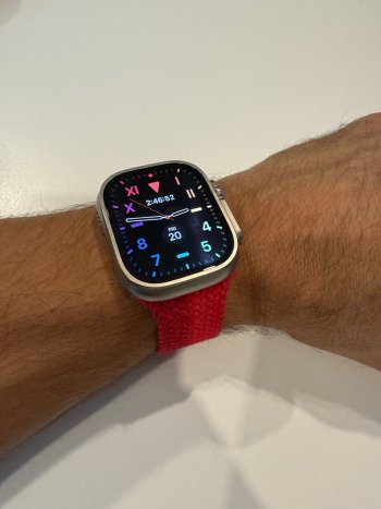
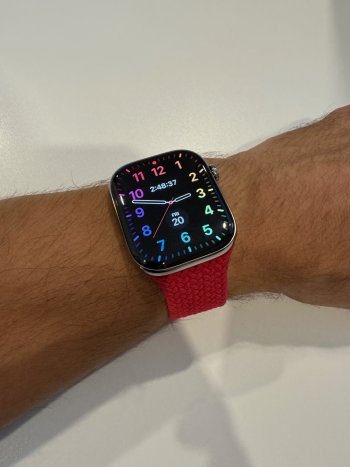
Can someone please post a side by side comparison of the S10 against a S7/8/9 with a white watch face so we can actually visually see the difference?
Without ideal lighting, it’s kind of difficult to fully judge the bezels, especially with a black casing.

IMG_3320.jpeg


(S7 space black titanium 45mm on the left, S10 slate titanium 46mm on the right)
 
Last edited:

mjpearce023

macrumors 6502a
Jul 10, 2012
785
566
Seriously? The people that posted their opinions are just repeating reviews comments? I just told you that I have both watches. Does my opinion count, or only yours (that the bezels shouldn't bug anyone)?

For years, I, and others, have asked for smaller bezels, and for a couple generations of AW, Apple did make smaller bezels. The desire for smaller bezels did not originate with S10 Reviewers.

Again, if you are ok with the new bezels that's great. To post here that everyone else has been brainwashed by reviewers and basically say that everyone should just like their watch, and like their bezels is beyond arrogant, now that you've doubled down here.

I won't comment any further. I will be deploying the big "I" button...
Totally agree with this. The main point of the Apple Watch 7 launch was look how thin the bezels are! We pushed the screen out almost to the casing. We even made a new watch face to show off the curved almost bezel-less screen. iPhone 15pro - we made the bezels smaller! iPhone 16 pro - we made the bezels smaller!!! Apple Watch 10 they went backwards, why? I’m guessing the screen would have been close to the edge if micro led had panned out but when they had to switch back to oled this was the best they could get in the thinner casing. The series 10 looks like a design compromise.
Hopefully the slate titanium is dark enough to hide the increased bezels but if not I’ll definitely be returning mine. I’m not paying this much for a step backwards in looks.
 

the future

macrumors 68040
Jul 17, 2002
3,636
5,927
I’m guessing the screen would have been close to the edge if micro led had panned out but when they had to switch back to oled this was the best they could get in the thinner casing.

Nope. The microLED rumour was always about Ultra getting it first. So it was definitely not planned for the S10.

The change of the glass/metal bezel ratio with the S10 was a deliberate design decision, maybe forced by the new thinness. Doesn‘t mean you have to like it, though.
 

dmccombs

macrumors 6502a
May 13, 2013
713
1,747
Totally agree with this. The main point of the Apple Watch 7 launch was look how thin the bezels are! We pushed the screen out almost to the casing. We even made a new watch face to show off the curved almost bezel-less screen. iPhone 15pro - we made the bezels smaller! iPhone 16 pro - we made the bezels smaller!!! Apple Watch 10 they went backwards, why? I’m guessing the screen would have been close to the edge if micro led had panned out but when they had to switch back to oled this was the best they could get in the thinner casing. The series 10 looks like a design compromise.
Hopefully the slate titanium is dark enough to hide the increased bezels but if not I’ll definitely be returning mine. I’m not paying this much for a step backwards in looks.
I did see the Slate Ti in the store and I think the Slate is dark enough that the digital bezel and Ti bezel blend pretty close. I think the Slate Ti looks ok with the newer/wider digital bezel.

I snapped a quick picture, but it's not very good. I hope it's useful anyway.
IMG_0928.jpeg
 
Register on MacRumors! This sidebar will go away, and you'll see fewer ads.