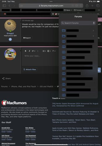
Is anyone else seeing a behaviour where (in portrait mode) if they have the favourites bar showing, and folders in that bar, when they tap one to open the popup menu, if there’s only say four items in it, the menu sizes down to near the bottom of the display, whereas if the menu has lots of items, it sizes to about 2/3 the vertical height, with overflow as touch-scrollable.
In landscape orientation, all menus size to approximate the bottom edge.
In landscape orientation, all menus size to approximate the bottom edge.


