Become a MacRumors Supporter for $50/year with no ads, ability to filter front page stories, and private forums.

spinedoc77

macrumors G4
Jun 11, 2009
11,488
5,413
Lol

Also the Apple watch screen is much smaller than the moto360 and that was most likely done intentionally for aesthetics.
Aesthetically, a huge (45mm) case with thin bezel makes for a very very large looking watch.
Even the largest popular watches that are 45-47mm (like many from Breitlings and DSSD from Rolex) in diameter usually sport thick bezels because thin bezel+large dial make for a foolish look, like a 50mm Nixon watch or a 60mm Diesel watch.

While those 50mm+ watches may look fashionable to some small number of people, it would not be a good look for most people, which is why the Moro 360, which resembles a Nixon watch with its humongous dial, has not sold well compared to the AW.

http://4.bp.blogspot.com/-naQqYxAYR...HuQPG6zvz28/s1600/20140908_161626_Android.jpg

this looks like a 40mm Rolex Submariner, which is perhaps the most popular luxury sport watch for men.
as you can see, the Moto 360 dwarfs it.

Compare that with the Apple watch (38mm) sitting next to probably a 36-37mm Patek Philippe
https://fortunedotcom.files.wordpress.com/2014/09/432141881006.jpeg?quality=80&w=750

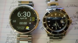
I find it ironic that while the apple watch is smaller and more "fashionable", it's also ugly as hell and reminiscent of a 1980s casio calculator watch. I'm sitting here at home looking at my moto 360 next to my submariner and while the 360 is definitely larger, I'd say it looks quite acceptable, but that's with the metal band which is wider than the leather band. I think a couple more mm on the band's width and lugs that taper and we'd be all set. But it certainly looks more acceptable than the pic of the AW next to the PP, the AW looks absurdly larger and the weird shape and thickness stand out like a sore thumb.

The apple watch sticks out like a sore thumb also because of its thickness and just the rounded way the edges are, it reminds me of a zippo lighter. I'm also not a fan of those huge bezels. On the android watches those silly looking fake diver rings/bezels also look horrible, especially because they serve no functional purpose. If anything on that level I can agree with you that maybe instead of using those stupid fake bezels watches like the urbane should just have been made smaller with no bezels.

BTW that rolex in your pic looks weirdly smaller than the 360. Here's a pic of mine and it doesn't look as small. Maybe the perspective, I'm not sure.
 

Attachments

  • 20150426_183046.jpg
    20150426_183046.jpg
    3.8 MB · Views: 204
Last edited:

SHNXX

macrumors 68000
Oct 2, 2013
1,901
663
I find it ironic that while the apple watch is smaller and more "fashionable", it's also ugly as hell and reminiscent of a 1980s casio calculator watch. I'm sitting here at home looking at my moto 360 next to my submariner and while the 360 is definitely larger, I'd say it looks quite acceptable, but that's with the metal band which is wider than the leather band. I think a couple more mm on the band's width and lugs that taper and we'd be all set. But it certainly looks more acceptable than the pic of the AW next to the PP, the AW looks absurdly larger and the weird shape and thickness stand out like a sore thumb.

The apple watch sticks out like a sore thumb also because of its thickness and just the rounded way the edges are, it reminds me of a zippo lighter. I'm also not a fan of those huge bezels. On the android watches those silly looking fake diver rings/bezels also look horrible, especially because they serve no functional purpose. If anything on that level I can agree with you that maybe instead of using those stupid fake bezels watches like the urbane should just have been made smaller with no bezels.

BTW that rolex in your pic looks weirdly smaller than the 360. Here's a pic of mine and it doesn't look as small. Maybe the perspective, I'm not sure.


Taper is not possible with the current screen designs I guess (curved screens maybe?)

I do agree that fake bezels are dumb.

As far as aesthetics of 360 vs apple watch, I think the world has agreed with me that the apple watch is better somehow, although perhaps it's due to the user interface, OS etc.
Thickness is about the same between 360 and Aw, and at 12.5 mm, it's almost exactly same thickness as your Rolex.
Only thinner watches in mechanical world would be dress watches, but only by a little bit (my Patek Calatrava is around 8.5mm if I remember correctly)

360 for me as a design is a complete failure because a) that stupid dead tire b) huge proportions c) thin bezel and no taper make for a look similar to the Nest thermostat, which is a good look for thermostat, not for a watch.
 

spinedoc77

macrumors G4
Jun 11, 2009
11,488
5,413
Taper is not possible with the current screen designs I guess (curved screens maybe?)

I do agree that fake bezels are dumb.

As far as aesthetics of 360 vs apple watch, I think the world has agreed with me that the apple watch is better somehow, although perhaps it's due to the user interface, OS etc.
Thickness is about the same between 360 and Aw, and at 12.5 mm, it's almost exactly same thickness as your Rolex.
Only thinner watches in mechanical world would be dress watches, but only by a little bit (my Patek Calatrava is around 8.5mm if I remember correctly)

360 for me as a design is a complete failure because a) that stupid dead tire b) huge proportions c) thin bezel and no taper make for a look similar to the Nest thermostat, which is a good look for thermostat, not for a watch.

I don't think the world has agreed that the AW is better than something like the 360. I do think that Apple as a company is genius in how they market. They marketed the living crap out of the AW as a fashion item and pushed it hard that way with fashion groups, magazines, icons, and also the watch world itself. But this doesn't necessarily speak for its functionality. But functionality is a weird thing, just like iOS versus Android. Apple has proven to be kings of fashion and solid hardware first, functionality second and marketing that combination of high quality and simplicity to the unwashed masses.

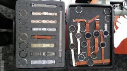
360 I never ever notice the dead tire, I get confused when people complain about it. It's this tiny little spot on the complete bottom of the phone. To complain about that but not care about the humungous bezels on the AW seems odd to me. I do agree that with no taper it is kind of odd, but the AW also has no taper. If the 360 2 rumors/leaks are true then it will have tapered lugs AND no flat tire, as beautiful as the 360 is now the 2nd iteration will be that much nicer. I'm not sure which rumor to believe though, the pic below has lugs but also the flat tire is still there. Where other leaks have shown no lugs but also no flat tire. I guess we'll find out in a couple of months.
 

Attachments

  • Moto-360.jpg
    Moto-360.jpg
    110.9 KB · Views: 107

tbayrgs

macrumors 604
Jul 5, 2009
7,467
5,097
Ironically, more information can be displayed on a circular watch like the 360, than on the square Apple Watch. Additionally, square information screens of equal size to what the Apple Watch displays are utilized on round watches, like the 360.
A square fits in a circle and can display a lot of info. A circle inside a square (like with the watch faces on an Apple Watch) are smaller and more cramped, than on a watch like the 360. Gives the illusion that the apple watch is even smaller than it already is.

Square screen data like you would see on an Apple Watch, can easily be utilized on a moto 360, but look at all the unused space!
Image

But your comparison is not applicable because the Moto 360 and Apple Watch displays are not the same width. A circle with the same diameter as a square watch will fit inside the square watch and have 22% less surface area--it's simple math. So all things being equal, a circular display is capable of displaying significantly less information, no matter how you slice it.

Again, please don't interpret this as my advocating square over circle for aesthetics or that I'm claiming this makes the Apple Watch better than it's circular counterparts but from a functionality standpoint, a square/rectangle makes more sense. It is a bit ironic that Apple, a company that often puts form over function, has gone the other way with their watch.
 

Lloydbm41

Suspended
Oct 17, 2013
4,019
1,456
Central California
But your comparison is not applicable because the Moto 360 and Apple Watch displays are not the same width. A circle with the same diameter as a square watch will fit inside the square watch and have 22% less surface area--it's simple math. So all things being equal, a circular display is capable of displaying significantly less information, no matter how you slice it.

Again, please don't interpret this as my advocating square over circle for aesthetics or that I'm claiming this makes the Apple Watch better than it's circular counterparts but from a functionality standpoint, a square/rectangle makes more sense. It is a bit ironic that Apple, a company that often puts form over function, has gone the other way with their watch.

Sorry. My post was in referenece to the Apple Watch and I keep saying 'square' when I should be saying rectangular. The width and height of the watch are not the same, ergo not square. So IRT the Apple Watch, given the same height vs diameter between a rectangular watch and a circular watch, the circle gives more surface area.
In the case of the Moto360 (specifically) vs the Apple Watch, the 360 is 4mm taller than the Apple Watch. In fact, the entire Apple screen would probably fit inside the Moto 360. :D
 
Register on MacRumors! This sidebar will go away, and you'll see fewer ads.