First impression of OneUI 3.0.
Well, obviously… lets start with the lockscreen… can tell immediately it’s different, however subtle it is. I like it… any visual changes is welcome, imo. But I like it… I like the font choice of clock, like the position of it. I know there’s ways to change the clock under Good Lock, but haven’t played with it yet.
And one thing I noticed, I’m not sure if it was a bug for me on OneUI 2.5. But notification strip did not show up when the phone was in idle. I didn’t get a peep of notifications. However, I keep my AOD display limited… for battery sake. But now when the device. is idle, I get notifications. If this is a new feature for OneUI 3.0, I like it.
Even though, this is minor… I like the location of the PIN code on the Lockscreen. I didn’t like it being centered, it’s much better entering my code now. Even though it’s not something I umm… had to have. It’s really nice seeing that change… I like it. I’ve been prolonging the Notification Center debacle…. Now it’s time to face it.
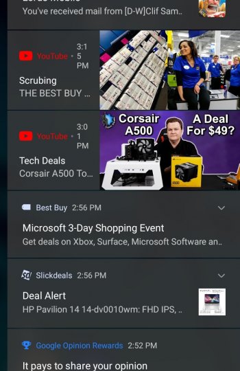
Well, first and foremost… I like it. I know it’s hot topic in the Fold circles… why did Samsung change the width? we have these left and right spaces uncovered? Why can this not be changed? But maybe… I’ve adjusted to it.. because the Notification Center is similar to that way on the iPad. The width is narrow. I’m not certain why Samsung changed it… however, I do think it looks better.
I think it looks much more modern and I think the changes are made due to Android 11. Google put so much thought behind the Notification Center… it’s one of the main features of Android 11, how everything is grouped together. I’m certainly Samsung could have implemented notifications filling up the entire display, but I think how Android 11 has set up the Notifications Center… it’s better it being centered and narrow.
With OneUI 3.0… it’s not a major upgrade, just minor visual changes.. mostly surrounding the LockScreen and Notification Center. I like how all my Good Lock modules been updated for OneUI 3.0, didn’t have to wait. However, one of my major gripes with OneUI 3.0. I can no longer swipe down on the left or right corners of an app to minimize the screen.
And oh yeah, the new multi-tasking system… this actually helps me. Since it opens up my Edge Panel, I tend to use it for multitasking. I like it.


 welcome to 3.0


 I'm looking forward