Become a MacRumors Supporter for $50/year with no ads, ability to filter front page stories, and private forums.

Should Apple bring its Apple Watch font to iOS 9?

  • Yes.

    Votes: 66 71.7%
  • No.

    Votes: 26 28.3%

  • Total voters
    92

Joseph C

macrumors 65816
Original poster
Feb 5, 2009
1,452
2,751
What are people's views on the Apple Watch font becoming the system font on iOS 9?
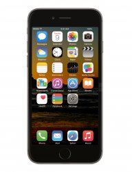
sanfranios9.jpg

See mockup and vote in the poll.

Personally I love the San Fran font Apple have created, it has character and style and would freshen up iOS 9's UI especially as it's going to be (if rumours are correct) a mainly under-the-hood release.
 

Jessica Lares

macrumors G3
Oct 31, 2009
9,612
1,057
Near Dallas, Texas, USA
It looks fine on a screen like that where all the text is spaced out, and is dominated by graphics, and it makes sense on a smartwatch where you're trying to fit in as much readable text as possible.

But it's otherwise too narrow as a system-wide font on a phone. I have it installed via AnyFont, and have compared it to Avenir Next in Drafts.
 

gsmornot

macrumors 68040
Sep 29, 2014
3,672
3,853
I'm really bummed to say this but...
...as my eyes age a slightly larger, clearer font is a good thing. It seems to me I could read the SF font a little better maybe than our current font. I don't have any issues with the current font but if the purpose was to make it easier to read than I have to vote yes.
 

Joseph C

macrumors 65816
Original poster
Feb 5, 2009
1,452
2,751
It looks fine on a screen like that where all the text is spaced out, and is dominated by graphics, and it makes sense on a smartwatch where you're trying to fit in as much readable text as possible.

But it's otherwise too narrow as a system-wide font on a phone. I have it installed via AnyFont, and have compared it to Avenir Next in Drafts.

I'm sure Apple would optimise it for legibility. They already have San Francisco Text and San Francisco Display, both of which look slightly different.
 

J.gerbes

macrumors 6502
Jun 11, 2012
268
11
It's a beautiful typeface, and is far better optimised for displays than Helvetica Neue. I love Helvetica, but San Fransisco looks so much more crisp.
 

0000757

macrumors 68040
Dec 16, 2011
3,893
850
It would need tweaking, but it doesn't look horrible. The spacing looks bad but otherwise, I like the overall font shape.
 
  • Like
Reactions: XTheLancerX

LordQ

Suspended
Sep 22, 2012
3,582
5,653
As a custom choice, sure, why not. Looks a bit Android-ish but that's just me.
 

cambookpro

macrumors 604
Feb 3, 2010
7,228
3,365
United Kingdom
It looks fine on a screen like that where all the text is spaced out, and is dominated by graphics, and it makes sense on a smartwatch where you're trying to fit in as much readable text as possible.

But it's otherwise too narrow as a system-wide font on a phone. I have it installed via AnyFont, and have compared it to Avenir Next in Drafts.

I highly suggest you install iFont, and compare it with any other font you like under Compare view ;)
</shamelessplug>

I think it looks quite nice, but hope if it is chosen, they go with the lighter weights. Some of the heavier ones look quite old fashioned on the phone.
 

viperGTS

macrumors 68000
Nov 15, 2010
1,560
941
I was originally against it, but if they tweak it to look better on iOS then I'll probably be okay with it. I just wish we could have a choice...
 

AZhappyjack

Suspended
Jul 3, 2011
10,183
23,657
Happy Jack, AZ
People complained when Apple moved to Helvetica Neue because the font was to "light". They said it was too hard to see, and did not contrast enough with the white background of iOS 7 and iOS 8. We've gotten used to it, and now that Apple is rumored to be changing it again, the complaints (concerns) get voiced.

Personally, I had no problem with the new look of iOS 7 or 8. If Apple, indeed, changes the font, I am sure they will do a good job of making it look good.
 

myrtlebee

macrumors 68030
Jul 9, 2011
2,677
2,242
Maryland
"No" was my vote, for the same reason someone else mentioned - Helvetica has an elegance that San Francisco lacks. SF looks more "techie". That said, change can be fun, so let's see it in action.
 

Rogifan

macrumors Penryn
Nov 14, 2011
24,734
32,198
Mark Gurman was on John Gruber's most recent podcast and they both were very confident San Francisco would be coming to iOS and OS X, but not the exact font that's used on the Watch; it would be optimized for those OSes.
 

Rogifan

macrumors Penryn
Nov 14, 2011
24,734
32,198
"No" was my vote, for the same reason someone else mentioned - Helvetica has an elegance that San Francisco lacks. SF looks more "techie". That said, change can be fun, so let's see it in action.
Couldn't it be argued that Helvetica is a better print font than system font? I'll wait until I see it to pass judgement.
 

XTheLancerX

macrumors 68000
Aug 20, 2014
1,911
782
NY, USA
It looks pretty good. It definitely looks like it needs to be moderately adjusted for iOS though. The spacing is all wrong and some of the little changes made to the characters for readability on a small screen (Apple Watch) need to be adjusted for large screens again. Then, I think this font would really look good. Just need dark mode and more drop shadows after that and the UI would be perfect!
 

Rogifan

macrumors Penryn
Nov 14, 2011
24,734
32,198
It looks pretty good. It definitely looks like it needs to be moderately adjusted for iOS though. The spacing is all wrong and some of the little changes made to the characters for readability on a small screen (Apple Watch) need to be adjusted for large screens again. Then, I think this font would really look good. Just need dark mode and more drop shadows after that and the UI would be perfect!
And then everyone would say Apple copied material design.
 

XTheLancerX

macrumors 68000
Aug 20, 2014
1,911
782
NY, USA
And then everyone would say Apple copied material design.
So what? Companies need to copy some things to improve competition. And I wouldn't worry about those dumb people who say "X Company copied this", especially on the matter of drop shadows. That's a really dumb thing to get mad about when it comes to the whole "copying" debacle.
 
  • Like
Reactions: _Refurbished_

Rogifan

macrumors Penryn
Nov 14, 2011
24,734
32,198
So what? Companies need to copy some things to improve competition. And I wouldn't worry about those dumb people who say "X Company copied this", especially on the matter of drop shadows. That's a really dumb thing to get mad about when it comes to the whole "copying" debacle.
Well I certainly agree it would be dumb as Matias Duarte didn't invent drop shadows. But that's what everyone would say. Honestly I don't get all the fuss over material design. I actually think the name and a lot of the marketing materials around it are just pretentious.
 
Register on MacRumors! This sidebar will go away, and you'll see fewer ads.