You should have known better than to post
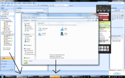
a modified screenshot showing all items in the taskbar with the highlight
instead of just the one the mouse is over[...]
That wouldn't have demonstrated how the glow color changes.
For that you need more than one glowing example.
Just to be clear so everyone gets this: the image contains a
selection of different taskbar buttons from different taskbars.
It isn't supposed to be a screenshot of a single taskbar at a
single point in time.
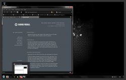
And this is what my actual screen looks like (half resolution &
roughly done gray frame added):

[...] and its even in "classic" mode which adds insult to injury.
I'm not sure what you mean by "classic" mode. Perhaps you are
referring to the "never combine" setting? I used that to show up
the glow more.
I don't think it's necessarily adding insult to injury. It's not what I
generally use, which is small icons/combined. But this is all to do
with personal preference. I wouldn't say the "classic mode" looks
especially horrible.
Note: this isn't entirely about aesthetics. The glow provides visual
cues that help the user to select the correct window.
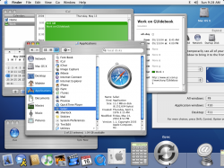
Having screenshot with the dock as small as possible with the magnification
as high as possible with some ugly icons in it would have been a nice way to balance it out.

this is what a real task-bar looks like. The FUD the OP is posting is astonishing.
FUD = Fear Uncertainty Doubt.
I was speaking in positive terms. How does FUD apply?


