Become a MacRumors Supporter for $50/year with no ads, ability to filter front page stories, and private forums.
Status
The first post of this thread is a WikiPost and can be edited by anyone with the appropiate permissions. Your edits will be public.

Squillace

macrumors 6502
Feb 22, 2016
400
494
Switzerland
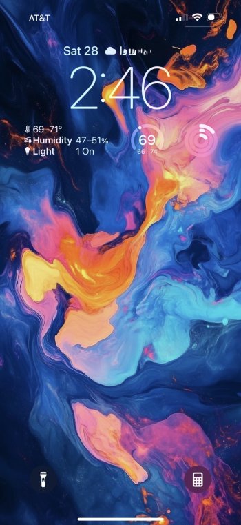
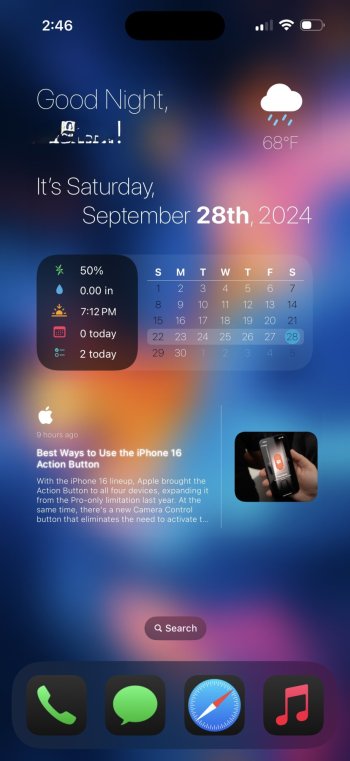
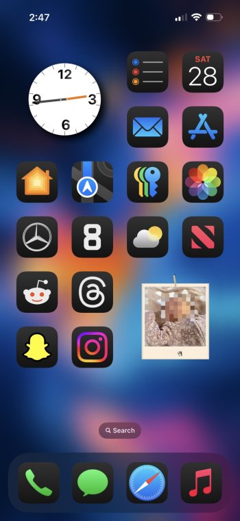
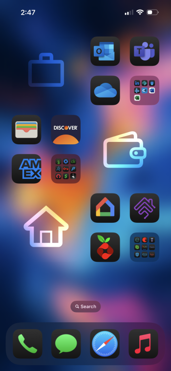
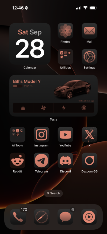
For now my icon layout is pretty simple, but I want to experiment a bit and try to build a layout with less icons.

I'm in love with the dark mode icons and this wallpaper combo. Suits perfectly with my new Natural Titanium 16 Pro Max. Beautiful screen!

IMG_0055.png
 

mizmor

macrumors newbie
Jun 12, 2024
20
16
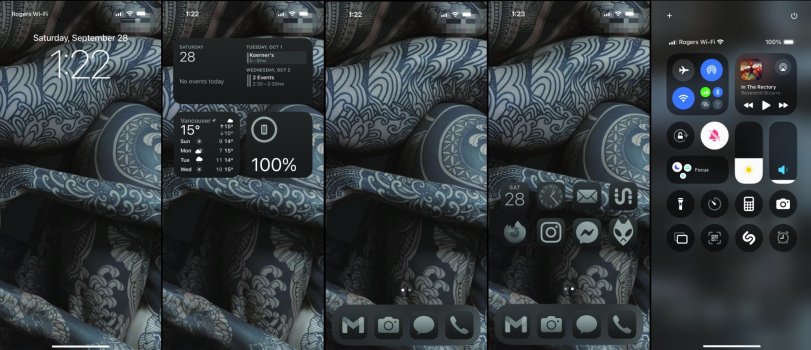
First iPhone in a decade. Keeping things fairly minimal and monochromatic. Really wish I could have small icons without labels and actually place the icons lower on the page, but I do understand we're dealing with a small, indie company so maybe in another 10 years they might figure out how to actually implement options?
 

Attachments

  • ios.jpg
    ios.jpg
    293.1 KB · Views: 105
  • Like
Reactions: bilibug

Ralfi

macrumors 601
Dec 22, 2016
4,374
3,101
Australia
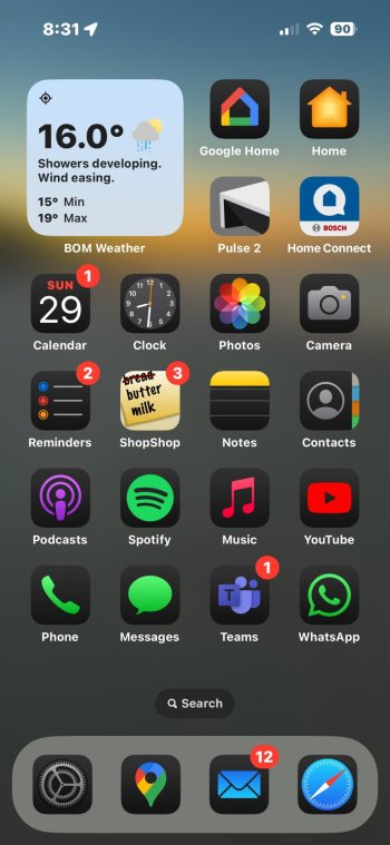
Dabbled with larger icons, but that hits a snag when you have groups of Apps in a folder where you can no longer see your custom name for that folder, so have settled on this for now…
IMG_3118.jpeg
 
Last edited:

Deeznuts.

macrumors 6502
Oct 26, 2015
491
361
Queens, NY
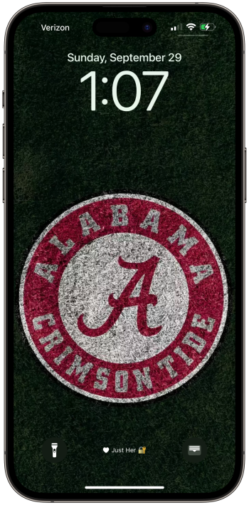
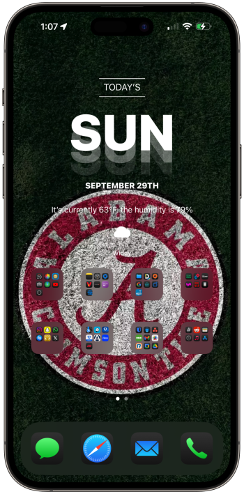
Let’s go Bama’
 

Attachments

  • Sunday, 29 Sep 2024 01:07:23.png
    Sunday, 29 Sep 2024 01:07:23.png
    2.9 MB · Views: 51
  • Sunday, 29 Sep 2024 01:07:59.png
    Sunday, 29 Sep 2024 01:07:59.png
    2.5 MB · Views: 49

Ipadonly1

macrumors member
Jun 8, 2023
46
32
I still have 34 apps waiting to go dark. Developers are slow.
That’s part of the reason why I’m not bothering with dark mode. Not all developers will implement the change. I’d wager that in 2 years time, I’d still have 3 apps with no dark icon. I’d rather keep the light mode, so at least there’s some consistency in inconsistency, rather than the inverse.
 
  • Like
Reactions: diego.caraballo

DR3MCLAREN

macrumors 6502a
Dec 13, 2021
965
1,620
Calgary Canada
That’s part of the reason why I’m not bothering with dark mode. Not all developers will implement the change. I’d wager that in 2 years time, I’d still have 3 apps with no dark icon. I’d rather keep the light mode, so at least there’s some consistency in inconsistency, rather than the inverse.
Oh yeah there will for sure be a few apps that never adapt.
 
Register on MacRumors! This sidebar will go away, and you'll see fewer ads.