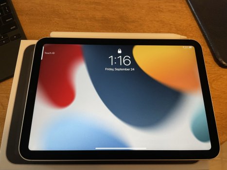
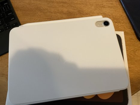
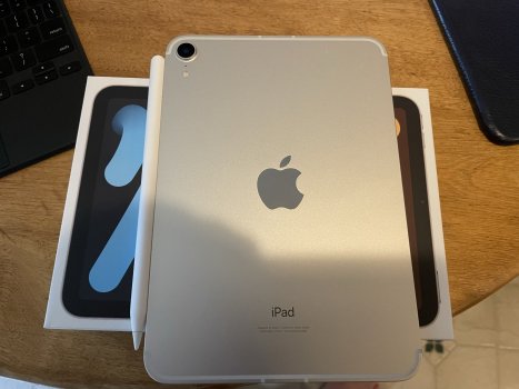
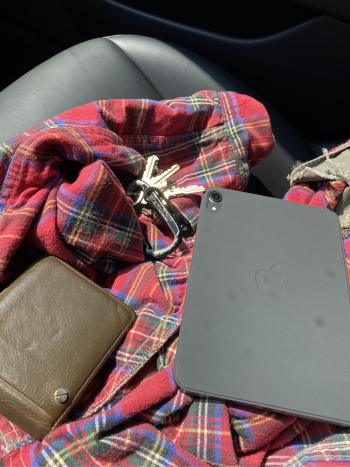
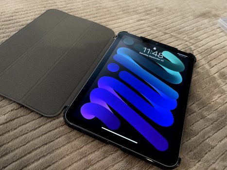
I switched from space grey to purple. Just set up my mini. Just love the purple color. Exactly what I was hoping for.Anyone hoping for purple to be well, purple don’t hold your breath. It seems just like a combination between silver and space grey. I mean, it’s truly hard to see ANY shade of purple in it.
Maybe I got a silver one instead?
Got a tip for us?
Let us know
Become a MacRumors Supporter for $50/year with no ads, ability to filter front page stories, and private forums.
iPad mini Show us your new iPad mini 6!
- Thread starter Yr Blues
- Start date
- Sort by reaction score
You are using an out of date browser. It may not display this or other websites correctly.
You should upgrade or use an alternative browser.
You should upgrade or use an alternative browser.
It is perfect and my ecosystem is complete. I got the 256 GB cellular model to complement my wifi-only iPP 12.9 (2020).

My Mini 6 will also compliment my 2021 12.9" Pro. Love how they look side to side. Thanks for the pics!It is perfect and my ecosystem is complete. I got the 256 GB cellular model to complement my wifi-only iPP 12.9 (2020).
View attachment 1845945
Same here! I was worried at first that they would be too similar to each other, but they are such different devices with different use cases.My Mini 6 will also compliment my 2021 12.9" Pro. Love how they look side to side. Thanks for the pics!
both my 12.9” (2020) and my new Mini 6 are cellular and I definitely feel like my ecosystem is complete. The Mini 6 is my new everyday carry device in my camera bag, while the bigger Pro will be with me for travel. None of them make each other redundant for my uses. I couldn't ask for more.
The iPhone 13 Mini can stay in my pocket and out of the way handling the bare essentials for phone calls, texts and a hub for my AW6.
The iPhone 13 Mini can stay in my pocket and out of the way handling the bare essentials for phone calls, texts and a hub for my AW6.
Does it have the same finish as the pro models?
The space grey colour of my Mini 6 is indistinguishable from that of my iPP 12.9.
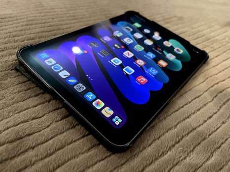
Anyone know how to get more icons on the screen? I’m not really sure why there is so much unused space on EVERY page.
Anyone know how to get more icons on the screen? I’m not really sure why there is so much unused space on EVERY page.
That’s an iPadOS 15 thing isn’t it?
I’ve seen reviews of the new software complaining about that poor use of space.
What’s in the bottom there? Is that a magnetic charging adapter
Yes it is. Good eye. ChargeASAP Infinity, I backed them on kickstarter and these work amazingly well. I’ve got the adapter on my iPad Pro, mini, and 12” MacBook.What’s in the bottom there? Is that a magnetic charging adapter
Which makes data transfers kind of exciting and risky. 😅Yes it is. Good eye. ChargeASAP Infinity, I backed them on kickstarter and these work amazingly well. I’ve got the adapter on my iPad Pro, mini, and 12” MacBook.
Anyone know how to get more icons on the screen? I’m not really sure why there is so much unused space on EVERY page.
That’s an iPadOS 15 thing isn’t it?
I’ve seen reviews of the new software complaining about that poor use of space.
I know the mini has historically had higher pixel density (326ppi) compared to all other iPads (264ppi), and it results in more screen real estate (relatively), but also means physically smaller points and touch targets.
iOS 15 really makes it odd with the new Home Screen layout to accommodate widgets. The 6x5 icon layout from iOS 13 was great, but now its very odd.
Not to mention, to me widgets look too small and tight on the mini (compared to the Air or Pros). And of course there's significant empty space along the edges.
Also odd, I notice that by default (in portrait) the icon layout is 5 x 6, but as soon as you add a widget it drops to 4 icons across (to accommodate the widget sizes).
All in all to accommodate widgets on the Home Screen in iPadOS 15 its resulted in some odd layouts and spacing. And the issue feels exasperated on the mini.
I’ve never had an issue with data transfers using these cables.Which makes data transfers kind of exciting and risky. 😅
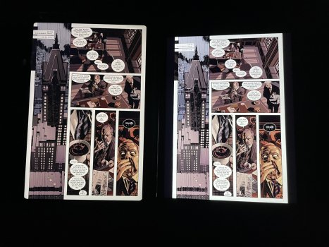
Can anyone please post a comic running on the new ipad mini?
Like from the app Comixology?
I am interested in this for apple books, and comics as well as arcade and web and twitter. thank you
Comixology hasn't been updated yet so fullscreen isn't working properly. The new aspect ratio is pretty perfect for moderns, though.
Comixology
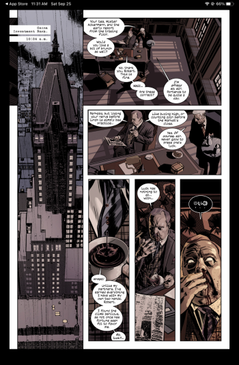
ComicGlass
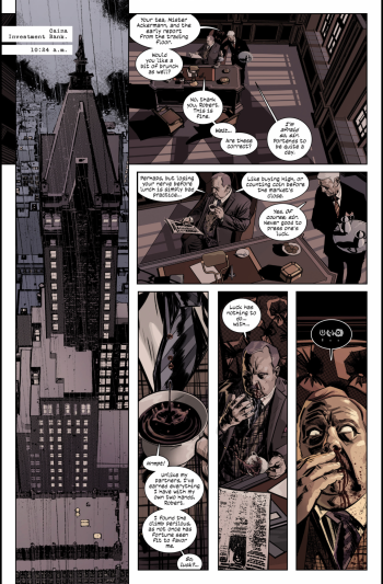
ComicGlass: iPad mini 6 vs iPad mini 4

Attachments
I had three appointments spread over about 1 1/2 hours (exchanging my wife's iPhone 11 for a new 13, picking up my iPad mini 6 and a folio case for it) and the guy I got took care of all of them at the same time. Sorry for your issue. Our Apple Store was busy so they were unable to put a screen protector on my wife's iPhone, but otherwise it was handled well.I had a 12 pm pickup today but my work scheduled a last minute call at 12. Went in at 9:30 to see if I can do early pickup but this Apple store is by schedule only. The guy I was talking to would not go and get me my iPad Mini... Now, I have to wait another week to see if I have time to get it then.
Living vicariously through all of you~
I just printed out a size mock up of the ipad mini. I wear docker style pants usually and guess what.
The ipad mini would fit in my front pockets. even with the case I believe.
Joy.
The ipad mini would fit in my front pockets. even with the case I believe.
Joy.
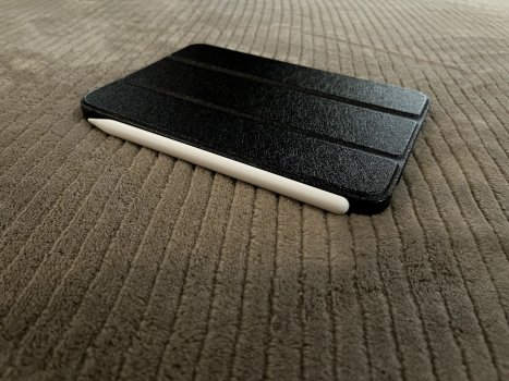
mini with a case from Amazon that arrived today.
What case is that?
Register on MacRumors! This sidebar will go away, and you'll see fewer ads.


