Got a tip for us?
Let us know
Become a MacRumors Supporter for $50/year with no ads, ability to filter front page stories, and private forums.
Snow Leopard wallpaper from WWDC
- Thread starter sn00pie
- Start date
- Sort by reaction score
You are using an out of date browser. It may not display this or other websites correctly.
You should upgrade or use an alternative browser.
You should upgrade or use an alternative browser.
I'm sure it'll be out in the wild soon since the new SL developer preview is(was?) going to be released today.
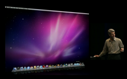
Thats not the one I'm looking for. I'm talking about the one that was on the screen during the SL demo showcasing the new features of SL.
yea thats the one.. in my opinion its much more elegant than the tacky leopard one..
Looks great! Wish it was higher res
yea thats the one.. in my opinion its much more elegant than the tacky leopard one..
Although it does look like the one they showed off, I still don't think its the right one. It looked more spacey, I'll try to find a picture of it.
Here is what the WWDC wallpaper looks like. It's the same.
Umm. Well, not it isn't. It's similar but definitely not the same..
Attachments
Umm. Well, not it isn't. It's similar but definitely not the same..
no he meant that its the same as the one linked from twitter here
Does anyone have this one from the latest server build?

Until the real one leaks out, I made this quickie in Photoshop...

The wallpaper posted from Twitter is very close to the one demoed but it certainly is not the same. Perhaps an alpha version of the wall?
The sharp line jutting down the right hand side of the Twitter post is not present in the WWDC wall. Also, the dimensions are incorrect. As most know, a standard Apple wall in 2560x1600.
Adjusting the Twitter wall to a width of 2560 only proportionally yields a height of 1441.
Therefore, the Twitter wall will not be positioned correctly on the display. The WWDC wall's nebula is more centered.
This "blown up" affect may also account for the "more spacey" look of the Twitter wall as the stars appear larger in size.
no he meant that its the same as the one linked from twitter here
Thanks for the clarification!
I definitely prefer this "Aurora" to the older one.
+1
Now only if someone would leak it onto the nets.
@mikelcroft Nice work. Now if one someone had the 1920×1200 or higher version.
+1
Now only if someone would leak it onto the tubes
@mikelcroft Nice work. Now if one someone had the 1920×1200 or higher version.
Fix'd that for ya!
In the mean time I'll take the one linked here. It's not high resolution, but hey, while I wait for the actual thing, it'll do.
Register on MacRumors! This sidebar will go away, and you'll see fewer ads.


