Become a MacRumors Supporter for $50/year with no ads, ability to filter front page stories, and private forums.

Dark Goob

macrumors regular
Original poster
Jun 6, 2007
182
32
Portland, OR
I still use iOS 6 on my iPad 3, so I can't use the new features of Notes yet. (iPad Pro.. hurry!)

I don't like Spotlight calling home, and I block it from using the network, so evidently I can't use ANY of the new features of Spotlight.

Safari's new features are not specific to Capitan.

And I don't ride the bus.

So like, the only new feature of Cap that would be useful at all to me, is the split screen feature where you can have two windows automatically arrange themselves side-by-side, through a complicated "long-press" on the green button.

Except... as I found out... split screen doesn't work unless the app supports it. However the only way to tell if the app supports it is to see if the tiny green button has a + symbol in it or not. That works fine when you pick the first app.

But then you have to click another window from amongst your other windows on the right-hand side, and of course it shows all of them to you, and at that scale you cannot tell which ones support split-screen, and which ones don't. Pick one that doesn't support split screen, and it will expand to full-size behind your currently half-screen sized app! OMG. Terrible.

Why does it even bother showing apps on the right-hand side, like Word 2011, that don't work with the feature? Why put users through such a buggy mess?

This feature is a joke compared to the elegant way it's handled in Windows. That's just sad. I can't believe that anyone at Apple actually thought this was a good idea. Whoever was in charge of this feature ought to be fired on the spot. Why is Apple employing idiots these days? Start hiring smart people!

EDIT:

OK so I have to say that when the feature works, I really think it's well implemented and smooth. In a few years when all apps support it, we'll wonder how we lived without it probably. See my video in post #50.

I think the main thing is that they need to have the system recognize which apps are not able to go to split-screen, and not show them as options for you to pick as the second app. That's probably a minor bug that will get fixed in a future release. I'll get on the developer connection and file it as a bug.

I do have to say Apple has a knack for giving developers compelling reasons to update apps, thusly keeping them employed :D
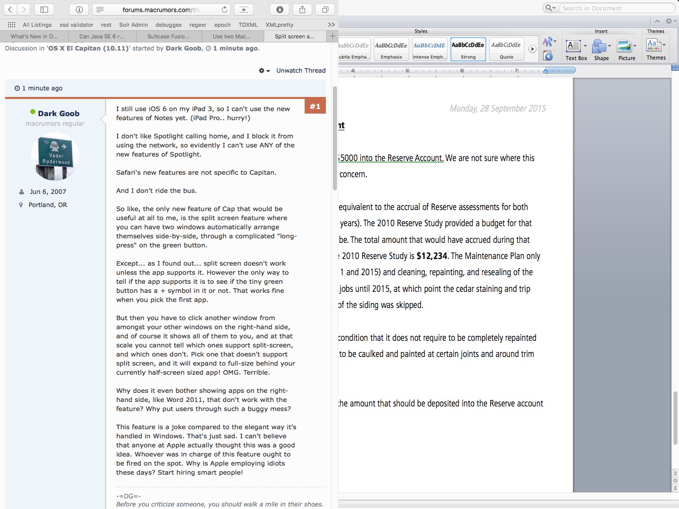
KKhaeVu.jpg
 
Last edited:

Shirasaki

macrumors P6
May 16, 2015
16,263
11,764
Magnet will be the best Windows-like aero snap feature simulator under Mac OS X .
 

beebarb

macrumors 6502
Sep 10, 2015
288
258
Split view is a joke on the desktop IMO.
Desktops have always been able to multitask, so the feature is effectively pointless (at least for me).

I can see the merit of it on an iPad, but not on my Mac.
I'm actually trying to find some way to disable split view entirely.
 

teezy

macrumors regular
Jul 18, 2012
118
26
Tri-State Area, USA
I don't like the press and hold on green icon. I use bettersnaptool as it is.

Ditto. Even though I have keystrokes set up for BetterSnapTool, it's kind of a pain when I use gestures to arrange my windows and El Capitan takes over.. for example (this is exclusive, anyway) when I drag a window to the top to maximize it, the OS thinks I'm trying to drag the window to another desktop, lol. I feel like I want to disable it, but then I'll probably find a use for that.
 

Shirasaki

macrumors P6
May 16, 2015
16,263
11,764
Ditto. Even though I have keystrokes set up for BetterSnapTool, it's kind of a pain when I use gestures to arrange my windows and El Capitan takes over.. for example (this is exclusive, anyway) when I drag a window to the top to maximize it, the OS thinks I'm trying to drag the window to another desktop, lol. I feel like I want to disable it, but then I'll probably find a use for that.
Maybe you just need to move window to the top a little bit slower. Just a little bit.

When trying magnet, I see the same issue. But when I don't drag window too fast to the top, issue solved.
 

teezy

macrumors regular
Jul 18, 2012
118
26
Tri-State Area, USA
Maybe you just need to move window to the top a little bit slower. Just a little bit.

When trying magnet, I see the same issue. But when I don't drag window too fast to the top, issue solved.

Yes I'm aware lol, I'm just saying that it's a general annoyance. More often than not, I use the keystroke instead of the gesture when maximizing anyway.
 

Shirasaki

macrumors P6
May 16, 2015
16,263
11,764
Yes I'm aware lol, I'm just saying that it's a general annoyance. More often than not, I use the keystroke instead of the gesture when maximizing anyway.
Yeah. Way more precise than mouse on this case.
 

kvic

macrumors 6502a
Sep 10, 2015
516
460
Split screen is useful to big screen Mac. It's one of the new features I look forward to in 10.11. I thought I could retire SizeUp. Perhaps not yet.
 

pat500000

Suspended
Jun 3, 2015
8,523
7,515
I still use iOS 6 on my iPad 3, so I can't use the new features of Notes yet. (iPad Pro.. hurry!)

I don't like Spotlight calling home, and I block it from using the network, so evidently I can't use ANY of the new features of Spotlight.

Safari's new features are not specific to Capitan.

And I don't ride the bus.

So like, the only new feature of Cap that would be useful at all to me, is the split screen feature where you can have two windows automatically arrange themselves side-by-side, through a complicated "long-press" on the green button.

Except... as I found out... split screen doesn't work unless the app supports it. However the only way to tell if the app supports it is to see if the tiny green button has a + symbol in it or not. That works fine when you pick the first app.

But then you have to click another window from amongst your other windows on the right-hand side, and of course it shows all of them to you, and at that scale you cannot tell which ones support split-screen, and which ones don't. Pick one that doesn't support split screen, and it will expand to full-size behind your currently half-screen sized app! OMG. Terrible.

Why does it even bother showing apps on the right-hand side, like Word 2011, that don't work with the feature? Why put users through such a buggy mess?

This feature is a joke compared to the elegant way it's handled in Windows. That's just sad. I can't believe that anyone at Apple actually thought this was a good idea. Whoever was in charge of this feature ought to be fired on the spot. Why is Apple employing idiots these days? Start hiring smart people!

KKhaeVu.jpg
aren't they dumb? These so-called, "engineers." I wonder who hired these rejects?
 
  • Like
Reactions: AleXXXa

leman

macrumors Core
Oct 14, 2008
19,521
19,677
Except... as I found out... split screen doesn't work unless the app supports it. However the only way to tell if the app supports it is to see if the tiny green button has a + symbol in it or not. That works fine when you pick the first app.

I am fairly sure that split screen works with any app that supports full-screen mode. The '+' symbols has nothing to do with it, its just the old good Zoom button.

That said, I agree that split screen is somehow cumbersome to use. However, Windows-style side snapping would not work with OS X because dragging windows to the sides moves them to a different virtual desktop. The solution with the fullscreen button is not bad. But it needs to work more seamlessly.
 

Mr. Buzzcut

macrumors 65816
Jul 25, 2011
1,037
488
Ohio
Seems you also need to escape full screen mode before invoking it. What if you would like the window you're looking at on the right? Pretty limited. In Windows, you simply press the Windows key and an arrow key to snap to whichever side you want. No futzing with the mouse needed.
 
  • Like
Reactions: Queen6

MBX

macrumors 68020
Sep 14, 2006
2,030
817
I agree it is a joke for now because it only works with Apple standard apps. AFAIK in Windows it works with any third party apps because of the way the backend UI is done.
 
  • Like
Reactions: AleXXXa

username:

macrumors 6502a
Dec 16, 2013
707
365
You lost me at "elegant way it's handled in Windows"

Elegant is not a word I would associate with Windows!

So you outlined some bugs. Some users do like the idea, myself included. I prefer using apps in full screen as it hides the messy toolbars and menubar and feels easier to use somehow. I just like using apps in full screen. It also maximises the use of space on my 13" air.
 

dandl

macrumors newbie
Oct 28, 2013
20
5
Naples, Italy
Seems you also need to escape full screen mode before invoking it. What if you would like the window you're looking at on the right? Pretty limited. In Windows, you simply press the Windows key and an arrow key to snap to whichever side you want. No futzing with the mouse needed.
Well if you have one windows already fullscreen you just need to go in mission control and drag and drop the second window in that virtual space.
 

Dark Goob

macrumors regular
Original poster
Jun 6, 2007
182
32
Portland, OR
aren't they dumb? These so-called, "engineers." I wonder who hired these rejects?

The same people who thought San Francisco was a good font, evidently. I'm about to carve my face off with a rusty spoon after a day with iOS 9 and El Capitan. Holy crap what an ugly font. I've started squinting when I use my devices, so that my vision is too blurry to see what font it is, exactly, whenever I can.

Now this is what I'm talkin' about:

biMka5U.jpg


HELL YEAH! TECHNO! Or better yet... SAND!

IhUYg3t.jpg


Also here is the car you are allowed to drive when using Mac OS 9:

cqx2emf.jpg


Vector W8 Twin Turbo :D
 
Last edited:
  • Like
Reactions: AleXXXa

Shirasaki

macrumors P6
May 16, 2015
16,263
11,764
Damn, I love it!:) And is great to have Pages and Firefox, or firefox and messages etc...

But to me, it work excellent and smooth.
One less feature Windows is superior to Mac OS X. Aero snap is a great time saver. and Mac OS X has this finally.
 

KALLT

macrumors 603
Sep 23, 2008
5,380
3,415
The same people who thought San Francisco was a good font, evidently. I'm about to carve my face off with a rusty spoon after a day with iOS 9 and El Capitan. Holy crap what an ugly font. I've started squinting when I use my devices, so that my vision is too blurry to see what font it is, exactly, whenever I can.

Now this is what I'm talkin' about:

biMka5U.jpg


HELL YEAH! TECHNO! Or better yet... SAND!

IhUYg3t.jpg


Also here is the car you are allowed to drive when using Mac OS 9:

cqx2emf.jpg


Vector W8 Twin Turbo :D

Please stay on topic. You have your thread about the typeface, so post your opinions about the typeface there.
 

costica1234

macrumors regular
May 21, 2013
203
150
I just use BetterTouchTool and it works really well (plus it's free). Only on rare ocassions I use Apple's Split View feature, but as other pointed out, it's way to awkward to trigger and it can be a pain if the app doesn't support this mode.
 
Register on MacRumors! This sidebar will go away, and you'll see fewer ads.