Currently watch app is d/l but it needs the car software to update too which i think will come out next week.
Got a tip for us?
Let us know
Become a MacRumors Supporter for $50/year with no ads, ability to filter front page stories, and private forums.
Tesla App for Apple Watch Coming This Month [Update: Now Available]
- Thread starter MacRumors
- Start date
- Sort by reaction score
You are using an out of date browser. It may not display this or other websites correctly.
You should upgrade or use an alternative browser.
You should upgrade or use an alternative browser.
Is it possible to use CarPlay on your phone and play it through bluetooth?Never. Definitely the biggest downside of my Tesla, but I’ve just accepted it at this point.
I guess we just disagree. A sat nav that doesn't show you your destination is bad. A UI that exclusively locks down actions to single actions at a time is bad, and obscures driver information as the same time is bad. Any interface touch points that is almost microscopic in size is bad. If you disagree that these are bad, can you explain how they are in any way 'good' ? Why is there a tiny 3x15 mm bar that you have to swipe to dismiss the directions box, and why not put it RIGHT NEXT to the cancel button?. Good idea! See pic.None of the above makes the UI bad. It just makes the UI not perfect, which is the state we are all in.
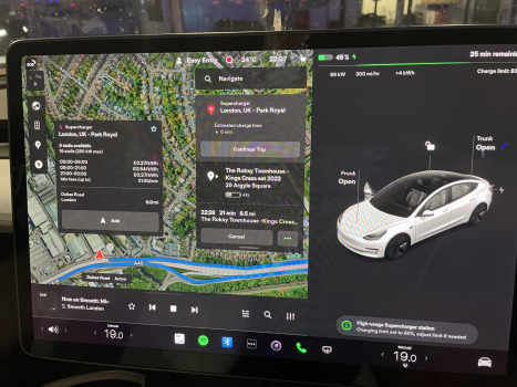
Also, see the radio ? Now on Smooth: Mic <--- ROFL I get literally 3 letters of my radio show name on a 15" LCD screen. Absolute Joke.
Attachments

Most of the internet praises the UI. Doesn’t mean it’s perfect. But yeah, opinions:I guess we just disagree. A sat nav that doesn't show you your destination is bad.
most UIs do this, including windows.A UI that exclusively locks down actions to single actions at a time is bad,
For me personally i don’t seem to have any issues with the UI. Either two reasons: 1. I’m not savvy or, 2. Complaining for complaining sake.and obscures driver information as the same time is bad.
Again, I have no issues and I’m not claiming the UI is perfect.Any interface touch points that is almost microscopic in size is bad.
It’s easy to use, easy to navigate. Again, an opinion of a negative doesn’t mean the interface is bad.If you disagree that these are bad, can you explain how they are in any way 'good' ?
Ok, some things could be improved, which is now the nth time I mention this.Why is there a tiny 3x15 mm bar that you have to swipe to dismiss the directions box, and why not put it RIGHT NEXT to the cancel button?. Good idea! See pic.
ROFL, kind of negates your point if you need that kind of pejorative intensity place.Also, see the radio ? Now on Smooth: Mic <--- ROFL I get literally 3 letters of my radio show name on a 15" LCD screen. Absolute Joke.
You seem to be comparing the tesla interface to Windows (?!) This is a car not a general purpose computer. operating system. If windows is your point of reference then yes, the tesla interface is amazing.most UIs do this, including windows.
It does scroll when the text changes. It probably should continuously scroll.Also, see the radio ? Now on Smooth: Mic <--- ROFL I get literally 3 letters of my radio show name on a 15" LCD screen. Absolute Joke.
no. It should not scroll. this is distracting. There is no need for it to scroll. There is plenty of space to fit in the title. Its same with podcasts - never enough room to fit in the episode name, i already know what podcast it is. Or a track name preceded by the album name.It does scroll when the text changes. It probably should continuously scroll.
There's a huge 1/3rd of a screen not even needed that could be used. All the pops up could appear there instead of on the map, or heating controls, so that they can be adjusted while passenger sat navs.
Right now, if you go into heating, and change your AC/temp. You have to WAIT until the pop up goes away before you can change you seat heating temperature. Also no feedback that you can now access the seat heater. This is insane UI design and car interface design. Try it for your self.
You want the display to be multi-line for what is playing so there is no scrolling, CarPlay does this?no. It should not scroll. this is distracting. There is no need for it to scroll. There is plenty of space to fit in the title. Its same with podcasts - never enough room to fit in the episode name, i already know what podcast it is. Or a track name preceded by the album name.
There's a huge 1/3rd of a screen not even needed that could be used. All the pops up could appear there instead of on the map, or heating controls, so that they can be adjusted while passenger sat navs.
Right now, if you go into heating, and change your AC/temp. You have to WAIT until the pop up goes away before you can change you seat heating temperature. Also no feedback that you can now access the seat heater. This is insane UI design and car interface design. Try it for your self.
Are you swiping to change your temp? Pressing either arrow in my car brings up the full HVAC panel where I can mess with the seat heaters at the same time. My biggest annoyance there, is that the SYNC option doesn't show on that interface you have to swipe the temp for the mini display to show where you can disable/enable temp sync.
You want the display to be multi-line for what is playing so there is no scrolling, CarPlay does this?
Yeah why not. Auto manafuactures have been doing this for decades. No scrolling/movement. All information available any time i look. In my picture there is even room to put it where is is plenty space. Also why are the play next pause buttons so small? Why? Just make the big enough not to miss or misclick. The should put controls the need touching at the side so you can rest you fingers on the screen frame to support the hand while choices are made.
Yes the panel comes up, and adjust the temp. The mini temp pop up covers the seat heating control. I dont even know why they need a mini temp pop up or why it exists at all. I will check it again tonight to refresh my memory.Are you swiping to change your temp? Pressing either arrow in my car brings up the full HVAC panel where I can mess with the seat heaters at the same time. My biggest annoyance there, is that the SYNC option doesn't show on that interface you have to swipe the temp for the mini display to show where you can disable/enable temp sync.
You seem to want the UI to multi-task. As you noted this isn’t a general purpose computer interface.You seem to be comparing the tesla interface to Windows (?!) This is a car not a general purpose computer. operating system.
I guess it depends on your reference point. As I said earlier, opinions.If windows is your point of reference then yes, the tesla interface is amazing.
I like the Tesla UI. Taking a reddit complaint without pictures as factual should set of all sorts of alarms with your 'common sense' meter. It could be true or not, but definitely not something to base a decision on, just something to look into.Why does the tesla have a ginourmous screen but can't fit in the name of the track or radio station i'm listening to, or even worse, the destination of the sat nav?
Here is what is looks like to me if I type "Tampa Int" into Tesla navigation and tap More Destination (otherwise it directs me to the main terminal):
I did learn something:
The passenger CANNOT adjust the temp at the same time you are entering the destination. The digital keyboard popups from the bottom, covering the temp controls, well all the controls along the bottom.
Yeah why not. Auto manafuactures have been doing this for decades. No scrolling/movement. All information available any time i look. In my picture there is even room to put it where is is plenty space. Also why are the play next pause buttons so small? Why? Just make the big enough not to miss or misclick. The should put controls the need touching at the side so you can rest you fingers on the screen frame to support the hand while choices are made.
Yes the panel comes up, and adjust the temp. The mini temp pop up covers the seat heating control. I dont even know why they need a mini temp pop up or why it exists at all. I will check it again tonight to refresh my memory.
I made a quick video replicating your issue. Or at least I think.
No, it's true. I experience this issue very often. I just searched quickly and found that thread with the same issue to illustrate the problem, seems I'm not alone. I can't find many pictures here, but here is a picture of 'Supercharger Warwic...' Now is that Warwick Supercharger Southbound or Northbound ? No way to tell except to bring down the route overview, which also then gives a birdseye map view. So i can't have my destination displayed AND the 'local' route directions at the same time. This happens with things like Hotels 'Travelodge London...' Um theres about 50 London travelodges which one ? Or just long place names in general . I also highlighted the ridiculous touch line you have to swipe to dismiss the route overview.I like the Tesla UI. Taking a reddit complaint without pictures as factual should set of all sorts of alarms with your 'common sense' meter. It could be true or not,
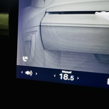
I checked it. I didn't know you could hit the (TINY!) arrows beside the heat to bring up a quick menu. Why are the things so small? I measured it to be max 10x10mm touch area. i think it's less. There's plenty space each side that could be made touchable. I always have hit the temp to bring up the temp settings. The pic shows the obstruction of the heated seats button.I made a quick video replicating your issue. Or at least I think.
Attachments
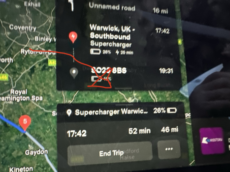
Ah, I see the issue. Once you tap the destination, you have to remember where you are going. It should be more easy just to look and verify, especially after driving for several hours. Tesla could do better here....but here is a picture of 'Supercharger Warwic...' Now is that Warwick Supercharger Southbound or Northbound ? No way to tell except...
@Elonmusk and send him a screen shot with a WTF please fix.
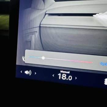
If you swipe along the temperature itself the mini HVAC control comes up. You don't have to actually hit the arrows.No, it's true. I experience this issue very often. I just searched quickly and found that thread with the same issue to illustrate the problem, seems I'm not alone. I can't find many pictures here, but here is a picture of 'Supercharger Warwic...' Now is that Warwick Supercharger Southbound or Northbound ? No way to tell except to bring down the route overview, which also then gives a birdseye map view. So i can't have my destination displayed AND the 'local' route directions at the same time. This happens with things like Hotels 'Travelodge London...' Um theres about 50 London travelodges which one ? Or just long place names in general . I also highlighted the ridiculous touch line you have to swipe to dismiss the route overview.
I checked it. I didn't know you could hit the (TINY!) arrows beside the heat to bring up a quick menu. Why are the things so small? I measured it to be max 10x10mm touch area. i think it's less. There's plenty space each side that could be made touchable. I always have hit the temp to bring up the temp settings. The pic shows the obstruction of the heated seats button.
You get it, my friend.Why does the tesla have a ginourmous screen but can't fit in the name of the track or radio station i'm listening to, or even worse, the destination of the sat nav?
Why can't a passenger enter in sat details at the same time as I adjust the heating ?
Why does the seat heater have 1 red, 2 red, 3 red, and then 3 black? Which is so tiny it's hard to see if it's 3 black or 3 red? Why not have either absense of red, or black to indicate not on but both?
Why on earth do I have to swipe little bars that are 3mm wide to dismiss sat nav step directions while driving at 70mph with no where to rest my hand while doing so ? (which also obscure the map) . Hey Elon , get rid of the stupid 3d car and put useful stuff there like sat nav info, heating controls that don't obscure the map. audio stuff that actually shows the track name properly
Just got the release notes for 44.25.2 [Holiday update]. My 2018 Model X does not get Apple Watch. 2025 is looking very likely I will be replacing the X for a 3. Very disappointed to see as Car key function was mention by Elon in 2018 for ALL Tesla's.
What series watch do you have? I have a series 5 and there is no app for me, if you read the fine print the watch app will only install on Series 6 and newer watches. You may just need to upgrade your watch like me.
Watch Ultra
Do any of the features work?Just got the release notes for 44.25.2 [Holiday update]. My 2018 Model X does not get Apple Watch. 2025 is looking very likely I will be replacing the X for a 3. Very disappointed to see as Car key function was mention by Elon in 2018 for ALL Tesla's.
Modern purchase 60-90 days ago in our household. SUV with a umm a spare.Doesn’t sound like you’ve bought too many modern cars. It’s very rare for any new car or moderately sized SUV to come with a spare tire
"About one-third of new vehicles are not equipped with a full-size spare tire. Instead, many are equipped with a space-saver (donut) spare or tire sealant and inflation kit. Getting a flat tire is a major hassle and can be costly."

Do I Even Need a Spare Tire? | Les Schwab
Many newer-model cars do not include a spare tire. Here’s what to know about spare tires, if you really even need one, and what other options are available.
I call a spare anything that can get you down the road however in the above link they mention a "space-saver." If a Tesla doesn't even have a space-saver that is even more reason to say HELL to the no. lol.
Oh and you stated "it's very rare for any new car .... to come with a spare tire." The article above says "one-third of new vehicles are not equipped with a full-size spare tire." But they have a space-saver. To me your generalization of "very rare" is not accurate.
To each their own. I feel sad for people who don't learn how to change a tire. Not even hating just saying it's sad to me. Oh well. I will carry on.
People are CLUELESS. They buy a Tesla and show up at "car meets" and claim they are "car people." I laugh when I see this. As I commented on another thread... many Tesla drivers don't even know how to change a tire! lol.The car does not have a “start” button. So the person driving then car has no knowledge of what transpired.
The Santa Fe software is amazing so far. We did test drive a Tesla just to try it but my wife did not like it. I'm glad because the Santa Fe is super nice. I am not a new car type of person myself.the hyundai will feel better quality and more 'put together' than the tesla. Also I bet it has actual switches. Hyundai lane assist and adaptive cruise are streets ahead of tesla as well.
Yah. Many ice drivers don’t know how to change a tire either.People are CLUELESS. They buy a Tesla and show up at "car meets" and claim they are "car people." I laugh when I see this. As I commented on another thread... many Tesla drivers don't even know how to change a tire! lol.
But none the less who cares if anybody claims they are car people and can’t change a tire.
Last edited:
Register on MacRumors! This sidebar will go away, and you'll see fewer ads.