Become a MacRumors Supporter for $50/year with no ads, ability to filter front page stories, and private forums.

diemo

macrumors newbie
Jun 3, 2011
4
0
Paris
Too late!

Argh! I just updated to iOS 5 and had I known about the changes in the music player, I wouldn't have done it!

It severely hampers my use of it, mainly for podcast listening:
  • missing top level list view
  • the track list view is too small and lacks dates
  • podcasts are now relegated into the "more" submenu
  • no more "x2" double speed playing

And, just for completeness, what has been always missing is a volume boost with the equalizer (as in Mac iTunes), necessary for some podcasts recorded with too low levels.

And what are these silly wood imitation sidebars there for? They're ugly, and I'd rather display more information.

There is a more in-depth analysis of the blunder at http://www.tuaw.com/2011/10/12/ios-5-features-changes-in-music-app-for-ipad/

Will suggest the missing features to Apple at http://www.apple.com/feedback/ipad.html.
 

diemo

macrumors newbie
Jun 3, 2011
4
0
Paris
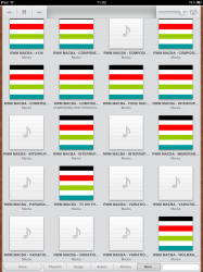
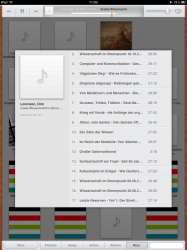
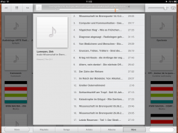
Some more details and screenshots on disimprovements in the iOS 5 iPad music player app:

  • there is no hint which episodes of a podcast have been played already
  • podcasts don't play through anymore (one has to manually advance to the next episode -- not handy for this which are split into 2-4 min items)
  • screenshot 1: the missing top level view shortens the names and thus prevents quickly finding the right podcast (see e.g. in the last line, where the first 3 appear the same)
  • screenshot 2 and 3:
    • the track view is too small (although there is lots of space around that is unused) and thus again the episode names are shortened
    • the episode dates are no longer shown, making it difficult to find a desired episode
    • there is no visual hint about which episodes are new

Argh! I just updated to iOS 5 and had I known about the changes in the music player, I wouldn't have done it!

It severely hampers my use of it, mainly for podcast listening:
  • missing top level list view
  • the track list view is too small and lacks dates
  • podcasts are now relegated into the "more" submenu
  • no more "x2" double speed playing

And, just for completeness, what has been always missing is a volume boost with the equalizer (as in Mac iTunes), necessary for some podcasts recorded with too low levels.

And what are these silly wood imitation sidebars there for? They're ugly, and I'd rather display more information.

There is a more in-depth analysis of the blunder at http://www.tuaw.com/2011/10/12/ios-5-features-changes-in-music-app-for-ipad/

Will suggest the missing features to Apple at http://www.apple.com/feedback/ipad.html.
 

Attachments

  • IMG_0066.PNG
    IMG_0066.PNG
    231.7 KB · Views: 117
  • IMG_0064.PNG
    IMG_0064.PNG
    329 KB · Views: 119
  • IMG_0065.PNG
    IMG_0065.PNG
    302.4 KB · Views: 89
Register on MacRumors! This sidebar will go away, and you'll see fewer ads.