Become a MacRumors Supporter for $50/year with no ads, ability to filter front page stories, and private forums.

MisterMillz

macrumors 6502a
Original poster
Mar 12, 2011
671
571
FL, USA
I may have an unpopular point of view, but I don’t think there’s a single thing wrong with it from a design point. People are acting like they plopped it there to cut out the screen. When in all actuality they added screen. If we got the bezel all the way across like some vehemently argued for (I wanted it too initially), there would be less screen real estate. However, the more I thought about it, the more I realized it’s simply extra space albeit tiny “ears” space. I care more about the narrow aspect ratio than the notch. Now that I have owned my phone for 2 days, I can genuinely say the “notch” isn’t even as much as an inconvenience during full screen immersion. That aspect ratio though...

Anyone else feel the notch hate was overblown? Conversely have you now experienced the phone and feel that the notch is completely unacceptable?
 

KrisLord

macrumors 68000
Sep 12, 2008
1,748
1,880
Northumberland, UK
I quite like the devil horns, the camera has to be somewhere and there’s always some stuff an app can shove up there.

On that point, I wish apps that had updated used a bit less of the top of the screen.... they still have a bar full width in most cases.

Also, if the “home bar” or whatever it’s called would be optional that would be great. I know I can swipe up, so don’t need an massive bar telling me so.
 
  • Like
Reactions: MisterMillz

acctman

macrumors 65816
Oct 26, 2012
1,334
882
Georgia
The "notch" is iPhone 4 to iPhone 5 all over again... remember when app weren't taking up the entire screen. its going to take at least a year for apps to get caught up and adjust for the "notch". even the popular apps have not update yet and the change forthcoming has been known for months. I spoke two one dev about two apps and his response was "majority of users do not have an X so no need to rush and update"
 

Macbook14in

macrumors regular
Apr 22, 2016
151
62
we're asked to embrace it
iPhoneX-Notch.jpg
 

acctman

macrumors 65816
Oct 26, 2012
1,334
882
Georgia
we're asked to embrace it
iPhoneX-Notch.jpg
sadly by default Apple should have forced all apps to "hide the notch" until they embraced it. Rather than the 1/2 inch on top and bottom crop. But I guess they figure forcing developers (by not embracing) would get them to update sooner
 

Ryan1524

macrumors 68020
Apr 9, 2003
2,093
1,424
Canada GTA
My immediate reaction to the notch was...I'd rather have this than the thicker bezels.


Second thought about the notch: This is an example of friction/barrier between human and machine interface. FaceID, which is the only real reason the notch exists, is a HUGE step forward towards ambient computing. Where something as ubiquitous, albeit irritating, process as authentication suddenly disappears. Using FaceID is like having a device simply knows you. I wish such 'awareness' is built into everything I use now. Car-keys, door-locks, workstation account logins, application preferences, etc.... can be a thing of the past, without compromising safety and security.

The perception of ambient computing, where tech simply melts away, was broken only by this notch. If the notch makes the desire for ambient computing more mainstream, and consequently accelerated its development, then it's a major step forward in the collective consciousness of tech consumption/utility.
 
  • Like
Reactions: MisterMillz

KingslayerG5

Suspended
Oct 16, 2017
1,254
1,292
Anything that Apple does whether it feels right or wrong gets overblown.

Curious if Apple adds Face ID on iPads or even their Macs? Just barely added Touch ID last year for the MBP. If not, then Apple really isn't about consistency anymore with their products.
 
  • Like
Reactions: MisterMillz

Macbook14in

macrumors regular
Apr 22, 2016
151
62
Anything that Apple does whether it feels right or wrong gets overblown.

Curious if Apple adds Face ID on iPads or even their Macs? Just barely added Touch ID last year for the MBP. If not, then Apple really isn't about consistency anymore with their products.
maybe, but i still dont understand why the Mac uses USB-C and other iDevices are still using the lightning connector
 
  • Like
Reactions: MisterMillz

convergent

macrumors 68040
May 6, 2008
3,034
3,083
I may have an unpopular point of view, but I don’t think there’s a single thing wrong with it from a design point. People are acting like they plopped it there to cut out the screen. When in all actuality they added screen. If we got the bezel all the way across like some vehemently argued for (I wanted it too initially), there would be less screen real estate. However, the more I thought about it, the more I realized it’s simply extra space albeit tiny “ears” space. I care more about the narrow aspect ratio than the notch. Now that I have owned my phone for 2 days, I can genuinely say the “notch” isn’t even as much as an inconvenience during full screen immersion. That aspect ratio though...

Anyone else feel the notch hate was overblown? Conversely have you now experienced the phone and feel that the notch is completely unacceptable?
Your argument on it being added space would hold water if they didn't count it in their measure of diagonal screen size.
 

15danielp

macrumors regular
Nov 2, 2006
181
19
Tucson, Arizona
sadly by default Apple should have forced all apps to "hide the notch" until they embraced it. Rather than the 1/2 inch on top and bottom crop. But I guess they figure forcing developers (by not embracing) would get them to update sooner
I agree. The screen size without the Notch is 5.1inches. Which is directly between the 8 and 8Plus screen sizes. But the smaller size of the phone is incredible.
 

flat five

macrumors 603
Feb 6, 2007
5,580
2,657
newyorkcity
I agree. The screen size without the Notch is 5.1inches. Which is directly between the 8 and 8Plus screen sizes. But the smaller size of the phone is incredible.

say what? where are you getting 5.1" from.. care to show that?
[doublepost=1509920269][/doublepost]
Your argument on it being added space would hold water if they didn't count it in their measure of diagonal screen size.
they actually subtracted for the notch & corners when arriving at the 5.8" measurement..

that said, we need to stop using diagonal measurements as a means to compare screen sizes as it's all too clear that most people don't understand what it means..

further, with these rounded corner screens we've been seeing, there is no diagonal measurement to be taken in the first place.. it makes no sense to use a diagonal measurement on a non-rectangular shape.

if anything, we should be using area instead.
 
Last edited:
  • Like
Reactions: MisterMillz

15danielp

macrumors regular
Nov 2, 2006
181
19
Tucson, Arizona
say what? where are you getting 5.1" from.. care to show that?
I posted the math in another tread:

screen size:
135.75mm x 63.12mm = 2.15 aspect ratio for the X
121.54mm x 68.36mm = 1.78 aspect ratio the the 8 plus.

63.12 mm wide screen for the X is the limiting factor. So the equivalent length of the screen would be 63.12 x 1.78 = 112.35 mm

The X screen in the same aspect ratio as the iPhone 8 is 112.35 mm x 63.12 mm = a 128.8 mm screen

128.87 mm = 5.07 inche

Please check me if I'm wrong. But the X screen is only 63.12mm wide (or tall depending on your orientation) compared to the 68.36mm wide screen on the 8plus.
 

flat five

macrumors 603
Feb 6, 2007
5,580
2,657
newyorkcity
I posted the math in another tread:

screen size:
135.75mm x 63.12mm = 2.15 aspect ratio for the X
121.54mm x 68.36mm = 1.78 aspect ratio the the 8 plus.

63.12 mm wide screen for the X is the limiting factor. So the equivalent length of the screen would be 63.12 x 1.78 = 112.35 mm

The X screen in the same aspect ratio as the iPhone 8 is 112.35 mm x 63.12 mm = a 128.8 mm screen

128.87 mm = 5.07 inche

Please check me if I'm wrong. But the X screen is only 63.12mm wide (or tall depending on your orientation) compared to the 68.36mm wide screen on the 8plus.
wait.. so you're saying if you make a 16:9 rectangle that fits within the X display, the diagonal is 5.1"?
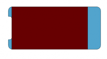
ok, but, here's what that looks like visually:

Screen Shot 2017-11-05 at 5.21.42 PM.png

the red part is 16:9 and it fills the width of the X.. the diagonal is 5.1" (it's actually 5.013")

but you get it that by saying this red portion is the true space to be measured on the X, you're leaving a whole bunch of display area out of the equation, right?
 

15danielp

macrumors regular
Nov 2, 2006
181
19
Tucson, Arizona
wait.. so you're saying if you make a 16:9 rectangle that fits within the X display, the diagonal is 5.1"?
ok, but, here's what that looks like visually:

View attachment 732674

the red part is 16:9 and it fills the width of the X.. the diagonal is 5.1" (it's actually 5.013")

but you get it that by saying this red portion is the true space to be measured on the X, you're leaving a whole bunch of display area out of the equation, right?
Your right. Actually I did the math with 16.9 in mind. So thanks for correcting me!

For most purposes the screen will be 5.1 because aspect ratio, but can be used for wider applications. Whats the screen size without the Notch?
 
Register on MacRumors! This sidebar will go away, and you'll see fewer ads.