Become a MacRumors Supporter for $50/year with no ads, ability to filter front page stories, and private forums.

0000757

macrumors 68040
Original poster
Dec 16, 2011
3,893
850
iOS 10 added a much needed and complete overhaul of the notification system. Personally, I accept this new redesign with open arms. However, there seems to be one major complaint: they take up a lot of space. Now, it's easy to blame the design of the notifications, and that's definitely part of the situation, but realistically, it's due to how iOS notifications work.

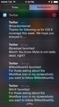
Currently, iOS handles notifications by creating a unique notification for every interaction with an app. To manage the multiple notifications, Apple offers an option to group notifications by app. If I have 5 Facebook notifications, I have 5 individual notifications. If I have 8 texts, I have eight individual notifications, etc., etc. This is the system Apple has used since the introduction of the Notification Center in iOS 5.

Example A.jpeg
Example A: Multiple Twitter Notifications
The problem with this current system is that notifications become easily cluttered. An active group chat can result in hundreds of individual notifications. For example I'm in a group chat of friends with about 12 active people, and I have to leave it muted anytime I choose not to participate, due to the amount of notifications that collect. In addition, this means that important information can get lost in the sea of notifications.

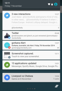
However, a solution exists, and it can be observed on any Android phone running Lollipop or newer. Currently, Android handles multiple notifications from the same application by grouping each event into one notification for that application. This allows the Notification Center to still display many different notifications, but in a design that is cleaner than what iOS provides.

screenshot_2014-11-07-13-11-50-1940x145531111111111.png
Example B: Android's Combined Notifications

The obvious solution to this issue is to create a single notification for what an app generates. I'm currently working an example with Apple's UI elements, but here's a sketch of how iOS notifications should be in the future:

Current:
Currently.PNG

New:
New.png


As you can see, this approach allows you to address the two major notification issues: organization and screen real estate.

In addition, this concept can be taken further, by allowing applications to create unique notifications for independent events, such as two different group chats, or two different email accounts:

IMG_0038.JPG


This solves the major issue of how iOS notifications are displayed.


Issues:

Problem: One issue of concern I've come up with is how you can still make the notifications interactive. For example an app may have specific force touch/interactions associated with that notification, so combining them into one list poses a challenge on how to access those actions.

Possible Solution: Interacting with the notification group allows you to then see a normal list of notifications (how it's currently displayed), and then notification actions can be taken from there.


Closing:

What do you guys think? I would like to get feedback and critiques, negative and positive. What do you guys like about the idea? What do you dislike? What could be improved?

Thanks for reading! I'll have actual iOS screenshots of the concept up soon.
 
Last edited:

DomC

macrumors 6502
Jul 28, 2010
454
174
I like the collapsing idea. I'd also like a system-wide option of not having Previews for Notifications. That would save a lot of space and also be handy in situations when maybe you didn't want a nosey someone to see the contents of an alert.
 
Last edited:
  • Like
Reactions: PowerBook-G5

0000757

macrumors 68040
Original poster
Dec 16, 2011
3,893
850
I've added some rough sketches (since I accidentally published the post early). I'll have some actual UI mockups up here in a bit!
[doublepost=1466041420][/doublepost]
It's already grouped. You want it collapsed.

Grouped in the sense that Notification Center creates specific reference points to when one section of notifications end and another begins (which iOS 10 seems to have removed from what I can tell, in favor of one giant missed), but it still results in hundreds of notifications at times. This groups each dependent event of an application into one notification, with separate notifications for other events within the app.
[doublepost=1466042723][/doublepost]I've added the first iOS mockup image as well as made it like sections!
 

batting1000

macrumors 604
Sep 4, 2011
7,464
1,874
Florida
I like the concept a lot...would love to see something similar to what you've proposed...seems like a no-brainer really, especially these days with how many apps and notifications everyone gets.
 

moloukhya

macrumors regular
Apr 6, 2007
104
25
Definitely a great idea, I agree.

Additionally, I wish incoming notification banners wouldn't cover content on the screen. Instead, they should simply push the screen down temporarily, similar to what WebOS did on the Palm Pre (remember those? lol)
 
  • Like
Reactions: Statusnone88

576316

macrumors 601
May 19, 2011
4,056
2,556
I like the collapsing idea. I'd also like a system-wide option of not having Previews for Notifications.

Umm...unless I'm being dumb, that's already a thing. You turn notification previews off in settings and no notification shows a preview of the message/content. At least, that's what my iPhone does.
 

jclardy

macrumors 601
Oct 6, 2008
4,233
4,577
I like this idea - after using iOS 10 for a day so far the main thing I am not liking is just how much vertical screen real estate notifications take up. Maybe 5 notifications fit on the lockscreen of the 6S+, whereas before I could see at least 7. The heavier UI chrome just makes everything feel too dense, compared to the smaller, cleaner look of iOS 9. I'm hoping they tweak it a bit, somehow.
 

oftheheavens

macrumors 68000
Jul 9, 2008
1,988
498
cherry point
iOS 10 added a much needed and complete overhaul of the notification system. Personally, I accept this new redesign with open arms. However, there seems to be one major complaint: they take up a lot of space. Now, it's easy to blame the design of the notifications, and that's definitely part of the situation, but realistically, it's due to how iOS notifications work.

Currently, iOS handles notifications by creating a unique notification for every interaction with an app. To manage the multiple notifications, Apple offers an option to group notifications by app. If I have 5 Facebook notifications, I have 5 individual notifications. If I have 8 texts, I have eight individual notifications, etc., etc. This is the system Apple has used since the introduction of the Notification Center in iOS 5.

View attachment 636226
Example A: Multiple Twitter Notifications
The problem with this current system is that notifications become easily cluttered. An active group chat can result in hundreds of individual notifications. For example I'm in a group chat of friends with about 12 active people, and I have to leave it muted anytime I choose not to participate, due to the amount of notifications that collect. In addition, this means that important information can get lost in the sea of notifications.

However, a solution exists, and it can be observed on any Android phone running Lollipop or newer. Currently, Android handles multiple notifications from the same application by grouping each event into one notification for that application. This allows the Notification Center to still display many different notifications, but in a design that is cleaner than what iOS provides.

View attachment 636227
Example B: Android's Combined Notifications

The obvious solution to this issue is to create a single notification for what an app generates. I'm currently working an example with Apple's UI elements, but here's a sketch of how iOS notifications should be in the future:
As you can see, this approach allows you to address the two major notification issues: organization and screen real estate.

In addition, this concept can be taken further, by allowing applications to create unique notifications for independent events, such as two different group chats, or two different email accounts:

View attachment 636231

This solves the major issue of how iOS notifications are displayed.


Issues:

Problem: One issue of concern I've come up with is how you can still make the notifications interactive. For example an app may have specific force touch/interactions associated with that notification, so combining them into one list poses a challenge on how to access those actions.

Possible Solution: Interacting with the notification group allows you to then see a normal list of notifications (how it's currently displayed), and then notification actions can be taken from there.


Closing:

What do you guys think? I would like to get feedback and critiques, negative and positive. What do you guys like about the idea? What do you dislike? What could be improved?

Thanks for reading! I'll have actual iOS screenshots of the concept up soon.
I think you have provided a very educated solution to the notifications! Please submit everything you posted above to the dev feedback section with apple. This type of organized response will definitely (I hope at least) get viewed and responded to in a future beta. Good post my friend!
 
  • Like
Reactions: Statusnone88

matt2053

macrumors 6502a
Jul 8, 2012
554
121
I think it's important that you be able to glance at the notification and get important information. Currently I can glance at a notification and often read all or most of it without having to do anything.

Under your method I have to drill down to get to the content of the notification.

For this reason I prefer Apple's implementation.
 

0000757

macrumors 68040
Original poster
Dec 16, 2011
3,893
850
I think it's important that you be able to glance at the notification and get important information. Currently I can glance at a notification and often read all or most of it without having to do anything.

Under your method I have to drill down to get to the content of the notification.

For this reason I prefer Apple's implementation.

Which I understand, but when you get hundreds of messages, it becomes hard to find important information.

An option to enable or disable grouping by app would be nice
 

boston04and07

macrumors 68000
May 13, 2008
1,834
935
I really like this a lot. You should absolutely submit this as feedback! It's so polished and logical that, now that I'm seeing it, I sort of can't believe they haven't done this already. I totally would have believed you if you'd said this was a screenshot from the beta. This would go a long way toward keeping things more organized. I could use this right now - I'm currently tagged in a large group pic on Facebook that everyone and their mother (literally) are commenting on this morning!

On the subject of managing and missing iPhone notifications, there's something else that's been bugging me for a while. Apple should make it so that users can have their iPhone notifications pushed to their Macs if they want. I sit in front of a Mac all day, and while most of my notifications come through there too (texts, emails, etc) not all of them do, and whenever I check my phone I usually have a screen full of notifications to go through. It would be so much more manageable for me and less annoying if these notifications could be displayed as regular Mac notifications in real time, allowing me to deal with them as they come in one at a time, with the "from your iPhone" line added like how calls from your iPhone are displayed. That, with the ability to universally dismiss notifications (i.e. a notification cleared on the Mac would be cleared everywhere) would help keep things manageable and organized a lot, I think, for those of us using Macs throughout the day. I don't have an Apple Watch but from what I understand, this wouldn't be too different from how notifications are handled there. And of course it should be 100% opt-in so that those who don't want to be bombarded with messages don't have to be. :)
 

stulaw11

Suspended
Jan 25, 2012
1,391
1,624
It looks nice but it would kind of defeat the rich notifications Apple just put in a bit.

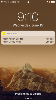
Android grouping like that looks pretty, but when you get into texts etc grouping simply wouldnt work. It wouldnt allow a rich reply if they were all grouped into 1 bubble like your snapchat concept (although there is no rich content there to begin with so not the best example).
 

boston04and07

macrumors 68000
May 13, 2008
1,834
935
I want the same thing too! Tried using Pushbullet for a while but it's not very reliable. Sometimes it would miss pushing notification to my mac.

I've tried that and a few other apps over the years, none of which worked reliably at all. I'm actually kind of surprised there aren't more apps out there that would do this, but I think a built in feature would work best anyway. Having it handled over the cloud (the way SMS messages are forwarded) would probably be preferable, I think - that way you wouldn't need to constantly maintain a Bluetooth connection and could still get them when the phone isn't on the same wifi network. I really hope they do something like this soon.
 

DomC

macrumors 6502
Jul 28, 2010
454
174
Umm...unless I'm being dumb, that's already a thing. You turn notification previews off in settings and no notification shows a preview of the message/content. At least, that's what my iPhone does.

You can turn previews on and off for apps like Mail and Messages. But not for ones like Gmail or Tweetbot.
 

mattoligy

macrumors 6502
May 15, 2010
396
191
Cloud 9
What do you guys think? I would like to get feedback and critiques, negative and positive. What do you guys like about the idea? What do you dislike? What could be improved?

Thanks for reading! I'll have actual iOS screenshots of the concept up soon.

Great post, completely agree with everything you're pointing out and it was an enjoyable read. Thanks.
 

Lucas30Araujo

macrumors newbie
Jun 16, 2016
2
0
I liked the idea, both how It looks and how it works, but what do you think about not grouping the notification by apps but by the people you are interacting with on the specific app instead. In my point of view it'd be easier to use 3D touch on the rich notifications this way.
 
Last edited:

boston04and07

macrumors 68000
May 13, 2008
1,834
935
Maybe Apple should make an API or something on the iOS SDK and Mac OS SDK so developers can build such feature into their own app, rather than having 3rd party apps doing such job.

Handle over cloud is definitely a must. The WhatsApp way is so troublesome (though that's probably limited by the mechanism of how WhatsApp delivers message)

Yeah, I was kind of wondering if they would do that this year - I mean it's not like there were any rumors or anything, but since they refined it on the watch it seemed logical to me they'd expand it to the Mac. Oh well...back to the feedback page I go!

@chrf097 just saw your mockup on the iOS blog, congrats! I was actually scrolling through Apple News and it came up in the For You section for me. Pretty cool!
 
  • Like
Reactions: 0000757

stulaw11

Suspended
Jan 25, 2012
1,391
1,624
I would email apple with your mockups and see what they say. This is only a Beta 1, they may be going some grouping way in later beta.
 
  • Like
Reactions: Lucas30Araujo

0000757

macrumors 68040
Original poster
Dec 16, 2011
3,893
850
Thanks for all the feedback guys!

A wonderful UX designer named Zuno Young took his own take on the concept, and his mockups are definitely better than mine! I suggest everyone also look at his work! LINK
 
Register on MacRumors! This sidebar will go away, and you'll see fewer ads.