Become a MacRumors Supporter for $50/year with no ads, ability to filter front page stories, and private forums.

allan.nyholm

macrumors 68020
Original poster
Nov 22, 2007
2,317
2,576
Aalborg, Denmark
Today is the my 42nd birthday and I have decided that a dumb decision is just dumb when stopping theming. It's what I like doing. SIP off - never an issue or problem being off anyway, so why would it ever be?!

Previously I stated that I was done with theming forever.. turns out ... not true. :rolleyes:

I can't stop making mockups and making small edits here and there.

Lately I thought of Cel Shaded as an option for Catalina. Mockup is still just that.

All this should make me think about what I do as an author - I can't just go away and delete links left and right.

Description:
I've made a new theme that explores the darker side of what was once Leopard and Snow Leopard.

Take a look and see if you like it. There's a readme file included this time that you may read. In fact. You should. It contains instructions.

The only reason I call it Leopard-esque is because I don't know what else to call it.

There's included graphics for non-Retina resolutions too. Like I write in the readme for this archive I'd like that you I've some feedback on it as I've used Resolutionator to downscale my Retina screen.

Also I'd like to point out that I haven't gone through each element for this release. I would need a good amount of patience for that. I might get there eventually.
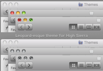
Leopard-esque_Preview.png

BTW. You don't have to use the iTunes theme (which is for the latest release) Or any of this. I just wanted to share it with you as I've been asked if I would ever make such a theme for High Sierra. This is what I came up with:

Download from here (outgoing link to my dA-account where this and other stuff reside)
Download from dA

OneDrive download that doesn't require a login or password. Doesn't expire unless Microsoft does something to turn off my possibilities to share.
I won't delete this either. I might just move the file around in the filesystem but if I do then the link will be updated manually accordingly:
Download LeopardEsque for High Sierra from OneDrive
 
Last edited:
Great! I have some updates coming tomorrow that help fixes some bugs and adds a larger traffic lights version. I wanted to upload it this evening but I have to sleep as it is past midnight here.
 
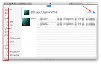
iTunes Sidebar Playlist icons messed up after applying the theme.
[doublepost=1525302733][/doublepost]Traffic light button unequal size between active and inactive windows. Too much shadow on the top side of the buttons on active windows...?

Otherwise the theme is great. Running Sierra on 2010 MBP...

BTW, how did you manage to change the system fonts to Lucida Grande on HS...?
[doublepost=1525303050][/doublepost]I find the toolbar buttons on non-Retina screens are a tad more squarish than from your screenshots above.
 

Attachments

  • iTunes Leopard Theme.png
    iTunes Leopard Theme.png
    306.2 KB · Views: 843
  • Finder Traffic.png
    Finder Traffic.png
    18.4 KB · Views: 713
  • Finder Toolbar.png
    Finder Toolbar.png
    22.9 KB · Views: 616
@Eithanius that's really strange.. I got up because I couldn't sleep and I just saw the e-mails from the forums.

I don't see the iTunes problem here: screenshot is down scaled
Screen Shot 2018-05-03 at 01.35.08.png


Also please try the version of the theme I link to in my original comment in just a few. I have really only changed the iTunes buttons and a few knobs plus the traffic lights. I haven't touched the sidebar at all.

I'm trying the best to make the theme for lower res too but it's kinda hard to be honest. And my Internet just died there for a minute or two.
[doublepost=1525305607][/doublepost]Oh @Eithanius and it might be that you are using Sierra. Not High Sierra. Not entirely sure about that particular iTunes issue? You are using the latest version of iTunes?
 
Last edited:
  • Like
Reactions: martyjmclean
Oh @Eithanius and it might be that you are using Sierra. Not High Sierra. Not entirely sure about that particular iTunes issue? You are using the latest version of iTunes?

My bad... I guess I neglected to inform, I'm on iTunes 12.6.4...

I'm not too worried about the iTunes interface, so I can go without the theme.
 
I think revision 2 with the smaller traffic seems nicer... Rev 3 seems too big and pixelated on non-Retina...
 
I think revision 2 with the smaller traffic seems nicer... Rev 3 seems too big and pixelated on non-Retina...

I've been modding the lights after I got home this afternoon and also reading your description of the lights..

I think these are more rounded. (non-retina monitor this time)
1.png
 
LeopardEsque_revision03-05-2018.zip with this version i had utilities folder error it wouldn't show up on 10.13.4 macos high sierra install.
 
Last edited:
LeopardEsque_revision03-05-2018.zip with this version i had utilities folder error it wouldn't show up on 10.13.4 macos high sierra install.

I'm sorry you have those issues - because I have none of those :/ It's hard for me to do anything that I can't experience myself.
 
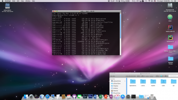
It is cool, but the windows control buttons appear so low res and jagged on my 1080p monitor, connected to a non retina MacBook Pro. Also, they look very small, and that other version looks very big.

I think that you are just barely missing it. I think that version with bigger buttons look too big, and this normal version looks somewhat tiny. Just a little bit bigger would be perfect.

show

[doublepost=1533204387][/doublepost]Actually, disregard my previous post. This is turning into something nice. :)
 

Attachments

  • Screen Shot 2018-08-02 at 12.02.26 PM.png
    Screen Shot 2018-08-02 at 12.02.26 PM.png
    1.7 MB · Views: 1,325
Last edited:
It is cool, but the windows control buttons appear so low res and jagged on my 1080p monitor, connected to a non retina MacBook Pro. Also, they look very small, and that other version looks very big.

I think that you are just barely missing it. I think that version with bigger buttons look too big, and this normal version looks somewhat tiny. Just a little bit bigger would be perfect.

show

[doublepost=1533204387][/doublepost]Actually, disregard my previous post. This is turning into something nice. :)

Yeah, I admit to not having been very fortunate with this.
 
That sucks. I really do not know how to edit and design this stuff, I would really like to offer some help. Any plans to improve upon, or you have gave up?

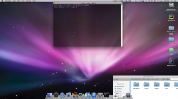
Edit: now, with some icons and tweaks this is starting to look better and better.
 

Attachments

  • Screen Shot 2018-08-03 at 7.00.21 PM.png
    Screen Shot 2018-08-03 at 7.00.21 PM.png
    1.7 MB · Views: 955
Is there any possibility to experiment with the Aqua style checkboxes, radio buttons and such? I got the xRevert, but it doesn't work. There are no forward/back buttons, and text inside buttons is off center. It is horrible. Although, I have the resources from the System.appearance.car, maybe you can recycle some of that? I know it would be pain in the @ss to draw it all yourself. I tried to make something in ThemeEngine, but I am stupid for that. I do not know where things should be put, what controls what.

This is an awesome theme you have here. The only thing missing are those. And it will be perfect.
[doublepost=1533399054][/doublepost]I can also copy the resources from the Snow Leopard that I have on VirtualBox, but I do not know where are those located. There is no SystemAppearance.car file in Snow Leopard.

If I could find it, I could experiment on it myself.
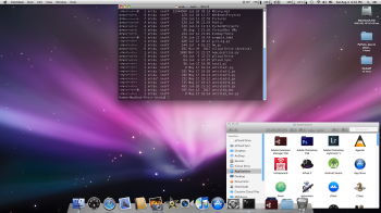
[doublepost=1533400440][/doublepost]OK, this time, using the windows control button that Princess Cake shared in other thread. Looks very well, indeed.
 

Attachments

  • Screen Shot 2018-08-04 at 6.32.33 PM.png
    Screen Shot 2018-08-04 at 6.32.33 PM.png
    1.7 MB · Views: 666
OK, it is getting more and more glossy and lickable.

I messed up the checkbox button, it looks too large. While inactive, it looks OK. :(

And sliders also need to be done.

I am gonna make this work, because now I see that it can be made to work. I am not gonna leave default elements, I want to eliminate the GUI inconsistency as much as possible.
 

Attachments

  • Screen Shot 2018-08-05 at 11.58.29 AM.png
    Screen Shot 2018-08-05 at 11.58.29 AM.png
    2.5 MB · Views: 808
OK, it is getting more and more glossy and lickable.

I messed up the checkbox button, it looks too large. While inactive, it looks OK. :(

And sliders also need to be done.

I am gonna make this work, because now I see that it can be made to work. I am not gonna leave default elements, I want to eliminate the GUI inconsistency as much as possible.

Looking very nice... great job!
 
OK, it is getting more and more glossy and lickable.

I messed up the checkbox button, it looks too large. While inactive, it looks OK. :(

And sliders also need to be done.

I am gonna make this work, because now I see that it can be made to work. I am not gonna leave default elements, I want to eliminate the GUI inconsistency as much as possible.

it does look very nice -I don't personally feel that it's worth continuing the theme so do as you please with files available from me at least.

The reason is the scaling issues - if I only had to do for 1x and not 2x it would be much more approachable. I work backwards and produce 2x and then 1x because I'm on that higher dpi resolution. It has bitten me once or twice in the behind with regards to customization being on a 5k resolution.

OK. That is understandable. This is very time and nerve consuming, I admit.

Now, can I ask, which ones are retina resources, and which ones are non retina? Are those labeled 2x for retina Macs and other for lower resolution Macs? Or vice versa?

Because every element has 2x and normal size.

So, if get to know which ones are needed for non retina, I can make theme for non retina only.

2x is for retina Macs - sort by scale and you'll have a better overview.
 
OK. That is understandable. This is very time and nerve consuming, I admit.

Now, can I ask, which ones are retina resources, and which ones are non retina? Are those labeled 2x for retina Macs and other for lower resolution Macs? Or vice versa?

Because every element has 2x and normal size.

So, if get to know which ones are needed for non retina, I can make theme for non retina only.
@1x is for non-Retina, @2x is for Retina. I have separate PSD files for each size of my Aqua window controls, started out with the Retina versions and adjusted them to look good on non-Retina as well.

Good luck with your compete theme. If it's non-Retina only, I'd still be willing to try it out on my Mac Pro 5,1. Will there be a version for Mojave, or Sierra / High Sierra only?
 
Register on MacRumors! This sidebar will go away, and you'll see fewer ads.