Hey, so I've started the attached ad for a Photoshop class, and I wondered if anyone had any opinions about it. The assignment is to first photograph a product, then insert in a product name, logo, copy, etc. I think it looks good in black and white, and I like the texture of the skin. One problem I have is the floor, especially around the feet- I think it still looks a bit messy. My main problem right now is the text/copy. This attachment has been rasterized pretty bad because it's compressed and not .psd, but I'm wondering if I should simply get the photo the way I like, then open it up in Illustrator for text editing there, taking out what's there from Photoshop (and copying it directly into Illustrator?). Also, it's been suggested that the UD logo and the text at the bottom are too purple, where I wanted them to be more of a dark pink. Do you agree, or is the colour good, and, more importantly, readable? That's another issue I'm having- I think the copy at the bottom isn't legible enough, nor is it necessarily complete as an ad (trying to reword it). If anyone could let me know ideas/opinions, it would be appreciated.
Got a tip for us?
Let us know
Become a MacRumors Supporter for $50/year with no ads, ability to filter front page stories, and private forums.
Thoughts on Ad design- now with ad!
- Thread starter Mr_Brightside_@
- Start date
- Sort by reaction score
You are using an out of date browser. It may not display this or other websites correctly.
You should upgrade or use an alternative browser.
You should upgrade or use an alternative browser.
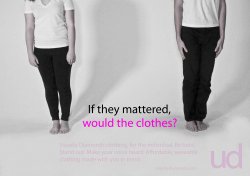
Lovely. It's uploading to another site because it didn't upload here.Good use of negative space.
Lovely. It's uploading to another site because it didn't upload here.
Link us when it's done, I'd like to see it. I'm a sr. art director in advertising for over 18 years. I'll give you a honest review.
To be 100% honest, I just don't get it. I don't get the message, I don't get what I'm looking at or why. The copy at the bottom needs to be brighter because I can barely see it. Also, they copy doesn't make sense...Maybe it's the wording but the first sentence just sounds incomplete. I think you need to work on your message a bit more, because you have little time to keep their attention before they move on.
I agree with the previous post. It doenst make sense at all. It took me too long to even realize its for clothing. I think if I saw this in a magazine I would skip right over it. I understand that you want to go with a minimalist style, but I dont think the picture is strong enough to stand on its own. I think the picture is poorly taken. Im not trying to be mean, just my opinion.
Hm... ok. I was hoping the initial idea would be fairly clear (ie, who cares what celebrity is wearing the clothes, as long as you are)- and I tried to sum up that thought with the tagline. My thinking hopefully is that the cropped out heads will make people look at the tagline, they'll read, go back to the people, and understand. I know the copy needs to be brightened; I just didn't get a chance to do that before posting. Also, that copy clearly needs to be reworded, something I was just struggling with before posting. I still haven't had much inspiration on that front. Technically, do you think I should move to Illustrator?To be 100% honest, I just don't get it. I don't get the message, I don't get what I'm looking at or why. The copy at the bottom needs to be brighter because I can barely see it. Also, they copy doesn't make sense...Maybe it's the wording but the first sentence just sounds incomplete. I think you need to work on your message a bit more, because you have little time to keep their attention before they move on.
Fair enough. I guess I was hoping the "clothes" in the tagline and the "clothing" in the copy would help bring that point across (?). While I can understand that you wouldn't be captivated by this in a magazine, do you think, given to a teacher who had time to read and analyze, that the image could hold up and the point could be made clear? How do you think the picture is poorly taken, and what can be done to improve it?I agree with the previous post. It doenst make sense at all. It took me too long to even realize its for clothing. I think if I saw this in a magazine I would skip right over it. I understand that you want to go with a minimalist style, but I dont think the picture is strong enough to stand on its own. I think the picture is poorly taken. Im not trying to be mean, just my opinion.
Thank you both for your help.
Same as the others, just don't get it, no connection to the name anywhere, I could kind of understood the idea if it had diamonds or something but as it is now its just not right.
There's not meant to be a connection- I just like the name.Same as the others, just don't get it, no connection to the name anywhere, I could kind of understood the idea if it had diamonds or something but as it is now its just not right.
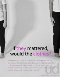
Cool, thanks.Might be better in portrait, with one person, not two.
I think the picture should be more dynamic. The subject matter to me is boring. If you took this picture, try making it a little more "artsy" and a little more edgy. The exposure to me is very washed out. I dont think the type is strong enough to grab attention either. As far as the message, I think you may be assuming how smart most readers are. I may be wrong, but I think the average reading level for the newspaper is around 7th grade, it may differ depending on what magazine it is. I understand where you are coming from with the clothing being in the tag line but that doesnt mean its for a clothing brand. It could be a PSA for donating clothes. Who knows. Keep at it though
Well, I'll try decreasing the exposure to see how that looks. What typeface do you think should be used? Unfortunately I am limited to what the PCs we edit with come with (can't run CS3 on the iBook). Are there any other fonts you could think of that would work better, that are either free or that I might already have? While I agree with the 7th grade thing, like I said above, this is something that my teacher is (hopefully) going to spend a good amount of time on, and (hopefully) he's smarter than your average 7th grader (up to this point he has been) so I would hope the message would transmit a bit clearer to him- after, of course, a lot of work on making the message more clear to everybody. As for usually diamonds, it was just my idea for the name of line, no more, no less. Thank you for your suggestions so far. I'm going back to this today so if you have the time there should be something up tonight.I think the picture should be more dynamic. The subject matter to me is boring. If you took this picture, try making it a little more "artsy" and a little more edgy. The exposure to me is very washed out. I dont think the type is strong enough to grab attention either. As far as the message, I think you may be assuming how smart most readers are. I may be wrong, but I think the average reading level for the newspaper is around 7th grade, it may differ depending on what magazine it is. I understand where you are coming from with the clothing being in the tag line but that doesnt mean its for a clothing brand. It could be a PSA for donating clothes. Who knows. Keep at it though
"Usually Diamonds clothing, for the individual" sounds like engrish. It sounds like youre trying to say "usually, diamond-clothing is for the individual" but used Babel Fish. Youll never be able to start a sentence with that brand name, and if you use the brand name in a sentence youll have to make it totally obvious that its a brand and not messed up english.
The title is the same way, Im wondering "if what mattered?" because its not a complete sentence.
The title is the same way, Im wondering "if what mattered?" because its not a complete sentence.
My first thought of the picture is the people hung themselves and you cropped out the head because it's too graphic.
Well, I'll try decreasing the exposure to see how that looks. What typeface do you think should be used? Unfortunately I am limited to what the PCs we edit with come with (can't run CS3 on the iBook). Are there any other fonts you could think of that would work better, that are either free or that I might already have? While I agree with the 7th grade thing, like I said above, this is something that my teacher is (hopefully) going to spend a good amount of time on, and (hopefully) he's smarter than your average 7th grader (up to this point he has been) so I would hope the message would transmit a bit clearer to him- after, of course, a lot of work on making the message more clear to everybody. As for usually diamonds, it was just my idea for the name of line, no more, no less. Thank you for your suggestions so far. I'm going back to this today so if you have the time there should be something up tonight.
I understand ultimately your teacher is going to be the one grading you, but you should prob prepare yourself for the real world and think about how the consumer would see the ad, and at this point I think 95% of the readers will not know what is going on with this ad. If you want to see some other fonts try dafont.com
After finally grasping the concept... I actually like it, but find the implementation quite weak.
First there is the ambiguity in the wording. Reference (semantically speaking) is unclear, because you did not properly introduce the topic, but are using an anaphora that has no antecedent. Since it is gramatically coreferential (through rule of concord) with "clothes" one naturally assumes this very coreference to be valid and the whole sentence to be very weird. The deictic reference is plain lost at this stage.
Easy solution
- make a graphic reference that "they" refers to the people on the foto (through typography perhaps, highlighting "they" and putting it closer to the referent) or
- get rid of one person in the photo, eliminating the syntactic ambiguity.
Actually by using a canonical method of identity protection, like the infamous black bar, I feel that the message you are trying to convey would come across much stronger. Perhaps you could then use that black space for typography and tighten up the message even more. The wording, as it is now, is awful anyway...
(ie, who cares what celebrity is wearing the clothes, as long as you are)
1) I like the font
2) I like the use of whitespace
3) I really don't get it... Really
Another style:
Attachments
eh...just don't get it. At first I thought it was a public awareness ad about maybe child labor or some 3rd world country. Seems like you're trying too hard to be clever with your headline. Sometimes there's nothing wrong with being direct and to the point especially when you're also trying to be a bit confusing/clever with the art direction.
I don't mind the style of the ad but I agree with those that say they don't get it. It just doesn't really make sense to talk about celebrities when you have two slouchy people standing there in boring clothing.
I think you are trying to say that comfortable clothing is more important than designer stuff that celebs wear, but it's not coming across in the picture and especially not in the "If they mattered, would the clothes?" tag line.
Something like "Forget Celebrity. Be Yourself." might be more appropriate given the image, but even then it wouldn't translate to "comfort" as much as it says "boring."
Register on MacRumors! This sidebar will go away, and you'll see fewer ads.