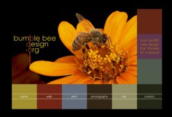
Also think the suggestion above is a good one, to consider tying the cards to the web design so you have a recognisable 'theme'. That is, of course, unless your theme is the pictures of flowers with a certain 'something' and you have more of them in which case, great.]
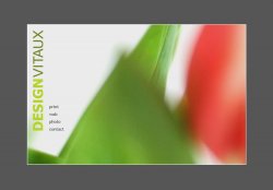
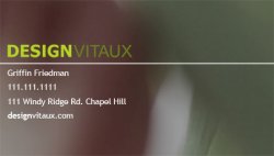
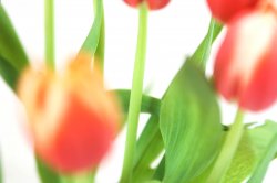
The background to the business cards is actually part of that flower image. I really want to link the two but I can't seem to get it to work out right. More fiddiling is in order I guess.
superninjagoat said:
Living in suburbia is very different for me than where I've lived previously. I don't dislike it, but it confuses the heck out of me. I'm showing my redneck upbringing here, but WTF do I need a neighborhood association for? It's my house, and if I want a fence and purple drapes in my front window, why is that the business of some dude who lives half a block away?
Suburbia scares the crap out me also. I grew up out in rural chatham county. Cary (and apex to some extent) really give me the creaps some times. Don't get me wrong, I think cary is a great place to raise kids, but personally, I could never live there. When I was little I dreamed of living in a real neighborhood, with friends that weren't a 20 minute car drive away. Cary has that. Now that I'm older I've learned to appreciate a more rural atmosphere.
superninjagoat said:
Can't wait to see how that comes out.
It didn't. It ended up being way to busy. That original picture just didn't lend itself to that idea. I think I'm just going to stick with the 19% grey. It grows on me the more I look at it.
superninjagoat said:
BTW, where did you get your design training?
I have had no design training at all. Its really a shame. I didn't appreciate art as much when I was in high school. I think I only took one true art class in high school... and it was required. That's the extent of my formal training.
I'm a science person (or at least I was). I'm currently a Biomedical Engineering major at Carolina. Lets just say my schedule doesn't leave much time for an art class, or really anything beyond physics, chem, calc, and bio.
My interests have been changing, and recently (at least with finals coming up) I've become disgusted with what I'm studying and really have no true interst in pursuing a career in science any further. This is really strange for me. It used to be I enjoyed spending my free time reading about science and working physics problems (heck... I even learned lightwave just so I could model an engine and learn the physics behind it). Nowadays I'd rather spend my time drawing or taking pictures.
I'm thinking of applying to the design school at state. I've heard its very hard to get into and I'm really doubting that my work is good enough. The whole process is kind of intimidating to someone with no formal art experiance.
superninjagoat said:
Also, what programs do you work in?
Right now I work primarily in Photoshop. I started playing around with it a few years ago and I really like it. I've been using Pagemaker for basic graphic design stuff, and have been forcing photoshop unwillingly into doing the more complicated stuff. I know Flash, but I try and use it only when absolutely neccessary. Beyond that I code everything by hand in a basic text editor.
I really want to learn indesign and illustrator this summer. I'm usually pretty quick at learning computer stuff, so hopefully it won't be that bad.
I think this summer's going to be great. I spent last summer working in a genetics lab (the whole science thing again) but I think I'm just going to devote this summer to building up my portfolio. I really want to apply to design school, but having not taken any really art classes, my current portfolio is kind of small and strange. Hopefully that'll change though.