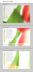
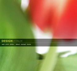
Become a MacRumors Supporter for $50/year with no ads, ability to filter front page stories, and private forums.
panoz7 said:
The background to the business cards is actually part of that flower image. I really want to link the two but I can't seem to get it to work out right. More fiddiling is in order I guess.

I got that they were linked. It doesn't matter that you can't "get" what the picture is in the card. It's an abstraction, so it's OK. The unifier is the abstract nature of the image and the typography. Also, I know someone else in the thread said they liked the color version of the card. (I said I liked the grayscale background.) Another reason for the grayscale card is that a commercial printer can produce it in two inks: black and green. The other would require a at least four-color process, and likely a fifth color of the green (that is, if you really want it to pop). Lots cheaper to go with the grayscale. BTW, if you're planning to print them yourself, don't. Cards are cheap – a couple hundred bucks for two-color for hundreds of them – and they so much better. You don't want you're calling card to say "cheap."

I have had no design training at all. Its really a shame. I didn't appreciate art as much when I was in high school. I think I only took one true art class in high school... and it was required. That's the extent of my formal training.

Design isn't about art. It's about presentation of information. Some artists are wonderful designers, but it doesn't have to be that way. So, I wouldn't worry about the lack of formal training.

I'm a science person (or at least I was). I'm currently a Biomedical Engineering major at Carolina. Lets just say my schedule doesn't leave much time for an art class, or really anything beyond physics, chem, calc, and bio.

My interests have been changing, and recently (at least with finals coming up) I've become disgusted with what I'm studying and really have no true interst in pursuing a career in science any further. This is really strange for me. It used to be I enjoyed spending my free time reading about science and working physics problems (heck... I even learned lightwave just so I could model an engine and learn the physics behind it). Nowadays I'd rather spend my time drawing or taking pictures.

I'm also a science guy. It helps me when doing medical illustrations and science pieces. It's great when I go talk to some scientist at Duke about genetics or cellular biology and they assume that I'm going to be some idiot, and I understand the basics of the subject and how his research fits into it. LOVE lightwave. I started picking it up about a year ago.

I'm thinking of applying to the design school at state. I've heard its very hard to get into and I'm really doubting that my work is good enough. The whole process is kind of intimidating to someone with no formal art experiance.

Go talk to a professor in the program with a selection of your five best clips. See what they say. Experience means a lot, but so does raw talent. If you'd like, you can send me some clips and I can critique. (You can IM me files. I'm MrDrennan on iChat (and AIM).)

I really want to learn indesign and illustrator this summer. I'm usually pretty quick at learning computer stuff, so hopefully it won't be that bad.

Yup, you've got to know the entire Adobe suit through and through. Quark Xpress wouldn't hurt, although it's becoming outmoded. Don't worry about speed yet, only mastery of at least 80 percent or so of what the program can do. Speed comes later. I reread the manuals of all my industry standard aps at least once a year. That helps ensure that I remember the capabilities of the programs when I need to use a super-obscure feature. But, then again, I'm a dork.
 
ATD said:
I would not worry about that. I had art classes all through high school and college but I didn't get good design training until I was in upper division college (BTW my minor was physics). You are way ahead of where I was at your age. Keep posting here, we will get your portfolio in shape.:D

Thanks for the comments and encouragement. I really appreciate it.

superninjagoat said:
Go talk to a professor in the program with a selection of your five best clips. See what they say. Experience means a lot, but so does raw talent. If you'd like, you can send me some clips and I can critique. (You can IM me files. I'm MrDrennan on iChat (and AIM).)

Thanks for the offer. Finals are next week and I'm trying to force my self to stay off of AIM, facebook, and MR till theyre done (I haven't been too succesful with that last one though :) ). I'll probably take you up on your offer once schools out. Thanks again.

I've been playing around with desings for the internal pages. I decided to try and keep the site unified as some of you guys suggested. I've created basic templates for two of the internal pages. They each have a different crop of the original flower image used on the homepage. I'm hoping that by doing this I'll unify the site while creating further intrigue. Probably getting a little bit ahead of myself with that one...

Anyway, I attatched my mockup showing the page templates and the background color I settled on.

here ya go... (oh yeah, ignore the text... it was just the first thing I thought of)
 

Attachments

  • vitauxdesignmockup.jpg
    vitauxdesignmockup.jpg
    169.5 KB · Views: 137
panoz7 said:
I've been playing around with desings for the internal pages. I decided to try and keep the site unified as some of you guys suggested. I've created basic templates for two of the internal pages. They each have a different crop of the original flower image used on the homepage. I'm hoping that by doing this I'll unify the site while creating further intrigue. Probably getting a little bit ahead of myself with that one...

Anyway, I attatched my mockup showing the page templates and the background color I settled on.


Nice, I like it.

3 comments if I may

1 Start working in the images of work and see if it still holds together.

2 Get the pages up to real viewing size in a web browser. My guess is the body copy is a bit larger than it needs to be.

3 A theme is important in that a site should feel like a whole. It does not have to be overt, just enough to for the viewer to feel they are within the same site when jumping for page to page. What you have there is nice but any theme can box you in. If your site grows to a lot of pages it may get harder to keep it fresh with the one image. Again, what you have there is nice, play it out to see if it can carry the full site.
 
panoz7 said:
[...]here ya go... [...]
Now you're on to something... ;)

I like the grey better and removing the thin white border did wonders...

Are you making business cards in the same style...? I think the background from both "page 2" and "page 3" would be excellent as backgrounds for a business card...
 
I think it looks really nice. Perhaps a darker border between the main area and the 18% grey?

I also like the darker grey of the original. I'm partial to darker greys and simplicity, myself. I really find that the dark grey really sets off against the colour photos I have. Not sure what I'd do with b/w photos.
 
My apologies for reviving a dead thread... I figured it was better then starting a new one on a similar topic. When I first posted a few months ago I was just starting the design and development of a new portfolio site.

This summer has been busier then I planned and I've only recently been able to find some free time to work on it. I gave up on the original design (at least for the internal site). It was too difficult to maintain a theme throughout the pages while effectively displaying the content, especially on the portfolio pages. I've done a bit of work the past few days and come up with some new ideas.

Here's a link to the web portfolio page template I've set up. None of the links work yet, its just a first attempt at converting it from photoshop to html.

http://bumblebeedesign.org/dv/home.php

I'd love your opinions and criticisms of the new design. I'd also be interested in how you think it compares to the original.

I haven't made up my mind yet on what to do with the home page. Do you think I should go with what I had or work with something based on the new design... perhaps the web portfolio site without the web portfolio stuff (just the leaf, logo, and links)?

Thanks for your help, and feel free to be harsh.
 
panoz7 said:
My apologies for reviving a dead thread... I figured it was better then starting a new one on a similar topic. When I first posted a few months ago I was just starting the design and development of a new portfolio site.

This summer has been busier then I planned and I've only recently been able to find some free time to work on it. I gave up on the original design (at least for the internal site). It was too difficult to maintain a theme throughout the pages while effectively displaying the content, especially on the portfolio pages. I've done a bit of work the past few days and come up with some new ideas.

Here's a link to the web portfolio page template I've set up. None of the links work yet, its just a first attempt at converting it from photoshop to html.

http://bumblebeedesign.org/dv/home.php

I'd love your opinions and criticisms of the new design. I'd also be interested in how you think it compares to the original.

I haven't made up my mind yet on what to do with the home page. Do you think I should go with what I had or work with something based on the new design... perhaps the web portfolio site without the web portfolio stuff (just the leaf, logo, and links)?

Thanks for your help, and feel free to be harsh.


Nice work. I can see you were paying much more attention to your type now. Letter spacing, leading, size relationships, grouping, negative space, playing within a single type family and working the grid are whats needed to make your work look professional. Thats the difference between learning computer programs and learning design. A couple of things, 1) perhaps a little more play in the size relationships of the elements, maybe leave the type the same size but increase the size of your upper left element. A big vs small type of play. 2) Not sure if the vertical type works yet. I like that you are being playful with the grid, maybe the type rotates to the horizontal when you do the rollover or appears somewhere else and it's more readable. Maybe flush left to the images and rotated 180 (reading up) instead of centered... play with it. 3) I was hoping to see the rest of the links.


BTW some your your earlier layouts were good too, they had some nice energy to them. Combine that energy with great type sense and you have nailed it. Sorry for the double post.

 
I like the design very much.

I also enjoy that you are designing for non-profits and such. This is actually a great idea, and think I am going to start offering this too. Not to bog this thread down, but do you just do designs, or do you host as well? Or how are the hosting fees taken care of? Just interested. :D
 
ATD said:
1) perhaps a little more play in the size relationships of the elements, maybe leave the type the same size but increase the size of your upper left element. A big vs small type of play.

I've played around with this and can't seem to get it to work. If I increase the size the leaf becomes too overwhelming and the site no longer looks balanced. I also tried selecting other parts of the leaf, but I just can't seem to get it to work.

ATD said:
2) Not sure if the vertical type works yet. I like that you are being playful with the grid, maybe the type rotates to the horizontal when you do the rollover or appears somewhere else and it's more readable. Maybe flush left to the images and rotated 180 (reading up) instead of centered... play with it.

That stupid text has been a real pain. I decided that legibility in this case wasn't all that important, and that the text should just serve as a further visual delineator between the links. Its also there to break up the white space below. I'm going to lighten them up a bit so they aren't so dominating though. I hadn't thought about the flush left thing, and I'm definitely going to give it a try.

ATD said:
3) I was hoping to see the rest of the links.

I'll have the rest of them up soon. I just wanted to get the basic design set before I started coding the rest.

ATD said:
BTW some your your earlier layouts were good too, they had some nice energy to them. Combine that energy with great type sense and you have nailed it. Sorry for the double post.

I'm going to try and combine those two in the new home-page design. I've decided that the home-page should be bright and colorful and the interior pages should be fairly minimalistic so that they don't distract the viewer from the portfolio work.

I've attached my new design for the home-page.

bwanac said:
I also enjoy that you are designing for non-profits and such. This is actually a great idea, and think I am going to start offering this too. Not to bog this thread down, but do you just do designs, or do you host as well? Or how are the hosting fees taken care of?

The non-profit thing never took off like I wanted it to. Most of the local charities and organizations either already had members who performed most of the web design work or preferred that my time was donated in other ways. I helped out with on occasion when they ran into problems, but never had the opportunity to really help like I wanted to.

I do the hosting for free. I have a VPS with a company called west-host. It doesn't cost me much to host an additional site and is usually simpler then trying to have a client select and pay for a proper hosting package. So far I haven't had any real problems, but my server does seem to be slowing down so I'm considering switching to another host... that's for another thread though.
 

Attachments

  • DVinteior.jpg
    DVinteior.jpg
    72.3 KB · Views: 98
Register on MacRumors! This sidebar will go away, and you'll see fewer ads.