Got a tip for us?
Let us know
Become a MacRumors Supporter for $50/year with no ads, ability to filter front page stories, and private forums.
Ugliest Apple icon?
- Thread starter chumawumba
- Start date
- Sort by reaction score
You are using an out of date browser. It may not display this or other websites correctly.
You should upgrade or use an alternative browser.
You should upgrade or use an alternative browser.

Although I really do like the iOS 7 icons (for the most part), I do not like the safari icon. The new settings icon could be revamped too
I wouldn't know which one to pick
 , so I pick them all.
Game Center by a country mile.
Last edited:

I'm casting a vote for the app store icon.

It's an ugly 'A' created out of old school analog art tools.
The app store is filled with an incredible variety of digital tools—which this icon fails to express.
It's an ugly 'A' created out of old school analog art tools.
The app store is filled with an incredible variety of digital tools—which this icon fails to express.
The app store is filled with an incredible variety of digital toolswhich this icon fails to express.
That is the best and most insight thought for the Appstore icon I've heard, seriously. Thinking about it the icon isn't representative of its primary usage.
ITunes and the App store icons. That's why I replaced them.
How?

Game Center by a country mile.
Agreed. That's the one icon in iOS 7 I still can't accept.
That's the finder icon from Public Beta to Jaguar, it was changed to the modern one in Panther. It looks bad.


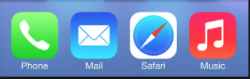
The new Safari icon looks out of place to me.
I still think it's funny that we identify "phone" with an old-fashioned phone shape. The problem with new phones is they're just rectangles that aren't as immediately identifiable as an old-school phone, so I understand why it's still being held onto as an icon.
I am wondering, however, how long that will last ... and what the icon will evolve into.
I'm casting a vote for the app store icon.
It's an ugly 'A' created out of old school analog art tools.
The app store is filled with an incredible variety of digital toolswhich this icon fails to express.
I'll second that. It's such an important icon and it's atrocious and misleading. Double fail.
----------
I still think it's funny that we identify "phone" with an old-fashioned phone shape. The problem with new phones is they're just rectangles that aren't as immediately identifiable as an old-school phone, so I understand why it's still being held onto as an icon.
I am wondering, however, how long that will last ... and what the icon will evolve into.
Same with email and the Mail icon.
Out of all the icons Apple has made, what do you guys think is the ugliest? I find this one rather appalling.
Image
How about that calendar icon? The new one.
It's just white with some text... lame.
Register on MacRumors! This sidebar will go away, and you'll see fewer ads.