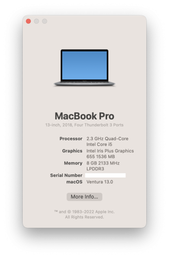
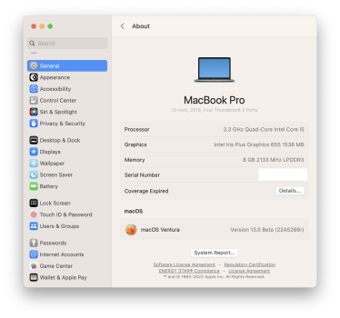
I agree with the point of view that the current app is not easy to navigate through due to the cluster of icons on the “home” view and the seemingly random order in which they appear and group different preference categories. I also think there is nothing inherently wrong with a sidebar as a stable navigational element. However, these things could have been added or improved without the overhaul of everything else.
The finer details and overall aesthetics still make me unhappy with the changes. This UI clearly borrows ideas from iOS/iPadOS that, in my opinion, are not a good fit. I dislike the push/pop navigation style where the right side of the window becomes its own navigation hierarchy that allows subpanes to be pushed completely over the right side and require a “Back” (strictly: “<”) button at the top to navigate back. This kind of navigation is rare on macOS. Instead it typically uses subviews that have tables, tabs and boxes to build a view hierarchy. I also dislike the reliance on generic table views to list all the settings on a pane, rather than individual designs as there are now to organise the settings. The noticeable distance between labels and toggles/buttons is bizarre too, the present UI keeps these together.
I think the app just lacks design. You can see that it was built with SwiftUI and that less attention to individual design was given over generic, reusable components.