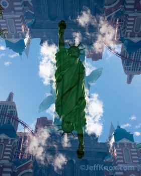
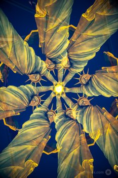
Laird Knox - Way to start it off with a bang. It’s very interesting and I’ve been trying to figure out exactly what you did here. In camera…Photoshop….both? Must be a reflection off of glass, I’m sure. The branch in the upper right is a bit distracting but overall it’s a very interesting and artistic image.
Alexander.Of.Oz - Very smooth background and nice isolation. I like the ants…I didn’t notice them at first. I would like to see the entire sprout in focus. I don’t do well with these kind of shots and I think people focus stack in order to get the entire subject in focus but still have lots of bokeh.
Miltz - Lovely light and a perfectly still lake. Has to be a morning shot. I like the composition as well and the lines lead you into the third. Well done.
Apple fanboy - Nice composition and I like the colors. I don’t mind the plant being out of focus but I’d like to see more of the bug. I can’t give to much feedback on macro shots. I struggle with them.
MacRy - Very nicely done. It looks like a forest on another planet. I may not know much about macro photography but this is a good one. I like that the subject is the dried curled bit but green obviously fills the image. Good depth of field.
pol0001 - Lovely scene but the branches are really getting in the way of the image. Please go back on a foggy morning when the sun is a bit lower (sans branches) and share the image with us.
cbrand493 - I like the thought of framing it through the cave (or whatever it is). I think the light was a bit unfortunate and kind of dulled everything out. I bet that algae really pops bright green when he sun is on it right.
Hughmac - Nice job and I like that the leaves are just hanging on to their green. The background is a bit busy but there’s not much you could’ve done about that.
ericgtr12 - The pattern and symmetry are pretty cool (though I think you could’ve shifted left like 6 inches maybe ! ) Plenty of green for the theme but white is really the subject of the image.
keno - I like the square frame for this. I like the composition and the bit of red. I’m thinking this image has had a good bit of sharpening done to it. Extremely shallow depth of field and the focus was on the leaf in the lower right or maybe the wind was blowing?
filmbufs - Lovely peaceful scene. Very spring like. I wish it had worked out where the leaves in the foreground completely blocked out the bright sky.
PunkRawkPurl - Welcome to the forum! Nice composition and good job on the blacks. Those waxy leaves are hard to not blast out so good job there too. My one critique is the shadow that cuts the leaf on the left makes the image a bit odd. Would’ve like to have seen the entire leaf in the image.
rx7dude - Plenty o green. Good depth of field for the subject. I’d probably try a bit different composition since for me the subject feels a bit cut off.
Thanks for all the entries and great job to everyone. I’m glad we got through the RGB contests. I don’t know if we ever made this a rule but I’m wondering if we should resist “liking” photos till after the judging. It might sway the judge a bit through popular opinion. Just a thought. Ah, well…on to it.
Honorable Mention - goes to PunkRawkPurl for her first contest entry (and a well done one at that)
2nd Place (Tie) - Laird Knox for a very creative take
2nd Place (Tie) - Miltz for great scene with lovely lines.
1st Place - MacRy for a really nice forest in miniature that I found captivating.
Congrats MacRy and over to you for the next one!


