Become a MacRumors Supporter for $50/year with no ads, ability to filter front page stories, and private forums.
Weekly Photo Contest (April 9th-16th)
- Thread starter Edge100
- Start date
- Sort by reaction score
You are using an out of date browser. It may not display this or other websites correctly.
You should upgrade or use an alternative browser.
You should upgrade or use an alternative browser.


My Entry - Torrey Pines State Park
I really liked the way that the sun played with the twisted trees at Torrey Pines

I really liked the way that the sun played with the twisted trees at Torrey Pines
The contest officially started at 3:46AM (GMT, I suppose) on April 10, so I'll keep it running for another 12 hours or so, just to make it a full 7 days. Get your entries in!
I didnt see any rules on the subject matter... If this pic is inappropriate i can submit another... Just let me know. ")


Comfortable...

Camera: Panasonic
Model: DMC-LZ8
ISO: 100
Exposure: 1/100 sec
Aperture: 3.3
Focal Length: 5.3mm
Camera: Panasonic
Model: DMC-LZ8
ISO: 100
Exposure: 1/100 sec
Aperture: 3.3
Focal Length: 5.3mm

And the winner is...
Before I begin the breakdown, let me say that as soon as I posted this topic, I regretted it; not because it's a bad topic, but because I just knew it would be difficult to judge. And it was. But everyone gave it a really great effort, and we do have a winner.
Here goes the breakdown:
Indydenny - I'm not getting much from this shot. Seem like a snapshot of a shadow; nothing wrong with it, but it's just not doing anything for me.
Gnd - This one is interesting. Again, a very literal interpretation of the topic, but the shadow does have a the ominous Freddy Krueger feeling to it. I wish it was taken a bit more straight on so that the stones ran perfectly horizontal, but otherwise this is a clever shot.
Telecomm - Again, a literal interpretation of the topic, which is fine. I'm not blown away by this, though, because it's really just your shadow. Would have liked to have seen something a bit more creative done with the shadow, as per Gnd's shot.
Freewayjim - Now we're starting to move away from a strict "here is a shadown" type of interpretation. I like your interpretation of the topic, but I'm not sure I know what you were trying to "say" with this shot.
imfrog2002 - I really like this. You really do get the sense that the shadowed subject is doing some very deep thinking by the babbling brook. Well done.
SLC Flyfishing - I like how the lines of the shadow lead my eye down the buildings; it's an interesting capture, but it's not saying a whole lot to me. Also, I don't know if it's just the saving for the web, but it looks oversharpened, which, paradoxically, makes some of the details hard to make out (at least for me).
Anubis - Beautiful. There's a conflict here in my mind; there's melancholy and happiness in this shot, but I can't explain why. Excellent use of shadows, and the film grain-type appearance really adds to the shot. The gift bag is right on the RoT node, which immediately draws my eye to it. Very nice.
luminosity - I'm conflicted here. I like the shot, but I feel it could be a whole lot better if you cropped out some of the extraneous stuff in the background. Less would be a lot more here (I'm thinking a tight crop around the shadowed couple and the tree).
WGR73 - Beautiful. His left eye is completely shadowed, which is very spooky. He's placed absolutely perfectly, and I love the reflection. It has a very "it was a dark and stormy night" feel to it. I also love the rich, warm colours. Very well done.
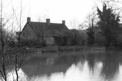
Ryan1524 - I have driven along this stretch of road many times (I live in Toronto), and I immediately recognized it. The processing has given it a very interesting texture; kind of like a "this is an abandoned road" feel (which I always get when I come to Hamilton anyway...no offence!). Unfortunately, the cars on the upper part of the shot ruin that feeling. So it would have been improved greatly if you had timed it such that there were no cars in the shot at all, but I know that isn't easy. Also, straighten the horizon.
Emotta - Love the desaturated colours. It would make a great "stock" shot for a magazine or website. The blown highlights are bothering me a bit, but overall I like what you've got here.
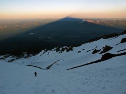
SUPERSTEVE9219 - An interesting shot. Clone out the "seam" along the equator of the moon, and I would have thought you shot this with a telescope or very long telephoto. And the shadow is an important part of the composition, which I was hoping for.
MaddMacs - I like this composition. Good leading lines with the shadows. Grey snow is one of my pet peeves, however; you need to add some exposure compensation for make sure the snow is white. I would have like to have seen this in HDR or at least with bracketed exposures, to make sure the snow was white and the highlights in the upper part of the shot weren't consequently blown out.
vicious1 - Cool effect. Made me do a double take. Again, a literal take on 'shadow', but you've been very creative with it, which I like. Well done.
Cara1001 - Very lucky capture. Nice. I'm not feeling the relation to 'shadows', though.
techie4life - Good capture. These are the types of shots that I sometimes miss completely because I'm looking at the subject, and not the light.
jbernie - This one doesn't do much for me. It's a fine snapshot, but I'm not feeling the 'vision' of the photo.
deep diver - Sometimes, I see photos where I love the post-processing, but the composition does nothing for me. This shot is the exact opposite. I really like what you've tried to capture; it's a spooky forest, and you don't know what's about to come after you from out of the shadows. But the PP just isn't doing it for me. It's not contrasty enough, and I don't like the straight-on illumination. You need to try to draw the viewers eye into the shadows a bit more with some vignetting or contrast adjustments or something. But again, nice idea and composition.
doubleohseven - again, not doing much for me. Move the lamp away from dead centre, crop out the black bar at the bottom of the shot, and give me some context of the shot.
mickbab - good capture, but you've cropped the far right shadow and the bird's head at the top. Otherwise a very good capture (I like that you've got down low to get it).
ClassicFan - This has a lot going for it. The juxtaposition of the Karnak statues with the people on the path is great, and I love that you've captured the people right in the gap between the shadows. The shot seems a bit OOF, though; could be from the web conversion??? I like this.
golfmaster - see my comments on doubleohseven's shot. They will be much the same for yours. I do like the intensity of the shadows here, but the composition just isn't doing it for me. Also, watch your white balance. Is your room really green?
Atomicfission92 - I really like this. Nothing takes away from the sillouette of the couple, and they're placed perfectly. The only thing I would have done is to clone out that post on the left, which kinda ruins the simplicity. But a nice shot, nevertheless. Well done.
AxisofBeagles - I like this a lot too. The shadow under the bridge is an important element, and it helps lead my eye across the shot. I don't like the B&W conversion, though, and I would have liked to have seen this in colour. The way you've done the conversion is just a bit too flat for me. That said, it's a great shot and very well done.
JDDavis - Similar to techie4life's shot, and something that I might ordinarily miss because I'm moving too fast to see it past the subject. If you had been there a fraction earlier (or later?), you might have caught the light such that the shadow didn't end above the horizon, but that's hardly your fault. Nice capture.
lucarelli - Beautiful. The only thing I would change is that I would have liked to have seen a bit more of the shadow itself. But the composition, capture, and PP are really great. Very well done.
Maxxamillian - More light painting, I see. I like this a lot. The shadows are obviously a big part of this, and that's what I was going for. Well done.
macgrl - Nice subject, but I would have liked to have seen a different B&W conversion; it's a bit flat. More contrast would have helped too.
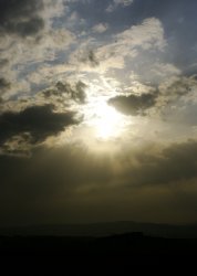
Chappers - Fantastic capture. I know how hard it is to shoot into the sun like this, and you've managed to do it, and avoid clipping the whole sky. Well done.
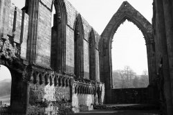
Mr. Ski 73 - Good capture. My eye is immediately taken through the hole in the Abbey wall, where I imagine stained glass would have been, once upon a time. A little more PP on this one, and I think you'd have a really great catpure; the background ladscape needs a bit more contrast, and I would have dodged and burned here and there for local contrast. But all of this is a bit picky. It's a great shot.
Rebrook - Another one that would have been a great "stock" shot. The shadow helps to lead my eye up the photo, which is nice. The cyan chromatic abberation is driving me crazy, though. But nevertheless, I like this a lot.
alt75 - Excellent. It's simple, and it lets the photo address the contest topic, without saying "here is a shadow". Very, very well done.
RabidBear - I too like the way the sun is producing these eerie shadows. My eye isn't really drawn to anything in particular; it's a bit abstract, which I think works given the subject. Good capture.
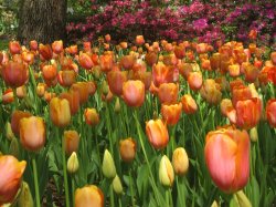
Tilpots - An ok photo, but I'm not at all sure how it relates to 'shadows'. Also, maybe it's just me, but I'm not getting a lot of the detail on the petals of the tulips. Coiuld be a web conversion issue.
HeadySpaghetti - This one is really good. It's a shame the bass player's legs are cropped, and I would have really boosted the contrast here to get deep, rich blacks, but I really like the shot nevertheless. Concert photography always amazes me, because I've tried it only once and I know how hard it is. Well done.
NeGRit0 - No issue with posting this from my point of view. I'm not a smoker (of anything...), but that's of no concern to me. I love the whisp of smoke; I would have tried to play that up a bit more in PP, to really emphasize it. The photo itself isn't doing a whole lot for me, though.
Fuzzy14 - Nice capture. Again, I like my landscapes a bit more contrasty, but that's just my style. Well done.
pdxflint - I really like this; I love how the shadows fall over the sleeping dog, and how they contrast with the stripes on the duvet. Well done.
strikeinsilence - Very interesting perspective, and I really enjoy the conversion here. This is really well done architecture/urban photography, which is my own primary style. Very well done.
So...
Overall, I thought these were really well done. Some of you took the topic literally, others interpretted, which was great. This was certainly difficult; there were several photos I thought deserved special recognition, but the prizes go to:
2nd Runner Up: strikeinsilence - I love the angle on this, and I have a soft spot for B&W architecture shots (especially when this well done). You've used the light and shadows very nicely.
1st runner up: anubis - Again, excellent use of shadows, and a very interesting photo that appears simple, but has layers, I think. Wonderful PP.
Winner: wgr73 - I simply loved this. You've made the shadow the absolute focal point of the photo, and I think that's the goal in these types of contests. Wonderful shot.
Great work, guys! This wasn't at all easy to judge; so many interpretations of the topic.
wgr73, the next contest is yours!
Before I begin the breakdown, let me say that as soon as I posted this topic, I regretted it; not because it's a bad topic, but because I just knew it would be difficult to judge. And it was. But everyone gave it a really great effort, and we do have a winner.
Here goes the breakdown:
Indydenny - I'm not getting much from this shot. Seem like a snapshot of a shadow; nothing wrong with it, but it's just not doing anything for me.
Gnd - This one is interesting. Again, a very literal interpretation of the topic, but the shadow does have a the ominous Freddy Krueger feeling to it. I wish it was taken a bit more straight on so that the stones ran perfectly horizontal, but otherwise this is a clever shot.
Telecomm - Again, a literal interpretation of the topic, which is fine. I'm not blown away by this, though, because it's really just your shadow. Would have liked to have seen something a bit more creative done with the shadow, as per Gnd's shot.
Freewayjim - Now we're starting to move away from a strict "here is a shadown" type of interpretation. I like your interpretation of the topic, but I'm not sure I know what you were trying to "say" with this shot.
imfrog2002 - I really like this. You really do get the sense that the shadowed subject is doing some very deep thinking by the babbling brook. Well done.
SLC Flyfishing - I like how the lines of the shadow lead my eye down the buildings; it's an interesting capture, but it's not saying a whole lot to me. Also, I don't know if it's just the saving for the web, but it looks oversharpened, which, paradoxically, makes some of the details hard to make out (at least for me).
Anubis - Beautiful. There's a conflict here in my mind; there's melancholy and happiness in this shot, but I can't explain why. Excellent use of shadows, and the film grain-type appearance really adds to the shot. The gift bag is right on the RoT node, which immediately draws my eye to it. Very nice.
luminosity - I'm conflicted here. I like the shot, but I feel it could be a whole lot better if you cropped out some of the extraneous stuff in the background. Less would be a lot more here (I'm thinking a tight crop around the shadowed couple and the tree).
WGR73 - Beautiful. His left eye is completely shadowed, which is very spooky. He's placed absolutely perfectly, and I love the reflection. It has a very "it was a dark and stormy night" feel to it. I also love the rich, warm colours. Very well done.
Ryan1524 - I have driven along this stretch of road many times (I live in Toronto), and I immediately recognized it. The processing has given it a very interesting texture; kind of like a "this is an abandoned road" feel (which I always get when I come to Hamilton anyway...no offence!). Unfortunately, the cars on the upper part of the shot ruin that feeling. So it would have been improved greatly if you had timed it such that there were no cars in the shot at all, but I know that isn't easy. Also, straighten the horizon.
Emotta - Love the desaturated colours. It would make a great "stock" shot for a magazine or website. The blown highlights are bothering me a bit, but overall I like what you've got here.
SUPERSTEVE9219 - An interesting shot. Clone out the "seam" along the equator of the moon, and I would have thought you shot this with a telescope or very long telephoto. And the shadow is an important part of the composition, which I was hoping for.
MaddMacs - I like this composition. Good leading lines with the shadows. Grey snow is one of my pet peeves, however; you need to add some exposure compensation for make sure the snow is white. I would have like to have seen this in HDR or at least with bracketed exposures, to make sure the snow was white and the highlights in the upper part of the shot weren't consequently blown out.
vicious1 - Cool effect. Made me do a double take. Again, a literal take on 'shadow', but you've been very creative with it, which I like. Well done.
Cara1001 - Very lucky capture. Nice. I'm not feeling the relation to 'shadows', though.
techie4life - Good capture. These are the types of shots that I sometimes miss completely because I'm looking at the subject, and not the light.
jbernie - This one doesn't do much for me. It's a fine snapshot, but I'm not feeling the 'vision' of the photo.
deep diver - Sometimes, I see photos where I love the post-processing, but the composition does nothing for me. This shot is the exact opposite. I really like what you've tried to capture; it's a spooky forest, and you don't know what's about to come after you from out of the shadows. But the PP just isn't doing it for me. It's not contrasty enough, and I don't like the straight-on illumination. You need to try to draw the viewers eye into the shadows a bit more with some vignetting or contrast adjustments or something. But again, nice idea and composition.
doubleohseven - again, not doing much for me. Move the lamp away from dead centre, crop out the black bar at the bottom of the shot, and give me some context of the shot.
mickbab - good capture, but you've cropped the far right shadow and the bird's head at the top. Otherwise a very good capture (I like that you've got down low to get it).
ClassicFan - This has a lot going for it. The juxtaposition of the Karnak statues with the people on the path is great, and I love that you've captured the people right in the gap between the shadows. The shot seems a bit OOF, though; could be from the web conversion??? I like this.
golfmaster - see my comments on doubleohseven's shot. They will be much the same for yours. I do like the intensity of the shadows here, but the composition just isn't doing it for me. Also, watch your white balance. Is your room really green?
Atomicfission92 - I really like this. Nothing takes away from the sillouette of the couple, and they're placed perfectly. The only thing I would have done is to clone out that post on the left, which kinda ruins the simplicity. But a nice shot, nevertheless. Well done.
AxisofBeagles - I like this a lot too. The shadow under the bridge is an important element, and it helps lead my eye across the shot. I don't like the B&W conversion, though, and I would have liked to have seen this in colour. The way you've done the conversion is just a bit too flat for me. That said, it's a great shot and very well done.
JDDavis - Similar to techie4life's shot, and something that I might ordinarily miss because I'm moving too fast to see it past the subject. If you had been there a fraction earlier (or later?), you might have caught the light such that the shadow didn't end above the horizon, but that's hardly your fault. Nice capture.
lucarelli - Beautiful. The only thing I would change is that I would have liked to have seen a bit more of the shadow itself. But the composition, capture, and PP are really great. Very well done.
Maxxamillian - More light painting, I see. I like this a lot. The shadows are obviously a big part of this, and that's what I was going for. Well done.
macgrl - Nice subject, but I would have liked to have seen a different B&W conversion; it's a bit flat. More contrast would have helped too.
Chappers - Fantastic capture. I know how hard it is to shoot into the sun like this, and you've managed to do it, and avoid clipping the whole sky. Well done.
Mr. Ski 73 - Good capture. My eye is immediately taken through the hole in the Abbey wall, where I imagine stained glass would have been, once upon a time. A little more PP on this one, and I think you'd have a really great catpure; the background ladscape needs a bit more contrast, and I would have dodged and burned here and there for local contrast. But all of this is a bit picky. It's a great shot.
Rebrook - Another one that would have been a great "stock" shot. The shadow helps to lead my eye up the photo, which is nice. The cyan chromatic abberation is driving me crazy, though. But nevertheless, I like this a lot.
alt75 - Excellent. It's simple, and it lets the photo address the contest topic, without saying "here is a shadow". Very, very well done.
RabidBear - I too like the way the sun is producing these eerie shadows. My eye isn't really drawn to anything in particular; it's a bit abstract, which I think works given the subject. Good capture.
Tilpots - An ok photo, but I'm not at all sure how it relates to 'shadows'. Also, maybe it's just me, but I'm not getting a lot of the detail on the petals of the tulips. Coiuld be a web conversion issue.
HeadySpaghetti - This one is really good. It's a shame the bass player's legs are cropped, and I would have really boosted the contrast here to get deep, rich blacks, but I really like the shot nevertheless. Concert photography always amazes me, because I've tried it only once and I know how hard it is. Well done.
NeGRit0 - No issue with posting this from my point of view. I'm not a smoker (of anything...), but that's of no concern to me. I love the whisp of smoke; I would have tried to play that up a bit more in PP, to really emphasize it. The photo itself isn't doing a whole lot for me, though.
Fuzzy14 - Nice capture. Again, I like my landscapes a bit more contrasty, but that's just my style. Well done.
pdxflint - I really like this; I love how the shadows fall over the sleeping dog, and how they contrast with the stripes on the duvet. Well done.
strikeinsilence - Very interesting perspective, and I really enjoy the conversion here. This is really well done architecture/urban photography, which is my own primary style. Very well done.
So...
Overall, I thought these were really well done. Some of you took the topic literally, others interpretted, which was great. This was certainly difficult; there were several photos I thought deserved special recognition, but the prizes go to:
2nd Runner Up: strikeinsilence - I love the angle on this, and I have a soft spot for B&W architecture shots (especially when this well done). You've used the light and shadows very nicely.
1st runner up: anubis - Again, excellent use of shadows, and a very interesting photo that appears simple, but has layers, I think. Wonderful PP.
Winner: wgr73 - I simply loved this. You've made the shadow the absolute focal point of the photo, and I think that's the goal in these types of contests. Wonderful shot.
Great work, guys! This wasn't at all easy to judge; so many interpretations of the topic.
wgr73, the next contest is yours!
Yes, thank you as well Edge for your comments. I really loved the shots people posted, some of you guys are AMAZING! There is a lot to learn in the world of photography, and you guys display a lot of knowledge!
This next weeks contest is up...Musical Instruments. Have a great day guys!
This next weeks contest is up...Musical Instruments. Have a great day guys!
Thank you and new thread has been posted
Edge100 - Thank you for your comments. I agreed with your evaluation of just about every image. That makes me take particular notice of your comments on my photo. I was going for a 1950's B-movie feel. Except for the lighting, I think I got that. Most of what I've been shooting in the last couple of years are gems and minerals, and religious and cultural artifacts. I've only ever taken vacation snap shot landscapes and I do almost no night photography. I have a lot to learn. Thank you.
Edge100 - Thank you for your comments. I agreed with your evaluation of just about every image. That makes me take particular notice of your comments on my photo. I was going for a 1950's B-movie feel. Except for the lighting, I think I got that. Most of what I've been shooting in the last couple of years are gems and minerals, and religious and cultural artifacts. I've only ever taken vacation snap shot landscapes and I do almost no night photography. I have a lot to learn. Thank you.
I don't like the B&W conversion, though, and I would have liked to have seen this in colour. The way you've done the conversion is just a bit too flat for me.
Thanks for taking the time to provide feedback on every photo. a tough job, for which we are all appreciative.
I agree about this photo being flat - but what is peculiar is that it is much more so when posted online. It was shot as B&W - using both a CPL filter and a red filter. When viewed on any of my screens (all calibrated) in Preview, CS2, iPhoto, or anything, it is much more sharp. But when I post the image online it seems to lose some of it's resolution. I get this with all my positings. sigh .. need to figure that one out.
BTW - was a hazy day, with noon sun. The colo(u)r shots I took are much less interesting than the B&W.
Thanks again Edge
Thanks for a great job, Edge100. I enjoyed reading your comments and going back and looking at the photos with your perspective. The winning shot was one I had noticed when it was posted on the POTD thread, and I agree with your take on it.
Congrats, wgr73. I just wanted to mention the guy in the shot reminds me of Trailblazer forward LaMarcus Aldridge (LA to us 'Rip City' fans... ) Very nice photo!
Congrats, wgr73. I just wanted to mention the guy in the shot reminds me of Trailblazer forward LaMarcus Aldridge (LA to us 'Rip City' fans...
) Very nice photo!
Register on MacRumors! This sidebar will go away, and you'll see fewer ads.