And The Winner Is...........
The contest is closed.
This is a great bunch of photographs. I am impressed by the many interpretations of the topic. Just a word about my criteria for judging this contest: My focus here was on the metaphor, meaning, and emotion I get from the image. In general and unless the image is technically poor, I give somewhat less attention than some other judges to the technical aspects of the photograph.
romanaz: I love this image. I see the contrast between the out of focus white mall and the clarity of the rusted cart buried in the pile as a commentary on the unfortunate prominence of homogenized merchandise and mass marketing. The colors of the cart really stand out against the bland shades of everything else.
heron88: When I first saw this image, I immediately thought of The Last Picture Show (1971; a coming of age film set in a small and dying Texas town). I get the sense of a lonely dry place. When I saw that it was a Minute Maid can, the connection ended. This would have worked much better for me if it were a Coke and Pepsi can.
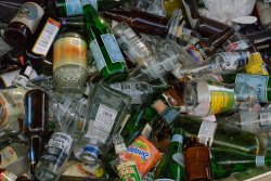
techie4life: I started out liking the form and color of this shot but nothing else. The more Ive looked at it the better I like it. The colors contrast very nicely. The bent rails of the barge add to the trashy feel. At the same time, the bottles look trashy but are not really trash also a nice contrast.
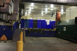
tomtomtom: I grew up in Philadelphia (the Northeast), so I was particularly interested in this image. There are a lot of elements that I really like: the one black cart among all of the blue, the one sheet hanging out, the way the posts match the slope of the ramp. I am not, however, getting any story or message from the image.
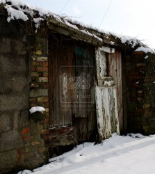
mattyb240: This is an outstanding image. There is interesting contrast between the cinder block which appears mostly intact, and the bricks and wood which clearly are not intact. I want to know all about this place. When was it built and for what purpose? Why is it not cared for. I see myself standing on the outside not sure if I should enter. Is it safe? Do people live there? What will I find? Great job.
Chappers: I like this. (It is similar to a lot of my work). The colors are rich and contrast well. I do get a sense of this as a potentially useful but overlooked item. Your reference to Fleming enhanced my experience of this image. The seamless white background suggests a sterile clinical setting that contrasts nicely against the mold.
chrisanderson: The image of the bird in flight is flat (gray on gray) and the framing does nothing for the picture. The second image is much more interesting. The birds strange posture is comical. Pelicans are scavengers. Technically your two images fit, but they say nothing about trash.
Cliff3: Ive spent a lot of time in train stop shelters. None of them ever looked this clean. I get a sense not only of actually looking into the shelter from the outside, but also wanting to look into the lives of the people that are no longer there. I want to know about that paper the date, headlines, etc. and I want to know about the person that left it there who was it, where did s/he go and why, how it will be used by the next person, etc. The angle and focus of the panel on the left are disturbing and distract from the image.
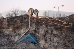
MaddMacs: I like this one very much. It is one of those images whose power is hard to put into words. The framing and the use of black and white are excellent. The debris and the empty train yard project desolation and decay. The snow is a strong element that adds to this overall mood, and it makes me wonder what else is in that pile.
AlexH: This picture doesnt do anything for me. The message of recycling is always important. While your picture shows those words, the message is missing. The framing exactly follows the rule of thirds, but technically good framing does not make the image. I just dont see anything that stimulates interest.
Edge100: I did not like this at all until I looked at the large version. Initially, I thought it was a very boring snap shot. I only got it after I saw Moliere. It brought back bad memories of high school French, and the strong urge I had to throw away both Moliere and Voltaire. Humor is often found in the subtle things. There are a lot of distracters the tree, bicycle shadow, and the pole. Overall, I dont think this picture works well.
jmdfd415: I like when something looks simple until you look deeper into it. That is my experience with this image. At first glance, it is just a nice picture of a slow stream. You only see the neglect when you look closer. This is a very nice image. The framing makes me feel like I am on the bank and it draws my eye down stream to the cleaner, but out of reach, water.
md2427: This image does not do work for me. The framing and the straight lines draw my eye down the street to the house with the red roof. The trashcan is so far down in the corner that I hardly see it. The image is too wide for the trash in the street to make any impact. I think I would have shot this as a much tighter image, probably from a low position, with the focus on the can and the blue shutters.
anubis: I like this image very much. It is a very well-executed landscape that captures an older time. In much of the world the old is respected. In the United States we tend to discard the old. This image is a strong reminder of that. Very nicely done.
RHVC59: I like this. It is very much like something I might have shot. I always marvel at how much form, color, and interest (and beauty????) can emerge from the chaos. I think I would have shot this even tighter, but that is a reflection of my own style rather than your photo.
nuwomb: I want to know what this building is. Everything about this place, even the advertisement, is trash. The flat gray color and the distortions add to that sense. I also like the contrast between the calm blue sky on the left and the dark ominous sky on the right.
NeGRit0: There are so many public service announcements that tell us that quitting smoking can be an act of love. This photo suggests how easy it is for us to discard both our health and love. This is a strong message, especially at this time of year. The out of focus area at the bottom, especially the heart, is an unpleasant distraction. The angle and framing are good. I would have shot this from further away with a longer lens to get better focus across the image.
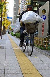
EugeneA: I dont get anything from this picture. It looks like a snapshot of the cyclist. The framing and composition are unremarkable and it does not leave me with any message.
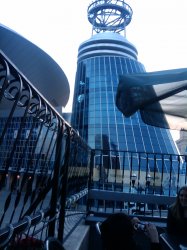
zman81: This image doesnt say anything about hockey, music, or trash. The shot is blurred (it looks like that is from camera motion), the umbrella and railing are distracters, and the couple at the bottom add nothing. The glass building could be the subject of a study of form, purpose, structure, and color.
mikekelley: I think this was probably a great structure to shoot, but this photo doesnt do it. The structure only adds a lot of black. If this were composed and framed differently, it might have made an interesting silhouette. The sunset might have added something if the colors were not so flat. A different exposure or time of day might have shown us something of the structure. I certainly dont know how much would come out but you might want to run it through Photoshop or Aperature.
rost12: This café looks like a lot of places I been to in the Middle East. Looking at this makes me wonder why I ate at those places. Initially, my eye is drawn to the sign, but then the trash draws down my attention. It is a great example of the kind of movement that can exist in a single frame. The ironic element is that a real oasis is a place of beauty. Everything about this image works for me. Well done.
Choosing was really hard, but here goes:
1st place: mattyb240
2nd place: anubis
3rd place: rost12
honorable mention: romanaz, techie4life, Chappers, MaddMacs, jmdfd415, RHVC59


") )
)