Contest is closed.
Thanks to all the entrants for bringing out a wide range of photos addressing the theme. I hinted at what the judging would be based on and the winners certainly did that, both in story and excellent artistic elements. I enjoyed the submissions in their choice of subject and theme. The blending of a story with an interesting image is what I was looking for here. Please consider these comments as critique relative my own personal taste and interpretation, which is likely different than your intent.
MacRy nice concept using the window as a frame for the scene, but no object of interest in focus. So that means that the window itself is the object of interest and no detail except for the brick.
Chappers Interesting subject with lots of detail. No central focal point and simplistic framing of the object, small tonal range on the building and shadows. This could use some processing to bring out the details such as the statues in the alcoves.
Stillcrazyman Great subject matter and outstanding title. The Christmas tree is distracting. This photo would be improved slightly by staging so that the map is on the wall that the desks are facing, giving flow to the lines and a secondary object of interest.
Needfx Model is posed as if not using the camera, interesting since it is no longer an action photo. Good call removing the eyes. Camera off-center and facing to left gives composition tension. The detail in the dress is a good contrast to the black of the camera.
Goftrey Subject matter draws interest but black shape dominates too much. Is the plant supposed to be part of the scene? Maybe it is my calibration but the greenish cast to the rocks is not in context with the stone walls.
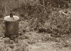
Kenoh - Sepia tone is too washed out (not enough tonal range) and white object to right is out of place. Subject is in unusual frame position and details in background dont enhance the context.
Themumu Weird object in strange location certainly evokes a story. Very little compositional interest with even framing and dead center. Title is good, If a sax falls in the forest?
Robotti Interesting subject in a static pose, more like a document photo with no story. Details are there but little interest unless you like ship rigging.
HantaYo This subject has potential. Post processing needed to bring out the truck against the background due to its unfortunate colour. Uninteresting composition with no real tension, subject is framed evenly when the cab is much more interesting than the rusted bed members.
Jkramerbob Entrances are always inviting to the world beyond but no doorway. White domination of the right side a little too strong. A little more of the building would give context to the condition of the sign. Good angle to capture the details in frame and big enough to see.
JDDavis Good subject and composition. Well graded from sky to ground covering tonal range. Unfortunate that graphical element of the fence does not match any of the lines of the barn. Repeating pattern of mountain peaks, treeline and rooftop is what makes this photo.
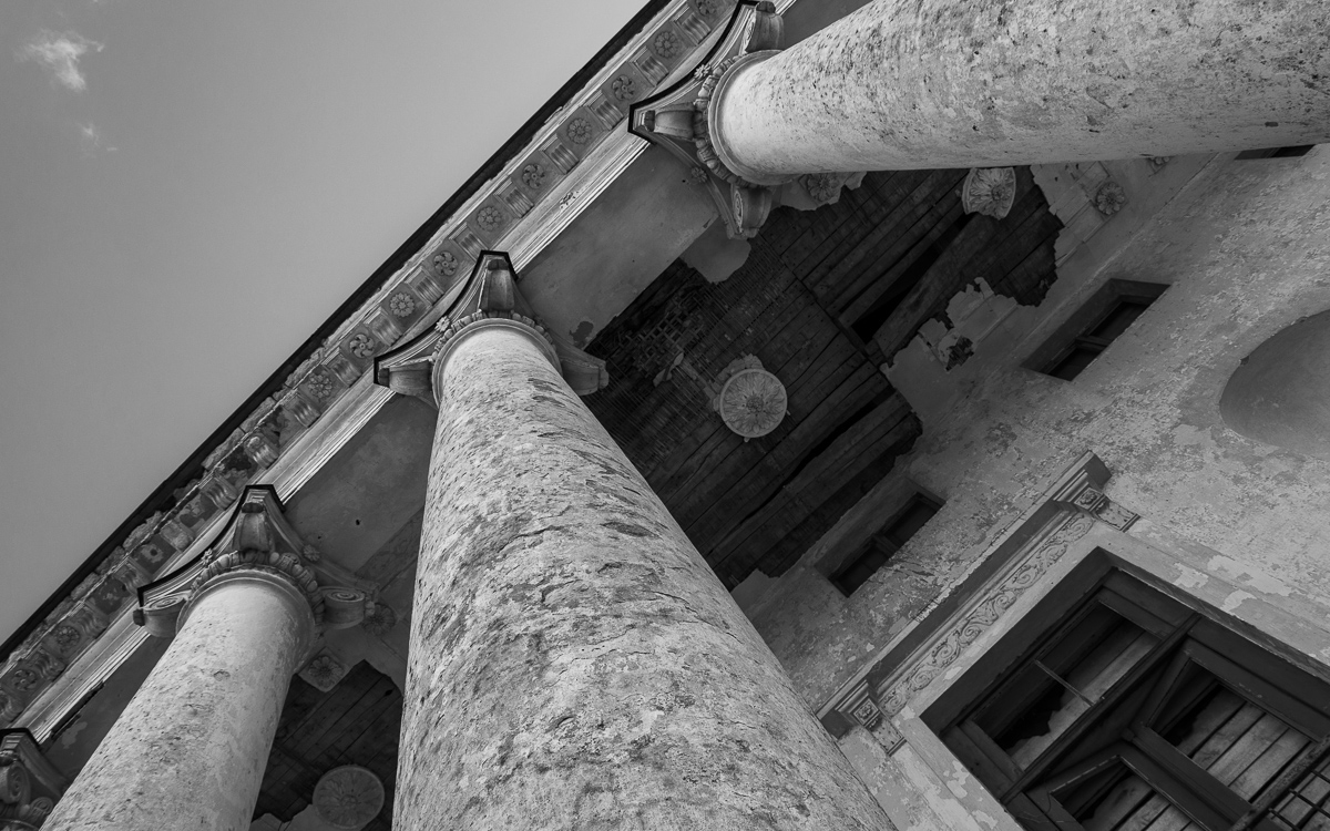
Berlepsch An exercise in leading lines. What do they point to? The cornice has detail but too small to see.
charpi confusing elements with tiny person drawing the attention. With some kind of write up this image would have context but does not tell a story alone.
AlexH good balance and subject is interesting. Storyline of the car is somewhat lost due to obvious staging in an artificial pose.
Apple fanboy Good tonal range and composition. Choice of angles well presented, and good flow to skyline against the buildings. Intact house to left gives context to the ruins.
Salacious - While the subject matter of the statues tells a story, an image of the statues alone does not.
fireman32 this photo has been entered before, which doesnt mean its not a good photo. My comments are similar to earlier opinions.
Thebro20 good subject and composition for the falls, whites are blown which removes the sense of flowing water since it looks more like snow. The waterwheel is far off to the side without leads so it appears extraneous. Good graphical elements overall but subject should be more in frame.
Hughmac Interesting texture of the wall with good depth of field offset against modern clock without context. Composition is supposed to be symmetrical? Flagpole is off center as is clock and centerline of building. A small amount of processing would correct the imbalance.
3rd Place JDDavis Classic landscape well executed.
2nd Place Needfx Captured the theme in a visually simple setting, providing contrast in both theme, texture and complexity. Only downside is no strong back story to the photo.
1st Place Stillcrazyman Artistic elements, story line and well presented.
Thanks again.


")