Got a tip for us?
Let us know
Become a MacRumors Supporter for $50/year with no ads, ability to filter front page stories, and private forums.
Weekly Photo Contest: July 21-28 (Entrance)
- Thread starter Parkin Pig
- Start date
- Sort by reaction score
You are using an out of date browser. It may not display this or other websites correctly.
You should upgrade or use an alternative browser.
You should upgrade or use an alternative browser.
Contest closed.
Another superb selection of entries, and another nightmare trying to sort out a winner. I added attachments of modified versions of two I particularly liked. I hope the original photographers won't be offended - I just wanted to illustrate what I meant in my comments.
AlexH - This one caught my eye when you posted it in POTD. A very cute little house, albeit in need of a little TLC, with an entrance just begging to be explored. Well composed, and you’ve handled the difficult backlit exposure well.
pmxperience - I can’t imagine this would work half as well in colour - b&w was definitely the way to go. I like the way the cigar smoke adds more beard. Great DOF, retaining just the right amount of detail on the background.
truttray - You are about to enter another dimension. A dimension not only of sight and sound, but of smell. You’ve just crossed over into….. the Toilet Zone!
Well composed, with the door open just the right amount, and a nice silver efex effect. A good interpretation of the theme.
fireman32 - This is beautiful, and looks like some degree of personal risk was involved in its creation. The title ‘Fire Portal’ says it all. This one jumps out of the screen. Perhaps you could explain how you created this?
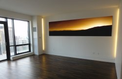
JDDavis - Lovely simple colour graduation here. I felt there was too much black which detracted from the rich colours above, so I experimented with cropping on this. For my taste (and this is only my opinion), it looks fabulous as a panorama with just the lower third in black and would look great on a wall (see attachment).
Indydenny - One of the things I love about the photography threads on MacRumors is the opportunity to see other parts of the World, different styles of architecture, and inspirations for places to visit. Your photo had me doing a little research, so I’m guessing this is the Temple in Haifa? Most of the pictures on the web are taken from below, so I’m not 100% sure. The one thing I’d like to change with this photo is for it to be bigger - I feel like we’re missing out on more rich detail on all four sides. I presume this is a lens/accessibility limitation, but it looks like a spectacular view.
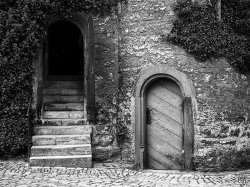
sea dragon - I like the quirky simplicity of this. The Yin and Yang of open and shut doors. I can’t help but feel this picture would work better in b&w though (see attachment)
MacRy - Stunning b&w with superb contrast. An excellent capture in what looks like very difficult lighting conditions. It has the air of brainwashed humans being drawn to the light of an alien craft - but that’s rush hour in the capital for you.
themumu - Looks like this stopped being an entrance long ago. Lovely colours, and my ‘coffee shop wall’ choice for this contest. The only thing I would change is the perspective to keep the door edges parallel.
Alexander.Of.Oz - Good composition. The vignette assists the walkway to lead the viewer into the picture. I like the silvery filter - it makes the beach look cold, although I guess it’s winter down under right now so that’s probably appropriate.
Hughmac - Food goes in here, and you picked up on the use of entrance as a verb which I deliberately missed off the description for this week’s contest to see if anyone would pick up on it, so congratulations for that. Good photo, though I feel it would have been greatly improved had the corners of the mouth not been cropped.
deep river - Nicely layered photo - I like the out of focus ‘frame’ here, and you clearly threw down the gauntlet for the number of layered entrances, which was swiftly picked up by our next contestant…
someoldguy - a classic shot - all the better for the consistent illumination throughout the arches.
kingalexthe1st - An excellent shot that demands the HDR treatment. A place I’d love to visit, and even more so after seeing your photo.
LongSticks - Good use of selective colour, and I like the idea that the primates are probably just as entertained by the public as we are by them. I don’t know if space allowed for the left pillar to be fully in the picture, but I’m guessing there’d have been too much empty sky if you’d have gone for a shot more central to the entrance?
needfx - I’m guessing this is a subtle(?) hint to encourage entries for the current Two/One contest? A good photo which draws the viewer in to try and work out exactly what they’re seeing, whilst also creating a slightly surreal interpretation of this week’s theme.
soulreaver99 - Good choice of colour which gives the picture a dated look, as does the simplistic building. It looks like a poorly stocked, but nonetheless popular calendar shop. Intriguing.
Apple fanboy - A dragon and a lion - somewhere near the Welsh border I presume? Probably not on the Welsh side or the lion would likely have been disfigured in some way. A good solid, well composed interpretation of this week’s theme.
jkramerbob - A creatively unusual view of this very well known landmark. There are probably very few photographs of the Lincoln memorial that don’t include the man himself. I like the variation of light on each column.
Ish - A quaint little entrance to a country retreat. Throwing the near bush out of focus has given a nice depth here.
Badrottie - Beautiful building, and I like the inscription just above the library name. I would have tried to bring the exposure down a notch, and maybe include the top of the central tower if space allowed.
Thanks to everyone who entered - another great variety of ideas and interpretations.
So to this week's top 3. Putting these three in order was the hardest part - all exceptionally good photos...
3rd place goes to fireman32
2nd place goes to pmxperience
1st place goes to MacRy
P.S.
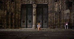
gasworks - I had just closed the contest but as you caught me just before I shut down for the night, and with such a great shot, it seems only right to include you. Great photo, an interesting and detailed doorway with subdued colours. The lady adds both a playful splash of colour, and perspective as to the size of the entrance. Setting the camera on the floor has given a lovely varying focus lead-in to the scene. If I were to change one thing, I would subdue or remove the colour from the sign on the right, to leave the lady as the sole splash of colour. The lighting is superb.
Another superb selection of entries, and another nightmare trying to sort out a winner. I added attachments of modified versions of two I particularly liked. I hope the original photographers won't be offended - I just wanted to illustrate what I meant in my comments.
AlexH - This one caught my eye when you posted it in POTD. A very cute little house, albeit in need of a little TLC, with an entrance just begging to be explored. Well composed, and you’ve handled the difficult backlit exposure well.
pmxperience - I can’t imagine this would work half as well in colour - b&w was definitely the way to go. I like the way the cigar smoke adds more beard. Great DOF, retaining just the right amount of detail on the background.
truttray - You are about to enter another dimension. A dimension not only of sight and sound, but of smell. You’ve just crossed over into….. the Toilet Zone!
Well composed, with the door open just the right amount, and a nice silver efex effect. A good interpretation of the theme.
fireman32 - This is beautiful, and looks like some degree of personal risk was involved in its creation. The title ‘Fire Portal’ says it all. This one jumps out of the screen. Perhaps you could explain how you created this?
JDDavis - Lovely simple colour graduation here. I felt there was too much black which detracted from the rich colours above, so I experimented with cropping on this. For my taste (and this is only my opinion), it looks fabulous as a panorama with just the lower third in black and would look great on a wall (see attachment).
Indydenny - One of the things I love about the photography threads on MacRumors is the opportunity to see other parts of the World, different styles of architecture, and inspirations for places to visit. Your photo had me doing a little research, so I’m guessing this is the Temple in Haifa? Most of the pictures on the web are taken from below, so I’m not 100% sure. The one thing I’d like to change with this photo is for it to be bigger - I feel like we’re missing out on more rich detail on all four sides. I presume this is a lens/accessibility limitation, but it looks like a spectacular view.
sea dragon - I like the quirky simplicity of this. The Yin and Yang of open and shut doors. I can’t help but feel this picture would work better in b&w though (see attachment)
MacRy - Stunning b&w with superb contrast. An excellent capture in what looks like very difficult lighting conditions. It has the air of brainwashed humans being drawn to the light of an alien craft - but that’s rush hour in the capital for you.
themumu - Looks like this stopped being an entrance long ago. Lovely colours, and my ‘coffee shop wall’ choice for this contest. The only thing I would change is the perspective to keep the door edges parallel.
Alexander.Of.Oz - Good composition. The vignette assists the walkway to lead the viewer into the picture. I like the silvery filter - it makes the beach look cold, although I guess it’s winter down under right now so that’s probably appropriate.
Hughmac - Food goes in here, and you picked up on the use of entrance as a verb which I deliberately missed off the description for this week’s contest to see if anyone would pick up on it, so congratulations for that. Good photo, though I feel it would have been greatly improved had the corners of the mouth not been cropped.
deep river - Nicely layered photo - I like the out of focus ‘frame’ here, and you clearly threw down the gauntlet for the number of layered entrances, which was swiftly picked up by our next contestant…
someoldguy - a classic shot - all the better for the consistent illumination throughout the arches.
kingalexthe1st - An excellent shot that demands the HDR treatment. A place I’d love to visit, and even more so after seeing your photo.
LongSticks - Good use of selective colour, and I like the idea that the primates are probably just as entertained by the public as we are by them. I don’t know if space allowed for the left pillar to be fully in the picture, but I’m guessing there’d have been too much empty sky if you’d have gone for a shot more central to the entrance?
needfx - I’m guessing this is a subtle(?) hint to encourage entries for the current Two/One contest? A good photo which draws the viewer in to try and work out exactly what they’re seeing, whilst also creating a slightly surreal interpretation of this week’s theme.
soulreaver99 - Good choice of colour which gives the picture a dated look, as does the simplistic building. It looks like a poorly stocked, but nonetheless popular calendar shop. Intriguing.
Apple fanboy - A dragon and a lion - somewhere near the Welsh border I presume? Probably not on the Welsh side or the lion would likely have been disfigured in some way. A good solid, well composed interpretation of this week’s theme.
jkramerbob - A creatively unusual view of this very well known landmark. There are probably very few photographs of the Lincoln memorial that don’t include the man himself. I like the variation of light on each column.
Ish - A quaint little entrance to a country retreat. Throwing the near bush out of focus has given a nice depth here.
Badrottie - Beautiful building, and I like the inscription just above the library name. I would have tried to bring the exposure down a notch, and maybe include the top of the central tower if space allowed.
Thanks to everyone who entered - another great variety of ideas and interpretations.
So to this week's top 3. Putting these three in order was the hardest part - all exceptionally good photos...
3rd place goes to fireman32
2nd place goes to pmxperience
1st place goes to MacRy
P.S.
gasworks - I had just closed the contest but as you caught me just before I shut down for the night, and with such a great shot, it seems only right to include you. Great photo, an interesting and detailed doorway with subdued colours. The lady adds both a playful splash of colour, and perspective as to the size of the entrance. Setting the camera on the floor has given a lovely varying focus lead-in to the scene. If I were to change one thing, I would subdue or remove the colour from the sign on the right, to leave the lady as the sole splash of colour. The lighting is superb.
Attachments
Last edited:
sea dragon - I like the quirky simplicity of this. The Yin and Yang of open and shut doors. I can’t help but feel this picture would work better in b&w though (see attachment)
Thanks Parkin Pig! I appreciate your comments. You know, I was thinking of doing b&w but kept going back and forth. I should have listened to my gut instinct. You're version definitely looks better. BTW, the closed door apparently goes down to a dungeon under the castle so the monochromatic look is even more appropriate.
Congrats to the winners!
")
Last edited:
Well done to the winners, and good job PP with the helpful critique.
So many great photos here, and lots of interpretations of the theme.
Looking forward to the next...
So many great photos here, and lots of interpretations of the theme.
Looking forward to the next...
Weekly Photo Contest: July 21-28 (Entrance)
Wow thanks for the first place. I don't envy you judging this week with so many great shots. I felt sure that pmxperience or someoldguy would win this one.
I was pretty early in St Pancras for that shot so it wasn't as busy as usual which gave me the opportunity to get more of the floor in the shot which I think think benefitted. You're right about the brainwashed human part as it made me think of zombies trudging towards the light.
New challenge is up and running.
Last edited:
Parkin' Pig, that's a great amount of good feedback for us all. Well done to all that entered, good to see some outside the box thinking amongst it all.
Felicitations fireman32, pmxperience & MacRy for stunning images, and kudos to PP for that extensive amount of analysis!
..and yes, it was a hint apologies for guerrilla marketing in your thread
..and yes, it was a hint
apologies for guerrilla marketing in your threadJDDavis - Lovely simple colour graduation here. I felt there was too much black which detracted from the rich colours above, so I experimented with cropping on this. For my taste (and this is only my opinion), it looks fabulous as a panorama with just the lower third in black and would look great on a wall (see attachment).
Thanks Pig and thanks for the mock up of the photo on someone's wall. I can only assume that someone was a fabulously wealthy art collector who enjoys paying exhorbitant prices for unkown pieces.
It actually looks really nice like that. I'm not sure if the blacks would print that well that large but I like the crop and agree with your comments. Thinking back I remember messing with different crops and there may be a 16:9 version of it in Aperture. I'll definitly go back and have another look at it.
Congrats to the winners and needfx I liked the color and symmetry in your shot.
Many excellent entries this week. Thank-you Pig for the time and effort to review each photo. I really liked pmxperience & MacRy as well!
Congratulations MacRy, that was a great shot, and well done everyone! Thanks PP for all the comments. They were dead on time and the next contest is up alreadythat must be one of the fastest transitions to the next contest I've seen!!
You're right PP, that's the Shrine of the Báb on Mount Carmel in Haifa. There are 19 terraces from the top to the bottom of the mountain and the Shrine is on the middle one. If you're interested in different styles of architecture, have a look at the Bahá'í temple in India.
Indydenny: were you on pilgrimage there or taking in the gardens as part of a holiday?
Indydenny - One of the things I love about the photography threads on MacRumors is the opportunity to see other parts of the World, different styles of architecture, and inspirations for places to visit. Your photo had me doing a little research, so Im guessing this is the Temple in Haifa? Most of the pictures on the web are taken from below, so Im not 100% sure. The one thing Id like to change with this photo is for it to be bigger - I feel like were missing out on more rich detail on all four sides. I presume this is a lens/accessibility limitation, but it looks like a spectacular view.
You're right PP, that's the Shrine of the Báb on Mount Carmel in Haifa. There are 19 terraces from the top to the bottom of the mountain and the Shrine is on the middle one. If you're interested in different styles of architecture, have a look at the Bahá'í temple in India.
Indydenny: were you on pilgrimage there or taking in the gardens as part of a holiday?
Wow thanks for the first place. I don't envy you judging this week with so many great shots. I felt sure that pmxperience or someoldguy would win this one.
I was pretty early in St Pancras for that shot so it wasn't as busy as usual which gave me the opportunity to get more of the floor in the shot which I think think benefitted. You're right about the brainwashed human part as it made me think of zombies trudging towards the light.
New challenge is up and running.
Congrats Mac - nice use of a busy station I know well!
Thanks for the comment PP
Thanks so much for third place. This shot was done with some steel wool in a wisk attached to a dog leash. The steel wool lights very easily. I set my camera on bulb mode and remote triggered the shutter and then lit the steel wool on fire and started spinning it while walking back from the camera. You can get anywhere from a few seconds up to 30 seconds of fire. I shot this in a bike tunnel so there was nothing that could catch on fire. Check out some of my other photos here.
https://www.flickr.com/photos/dspector32/sets/72157638884301924/
https://www.flickr.com/photos/dspector32/sets/72157638884301924/
Register on MacRumors! This sidebar will go away, and you'll see fewer ads.