This Week's Results
A vast array of excellent and entertaining photos this week. I am always amazed at how much fun many of you have with your photographs. It was quite evident this week. Here we go!
----------------------------------------
trutray This was the first entry and I bet you knew immediately what photo you would submit. The angle of his hat. The cigarette behind the ear. His glare at camera. Up-close & personal. Background is not distracting. Soft lighting. Everything adds up to a good photo and his personality is really captured in the photo. I think this would also be good in black & white.
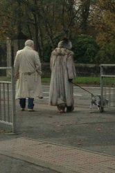
kenoh Certainly look like characters. Especially her outfit. Composition, a bit tighter but you were probably trying to be somewhat discreet. Impeccable timing as the dog is lifting his leg. This tells a nice story.
pukifloyd A beautiful photo. Great angle, lighting and selective focus. Like many good photos, this tells a wonderful story. You uncle is obviously smitten with his new bride. I cant say enough about how much I like this photo.
fcortese A hat can be a persons identity. Not just the type of hat but way they wear it, the curve of the brim, the angle, its all very personal. Even without the cap, this guy has a lot going on. This is such a fun photo. I really like the background. Normally it would be distracting but in this case it almost is complimentary. It is also a bit out of focus so the subject stands out well. I wish his face wasnt shaded by his hat so much but regardless, nicely done!
MacRy Its almost unfair to allow Brits in this contest as they might have a surplus market on characters. What can you say about this photo? The expressions are priceless. Did they dress this way with the intent of people taking snapshots? Where did they find one sport jacket that ugly, let alone matching ones? Lighting is soft and wonderful. Did you use fill flash? X100? Regardless, as always, I really like your photo MacRy.
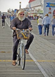
deep diver It probably wasnt too difficult to find a few characters on the Ocean City Boardwalk. I really like this guys pleasant smile. Good composition and exposure. The background is has just the right amount of focus so that it is identifiable but not too distracting.
AlexH Without question this is probably the best Bigfoot photo I have had the opportunity to review. I would have been nice if you could have him leaning on the tree or possibly engaged in some horseplay. He seems a bit rigid or possibly even startled. You might consider a fill flash to eliminate some of the harsh shadows. This lighting is a bit unflattering and, while adequate for social media, probably would not be acceptable for singles/dating sites. The fact that you probably put your life a risk taking this photo was considered in the judging process.
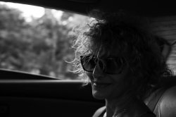
gaswerks Your photo really caught my eye. I love the back lighting and mood of this. She even has a bit of a Mona Lisa smile going. I dont have much to say about this photo because there isnt anything that I would change.
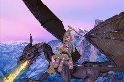
v3rlon The only animated character this week! I hope a printed copy of this has found a place on your refrigerator or daughters bedroom wall. In that your daughter is the real star, I might suggest cropping the upper & right portion of the photo so that her face is larger and less centered in the photo. Regardless, very creative!
anotherscotsman I would guess another daughter photo? These are memories that we might not recall if not for photographs. Exposure is spot-on. I might have cropping a bit from the top & left side so that I could get more face in the photo. Be careful with the backgrounds so you dont have flowers growing from the heads of loved ones. Nicely done.
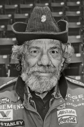
britincan This is a really nice B&W capture. The exposure is spot-on with superb facial detail. Looks like you used a fill flash. Otherwise his hat would have shaded his face from the overhead gymnasium lights. He seems a bit stiff but many subjects do this when looking into the camera. If I were to make a suggestion it might be to spend more time with this guy. He looks interesting and he also might loosen up a bit more for photos. You might have done just that and this might just be as relaxed as he gets! Good photo!
Miltz OK. This is one of my favorite photos of the week and here is why. The camera angle is perfect. The cropping is tight. The exposure is correct. The subject has a little attitude, possibly a bit annoyed, and that is captured in the photo. You nailed the focus. I find focusing on a subject that very close and their face is not square with the camera quite difficult. Too large of a lens opening and it is difficult to get both eyes in focus. Too small of a lens opening and the background becomes a distraction. In summary: excellent photo.
Apple fanboy It looks like you might have had the good fortune to attend a festival of characters. Anyone that would wear that helmet and suit around all day definitely is a character. Your photo is nicely exposed and has a nice gritty mood. If it were me, I would cropped it a bit tighter. And, even though nicely blurred, I find the guy in the lower right still a distraction.
acearchie This is one of those photos that probably breaks some rules. The subject is dead center. The lighting on the subjects face couldnt be much more unflattering. That said; I wouldnt change a thing. The colors are simply amazing. The lighting is un-staged. The expression on the subject seems painfully spontaneous. The lighting, background and subject fit together seamlessly to create a haunting mood. This looks more like a movie set than a photo shoot. I am a bit uncomfortable critiquing a work that I would not have the vision to create. Well done and thank-you for sharing your photograph.
needfx The one thing I am guaranteed, is that a needfx photo submission will have excellent lighting. Everyone needs to look at the history of needfx photo postings to see the great deal of attention that is given to lighting. Light is everything in photography and, like most needfx photos, this is textbook. An excellent photo, made even better because of your attention to light.
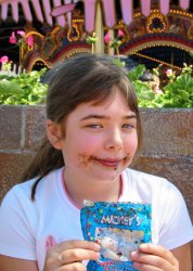
DirtySocks85 This is a wonderful creative use of a wide angle lens. Sometimes wide angle shots of animals produce an accentuated unflattering large and humorous nose. Your photo is not so much distorted. I like the girl in the background and her expression. She is a part of the photo without being a distraction. There is no confusion who is the subject of this photo! Very creative composition and it looks like you used a fill-flash. Otherwise the giraffe, whose face is mostly shaded, would be underexposed. Nicely done DirtySocks.
Chappers Even though this was posted a few minutes after the contest closed it certainly deserves comment. As much as I enjoy your work, I simply cannot condone photographs that could in some way scar a child for life. I can tell however, by the subjects level of enthusiasm, he is fully on-board with this! Seriously, these are the snapshots that years from now will still bring a smile. Although my child/skull portfolio is pretty lean, a couple suggestions: Move the subject away from the wall. Get at eye level with small children (not eye level with the skull).
----------------------------------------
This was a week of wonderful and entertaining photos. Please remember that any suggestions or comments are what I would do and might not make your image any better. As I do not have the credentials to accurately judge the quality of each and every photo, I will use the purely subjective method of picking this weeks winner based solely on what I like. Actually I like each of these photos for different reasons.
My third favorite photo(s): pukifloyd - Beautiful composition and selective focus.
My second favorite photo: Miltz - This is a simply pro-shot that makes me jealous.
My favorite photo of the week: acearchie - A compelling image that oozes with originality.
OK acearchie. Congratulations and its your turn to get the next contest started!

") Shot this in Chicago this summer.
Shot this in Chicago this summer.