Got a tip for us?
Let us know
Become a MacRumors Supporter for $50/year with no ads, ability to filter front page stories, and private forums.
Weekly Photo Contest (Oct 11 - Oct 18) -- Details
- Thread starter MCH-1138
- Start date
- Sort by reaction score
You are using an out of date browser. It may not display this or other websites correctly.
You should upgrade or use an alternative browser.
You should upgrade or use an alternative browser.
Well, you all certainly didn’t make it easy on me this week, but thank you all for the great submissions...
Nice use of the shallow depth-of-field to focus on the details of the near branch and needles. If anything, it is perhaps a little too shallow, as the out-of-focus portions of needles in the foreground are a bit distracting in my view. I like the dreamy feel of the out-of-focus needles in the background though. To my eye, the in-focus needles in the bottom-right of the frame distract from the composition. The center needles also seem to get a little lost against the similarly-shaded background. Also, the image seems a little underexposed to me, especially considering the title you have given it -- maybe consider bumping the exposure up by a stop or so.
I will admit that I am not really a car guy, so I probably would not have won a prize on this one (but my horizons have now been expanded). Nice job with the brief in terms of focusing in on a detail that defines the car. There are a couple of “in-betweens” to my eye with this shot. I think it could benefit either from a little more or a little less depth-of-field as you are losing focus at the near (right) side of the grill and the far (left) supercharger exhaust pipe. Similarly, I think the composition would be stronger if you either pushed in further and maybe framed just one of the exhaust pipes or pulled back some so you could capture the entire grill and more of the pontoon fender. Finally, the lighting seems a little harsh and flat to me. Whether it was flash or ambient, it seems to be obscuring the great curves of the pontoon fender, etc.
Beautiful colors in the sunset and sky, and nice backlighting of the plants in the foreground. The horizon looks a hair off to my eye (as if it needs to be rotated counter-clockwise just a smidge). Compositionally, the centered sun is a little distracting to my eye. Not sure this quite fits what I had in mind with the brief (although I left it somewhat ambiguous and I imagine you are focusing on the details of the plants in the foreground rather than the whole of the sunset). I was a little surprised to not see one of your piano detail shots.
Definitely focusing in on a detail. I think it could use just a touch more depth-of-field, as you are losing focus at the left of the eye and it looks like it wouldn’t affect your background much. Nice catchlight in the eye. It is a shame that the patch of light in the bottom of the frame wasn’t a little higher, so as to highlight the eye and the shape of the bird’s face around it.
This one appeals to me in an abstract “what is it?” sense. Nice balance of highlights and shadows giving the water drops and the underlying weave depth and texture. Not sure if it is fringing or a reflection of something colored, but the blue-green bits along the edges of some of the water droplets are a bit distracting -- maybe consider converting it to black-and-white. The scratches and spots on the glass tabletop are a little distracting, as well (although I assume this was basically as-found, rather than staged).
Nice work on this -- depth-of-field and focus seem just right, and I like the lighting and how the white pops against the the darker background. A couple of nits -- the dried bit at the bottom of dandelion is a bit of a distraction to me, since it contrasts against the white and is either in focus or close to being in focus. Also, to me, the placement of the watermark detracts from an otherwise-strong image (it would perhaps be less distracting in bottom-right corner).
Welcome, and nice photo for your first submission! This is right in line with the brief in terms of focusing on a detail or details. I like the rich color of the guitar body against the dullness of the background, and nice use of the shallow depth-of-field to focus on the bridge. I find the out-of-focus knobs in the foreground to be distracting (particularly the nearer of the two), so I think the composition might have been a little stronger if you moved the camera up inch or two and shot down over the knobs. Alternatively, you could shoot from an angle further to the left, but then you would have a different view of the bridge and the strings. Shooting from a little higher might also let you use the strings as more of an element in the photo.
I’ll admit that I had to look twice before seeing the spider -- a very interesting capture, indeed. I like the white petals against green background. Maybe it’s my screen, but the bee and spider seem slightly out-of-focus to me. (Looking at the EXIF data, it could be a hint of camera shake, as well). I think it would be a stronger image if you were able to compose it so the spider sat against the green out-of-focus background rather than against the out-of-focus white area. Also, maybe consider cropping some so the “action” isn’t essentially centered.
A nice play on words, focusing on the “details” in your detail shot! My initial thought is that the composition would be stronger if you included more of the text’s title. Not sure how it is lit, but the circular highlight (around “tails”) seems a little out of place against the less-brightly lit ellipse. Maybe also consider bumping the shadows up a little, so the text doesn’t get quite as lost, and shooting from a lower angle so you can use a shallow depth-of-field to emphasize or de-emphasize portions of the text.
This really nails the brief, or at least what I had in mind. I really like the bold yellow petals, the contrasting colors and textures, the use of the diagonal lines, and the lighting and exposure throughout the frame. Very nice.
I will confess that I had no idea that the letters were on silver dollars, either. The composition doesn’t quite nail it for me, although I’m struggling as to offering a constructive suggestion -- maybe framing the shot a little lower and a shade wider so that the “welcome” line is higher in the frame and you capture a little more of the “to fabulous” line. As framed, the “C” that is being cut off is a little distracting, as is the bottom of the star at the top of the frame. It would be interesting to see what this looks like closer to evening, when you could pick up the neon and other lights, but there might still be enough ambient to retain legibility on the silver dollars.
I like the colors here with the bright green and pastel purple against the rich green background. The composition might be stronger if the flower were not centered in the frame. To my eye, it would benefit from a little deeper depth-of-field in order to bring the stamens on the near flower into focus. Similarly, not sure if you meant to include the bee (or what I presume is a bee), but it didn’t make it into the in-focus area so it is a little distracting.
Another nice detail shot that fits the brief quite well. Nice use of the shallow depth-of-field to emphasize the details you were focusing on (no pun intended). I would have liked to see the focus point just a hair closer, so more of the teeth in the center gear were in focus. Not sure how much of this may just be a loss of detail at the higher ISO -- looking at the EXIF data, I’m assuming this was in fairly low ambient light. Maybe consider cropping the bottom of the frame out -- I find the amount of out-of-focus elements in the foreground to be a little distracting.
Again, I’m not a car guy, but I was able to figure this one out.") Nice detail shot. I like the out-of-focus dashboard elements in the background. Not sure if this was lit with a flash or if the ambient was a little harsh, but the center of steering wheel is casting some odd reflections. Maybe tweak the framing to either get the steering wheel centered or more purposefully off-center. As it is, it seems to be a shade off.
Nice detail shot. I like the out-of-focus dashboard elements in the background. Not sure if this was lit with a flash or if the ambient was a little harsh, but the center of steering wheel is casting some odd reflections. Maybe tweak the framing to either get the steering wheel centered or more purposefully off-center. As it is, it seems to be a shade off.
No rules against using older photos. This is an interesting combination of focusing on certain details (the eyes and mouth) while eliminating other details (nose, etc.). I find the lack of a nose to be a little creepy, but that’s just me. To me, it would be a more compelling image if you cropped and focused on just one eye rather than both eyes and the mouth. The way the highlights are blown out in the detail areas is a little much for me, although I see how that fits with the broader image and the way the other areas of the face are obscured.
Nice detail shot of the bench. I like how there is enough of the bench included that the viewer can probably figure out what it likely is. Nice use of the shallow depth-of-field, although I am torn as to whether I would rather that it focus on “London” instead of “City.” The lighting seems a little flat -- it would be interesting to see what kind of detail you could pull out of the weathered wood if had a little more light running across it in order to cast some shadows in the grain, etc. I like the diagonal lines, as well.
Nicely framed image. Not sure if the top of the wings are out of focus due to a shallow depth-of-field (macro, etc.) or if there is a little motion blur, particularly while the rest of the image is so sharp. Nice colors against the out-of-focus background, as well. Maybe not quite what I had in mind with the brief, but a nice shot nonetheless.
I really like the color and texture in this one, including the warm tones on the left against the cool tones on the right. The peeling and flaking paint is terrific. Looks like some sort of wagon wheel? I’d be inclined to go with a deeper depth-of-field on this one, at least enough to get the (what appears to be an) axle at the bottom of the frame in focus since that links the two sides.
-----
So once again, great work everyone. Here are my picks for the week:
3rd: (tie) Alexander.Of.Oz, Apple fanboy
2nd: butch10x
1st: Cheese&Apple

Nice use of the shallow depth-of-field to focus on the details of the near branch and needles. If anything, it is perhaps a little too shallow, as the out-of-focus portions of needles in the foreground are a bit distracting in my view. I like the dreamy feel of the out-of-focus needles in the background though. To my eye, the in-focus needles in the bottom-right of the frame distract from the composition. The center needles also seem to get a little lost against the similarly-shaded background. Also, the image seems a little underexposed to me, especially considering the title you have given it -- maybe consider bumping the exposure up by a stop or so.
iconic and of the era
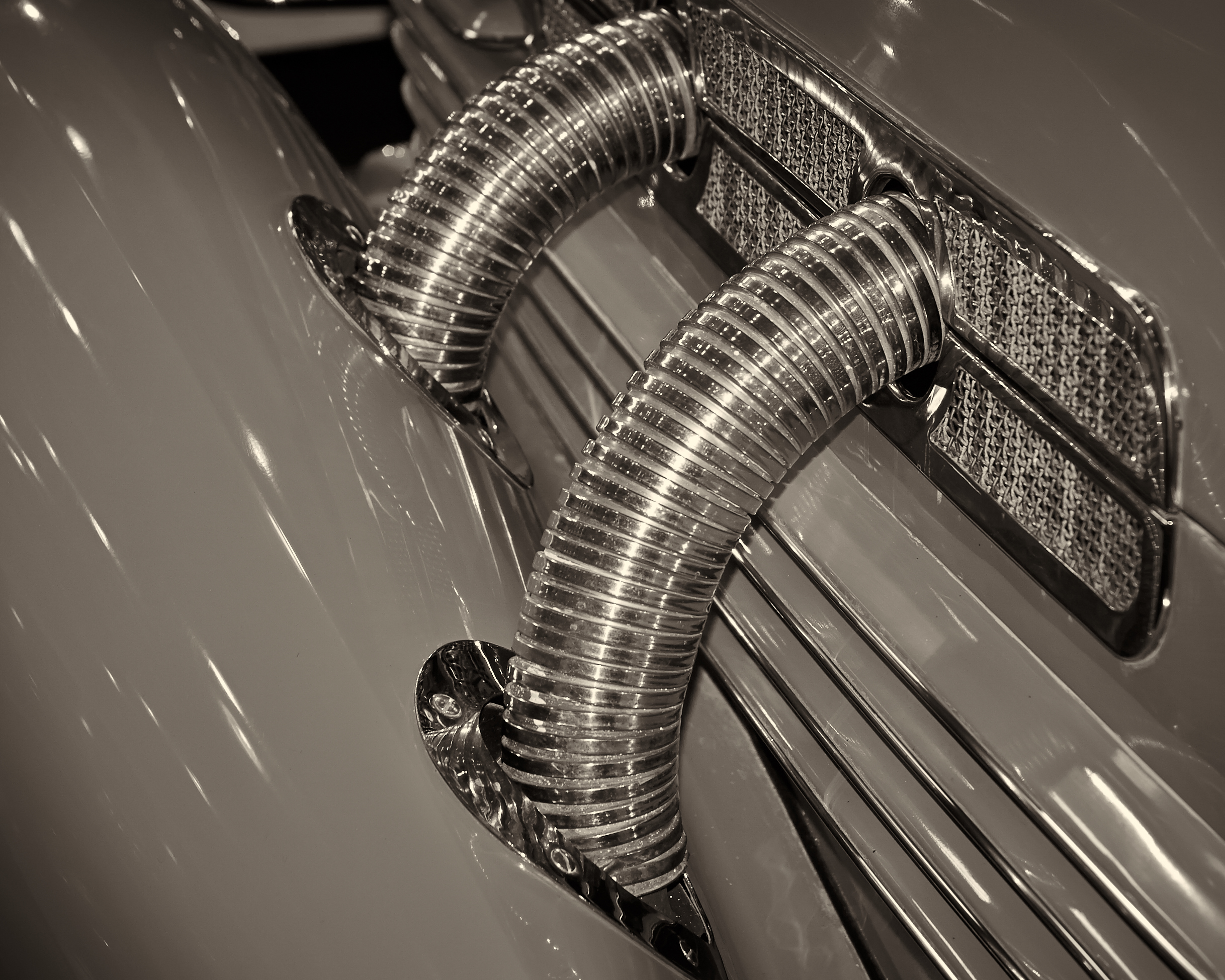
I will admit that I am not really a car guy, so I probably would not have won a prize on this one (but my horizons have now been expanded). Nice job with the brief in terms of focusing in on a detail that defines the car. There are a couple of “in-betweens” to my eye with this shot. I think it could benefit either from a little more or a little less depth-of-field as you are losing focus at the near (right) side of the grill and the far (left) supercharger exhaust pipe. Similarly, I think the composition would be stronger if you either pushed in further and maybe framed just one of the exhaust pipes or pulled back some so you could capture the entire grill and more of the pontoon fender. Finally, the lighting seems a little harsh and flat to me. Whether it was flash or ambient, it seems to be obscuring the great curves of the pontoon fender, etc.

Beautiful colors in the sunset and sky, and nice backlighting of the plants in the foreground. The horizon looks a hair off to my eye (as if it needs to be rotated counter-clockwise just a smidge). Compositionally, the centered sun is a little distracting to my eye. Not sure this quite fits what I had in mind with the brief (although I left it somewhat ambiguous and I imagine you are focusing on the details of the plants in the foreground rather than the whole of the sunset). I was a little surprised to not see one of your piano detail shots.
African Grey Parrot at the zoo.

Definitely focusing in on a detail. I think it could use just a touch more depth-of-field, as you are losing focus at the left of the eye and it looks like it wouldn’t affect your background much. Nice catchlight in the eye. It is a shame that the patch of light in the bottom of the frame wasn’t a little higher, so as to highlight the eye and the shape of the bird’s face around it.
Water droplets on the garden table
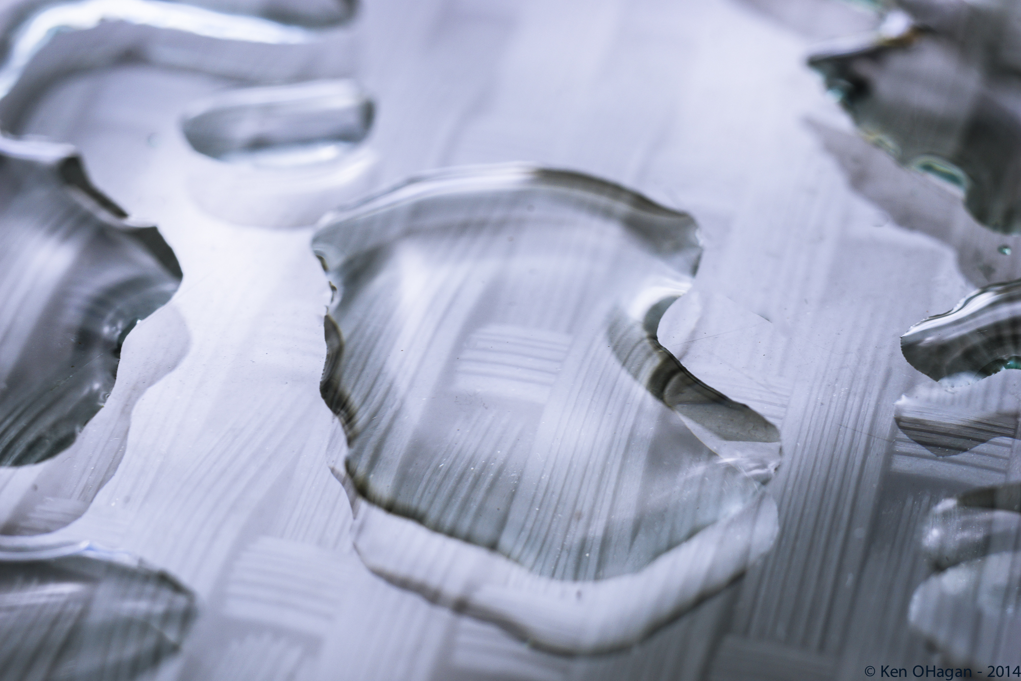
This one appeals to me in an abstract “what is it?” sense. Nice balance of highlights and shadows giving the water drops and the underlying weave depth and texture. Not sure if it is fringing or a reflection of something colored, but the blue-green bits along the edges of some of the water droplets are a bit distracting -- maybe consider converting it to black-and-white. The scratches and spots on the glass tabletop are a little distracting, as well (although I assume this was basically as-found, rather than staged).

Nice work on this -- depth-of-field and focus seem just right, and I like the lighting and how the white pops against the the darker background. A couple of nits -- the dried bit at the bottom of dandelion is a bit of a distraction to me, since it contrasts against the white and is either in focus or close to being in focus. Also, to me, the placement of the watermark detracts from an otherwise-strong image (it would perhaps be less distracting in bottom-right corner).
Hello everyone,
I follow the weekly contests since a long time and I have learnt a lot
Epiphone the Dot by ál-Andalus, on Flickr
Cheers from Spain

Welcome, and nice photo for your first submission! This is right in line with the brief in terms of focusing on a detail or details. I like the rich color of the guitar body against the dullness of the background, and nice use of the shallow depth-of-field to focus on the bridge. I find the out-of-focus knobs in the foreground to be distracting (particularly the nearer of the two), so I think the composition might have been a little stronger if you moved the camera up inch or two and shot down over the knobs. Alternatively, you could shoot from an angle further to the left, but then you would have a different view of the bridge and the strings. Shooting from a little higher might also let you use the strings as more of an element in the photo.
The details of this photo are often over looked - luckily that day I spotted the strange bee and knew the reason why it looked the way it did.

I’ll admit that I had to look twice before seeing the spider -- a very interesting capture, indeed. I like the white petals against green background. Maybe it’s my screen, but the bee and spider seem slightly out-of-focus to me. (Looking at the EXIF data, it could be a hint of camera shake, as well). I think it would be a stronger image if you were able to compose it so the spider sat against the green out-of-focus background rather than against the out-of-focus white area. Also, maybe consider cropping some so the “action” isn’t essentially centered.
From page 89 in case you were wondering ...
Cheers
Hugh
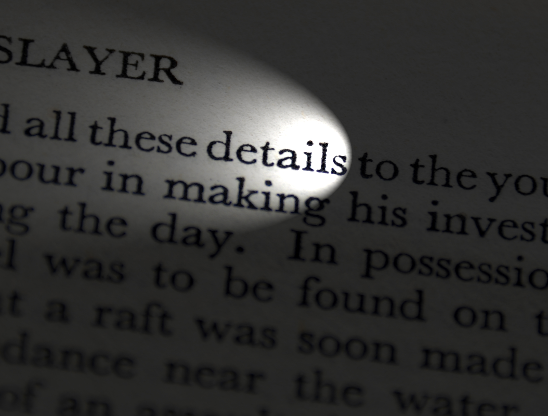
A nice play on words, focusing on the “details” in your detail shot! My initial thought is that the composition would be stronger if you included more of the text’s title. Not sure how it is lit, but the circular highlight (around “tails”) seems a little out of place against the less-brightly lit ellipse. Maybe also consider bumping the shadows up a little, so the text doesn’t get quite as lost, and shooting from a lower angle so you can use a shallow depth-of-field to emphasize or de-emphasize portions of the text.

This really nails the brief, or at least what I had in mind. I really like the bold yellow petals, the contrasting colors and textures, the use of the diagonal lines, and the lighting and exposure throughout the frame. Very nice.
It wasn't until I visited Las Vegas and that famous sign that I realised the letters of 'WELCOME' are written on Liberty Dollars.
Liberty Dollars by Parkin Pig, on Flickr

I will confess that I had no idea that the letters were on silver dollars, either. The composition doesn’t quite nail it for me, although I’m struggling as to offering a constructive suggestion -- maybe framing the shot a little lower and a shade wider so that the “welcome” line is higher in the frame and you capture a little more of the “to fabulous” line. As framed, the “C” that is being cut off is a little distracting, as is the bottom of the star at the top of the frame. It would be interesting to see what this looks like closer to evening, when you could pick up the neon and other lights, but there might still be enough ambient to retain legibility on the silver dollars.

I like the colors here with the bright green and pastel purple against the rich green background. The composition might be stronger if the flower were not centered in the frame. To my eye, it would benefit from a little deeper depth-of-field in order to bring the stamens on the near flower into focus. Similarly, not sure if you meant to include the bee (or what I presume is a bee), but it didn’t make it into the in-focus area so it is a little distracting.
 watch.
Another nice detail shot that fits the brief quite well. Nice use of the shallow depth-of-field to emphasize the details you were focusing on (no pun intended). I would have liked to see the focus point just a hair closer, so more of the teeth in the center gear were in focus. Not sure how much of this may just be a loss of detail at the higher ISO -- looking at the EXIF data, I’m assuming this was in fairly low ambient light. Maybe consider cropping the bottom of the frame out -- I find the amount of out-of-focus elements in the foreground to be a little distracting.

Again, I’m not a car guy, but I was able to figure this one out.
Nice detail shot. I like the out-of-focus dashboard elements in the background. Not sure if this was lit with a flash or if the ambient was a little harsh, but the center of steering wheel is casting some odd reflections. Maybe tweak the framing to either get the steering wheel centered or more purposefully off-center. As it is, it seems to be a shade off. I didn't know whether the photo may be an older one, if not, disregard. This is from ten years ago.
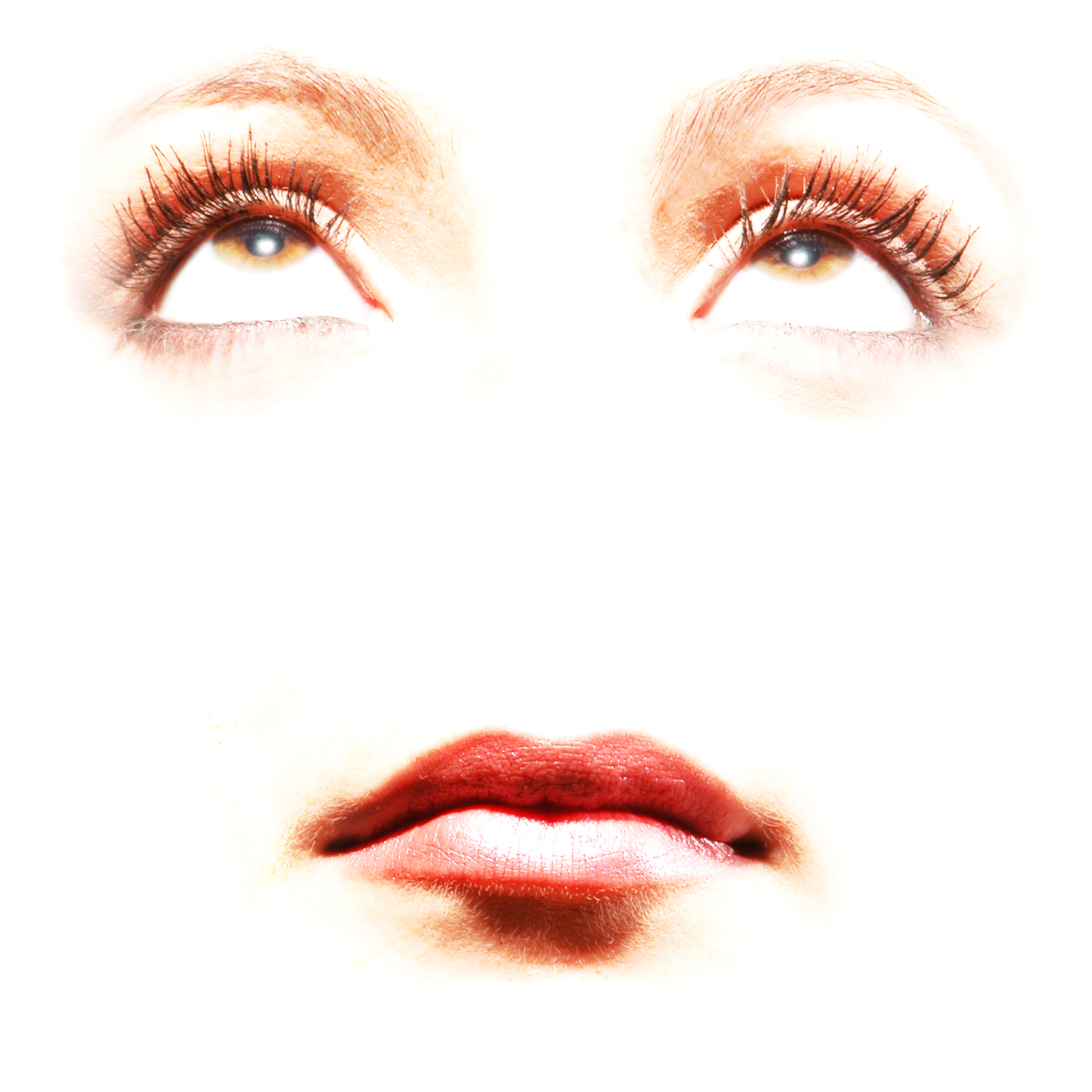
No rules against using older photos. This is an interesting combination of focusing on certain details (the eyes and mouth) while eliminating other details (nose, etc.). I find the lack of a nose to be a little creepy, but that’s just me. To me, it would be a more compelling image if you cropped and focused on just one eye rather than both eyes and the mouth. The way the highlights are blown out in the detail areas is a little much for me, although I see how that fits with the broader image and the way the other areas of the face are obscured.

Nice detail shot of the bench. I like how there is enough of the bench included that the viewer can probably figure out what it likely is. Nice use of the shallow depth-of-field, although I am torn as to whether I would rather that it focus on “London” instead of “City.” The lighting seems a little flat -- it would be interesting to see what kind of detail you could pull out of the weathered wood if had a little more light running across it in order to cast some shadows in the grain, etc. I like the diagonal lines, as well.

Nicely framed image. Not sure if the top of the wings are out of focus due to a shallow depth-of-field (macro, etc.) or if there is a little motion blur, particularly while the rest of the image is so sharp. Nice colors against the out-of-focus background, as well. Maybe not quite what I had in mind with the brief, but a nice shot nonetheless.
Tweaked this a bit on my phone, so I hope it looks okay.

I really like the color and texture in this one, including the warm tones on the left against the cool tones on the right. The peeling and flaking paint is terrific. Looks like some sort of wagon wheel? I’d be inclined to go with a deeper depth-of-field on this one, at least enough to get the (what appears to be an) axle at the bottom of the frame in focus since that links the two sides.
-----
So once again, great work everyone. Here are my picks for the week:
3rd: (tie) Alexander.Of.Oz, Apple fanboy
2nd: butch10x
1st: Cheese&Apple
Last edited:
Thanks MCH-1138 for a good and easy to follow critique on the photos!
Well done C&A for a beautiful photograph and to Butch, Alex and AFB
Re my photo: the light was very flat. It had rapidly turned into a very grey afternoon from a promising start. Went there again yesterday but it was even worse! I wondered too, afterwards, about focusing on the word London and will give it another go next time I'm there, probably in the spring now.
Thanks MCH-1138 for the solid critique. When I reviewed my Vegas pics I wished I had done a close up on just one of the Liberty Dollars, but hindsight is a cruel mistress.
Congrats to the winners - all well deserved. Stunning shot by Cheese&Apple.
Welcome to Arsolu - I look forward to seeing more of your contributions.
Chappers - I studied your photo and still couldn't work out why you'd mentioned the overlooked details until I read MCH-1138's comment about the spider. That is one excellent shot!
Wow, thank you for the great judging effort and the nod MCH-1138. Well done everyone - some outstanding shots this week. I thought Alexander had a lock on this one.
Back in a bit with the next contest.
~ Peter
Back in a bit with the next contest.
~ Peter
Thanks for the critique. Yes it was as found not staged... I am on the fence about staging shots right now but sure that will change.
Well deserved podium places guys!!!
Ken.
Well deserved podium places guys!!!
Ken.
Many thanks for taking the time to critique each entry . Figured Alexander and Kenoh had it locked up , but as usual I'm wrong .
Re: my entry .... Lighting was ambient through the open garage door .Don't know what's going on with the reflection on the MG lettering . I noticed it when taking the picture , hadn't noticed it previously . I drive the car pretty often in the warm months and don't recall seeing anything unusual in the logo . Hopefully , it's not the plating flaking . Incidentally , the 'other car's exhaust pipes mark it as a 1937 Cord 812 . Only made for 1 year IIRC , then the company went bust .
Re: my entry .... Lighting was ambient through the open garage door .Don't know what's going on with the reflection on the MG lettering . I noticed it when taking the picture , hadn't noticed it previously . I drive the car pretty often in the warm months and don't recall seeing anything unusual in the logo . Hopefully , it's not the plating flaking . Incidentally , the 'other car's exhaust pipes mark it as a 1937 Cord 812 . Only made for 1 year IIRC , then the company went bust .
Good work everybody. Some really good details in these photos. Great critique and thanks for the nod on joint third place.
It's an older photo, before I had a dedicated flash etc. I was going to go with a more recent one, but decided this fitted the theme better.
Looking forward to the next.
It's an older photo, before I had a dedicated flash etc. I was going to go with a more recent one, but decided this fitted the theme better.
Looking forward to the next.
Really valuable and insightful comment across the board - thanks for your judging efforts and to the worthy winners.
Ill admit that I had to look twice before seeing the spider -- a very interesting capture, indeed. I like the white petals against green background. Maybe its my screen, but the bee and spider seem slightly out-of-focus to me. (Looking at the EXIF data, it could be a hint of camera shake, as well). I think it would be a stronger image if you were able to compose it so the spider sat against the green out-of-focus background rather than against the out-of-focus white area. Also, maybe consider cropping some so the action isnt essentially centered.
I have different versions of this and yes it is slightly out of focus. Not surprising when this was playing out on a small plant on a very windy day. I couldn't hold the plant to take the shot so had to try and focus as everything moved. This was basically the first shot I took as it was what I saw in the first place. Fair critique on your part.
Well, you all certainly didnt make it easy on me this week, but thank you all for the great submissions...
Definitely focusing in on a detail. I think it could use just a touch more depth-of-field, as you are losing focus at the left of the eye and it looks like it wouldnt affect your background much. Nice catchlight in the eye. It is a shame that the patch of light in the bottom of the frame wasnt a little higher, so as to highlight the eye and the shape of the birds face around it.
Thanks MCH-1138, for the great effort of this individual feedback. Congratulations Peter, a lovely image from you!
I was in deep shade at the Zoo, with my macro lens shoved hard against the fine metal bird wire. I had to use my 90mm macro lens to allow enough light in and get some focus in the deep shade, with me manually focusing through the viewfinder. Depth of focal field when you are so close to something and can't stack images is not really much of an option. This bird doesn't stay still for long, being very inquisitive (and bitey!) It's one of those images that you can't ever go back and get again, so I'm happy with what it is.
Register on MacRumors! This sidebar will go away, and you'll see fewer ads.