Got a tip for us?
Let us know
Become a MacRumors Supporter for $50/year with no ads, ability to filter front page stories, and private forums.
Weekly Photo Contest (Oct 25 - Nov 1)
- Thread starter anubis
- Start date
- Sort by reaction score
You are using an out of date browser. It may not display this or other websites correctly.
You should upgrade or use an alternative browser.
You should upgrade or use an alternative browser.
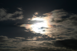
Sun setting near my place
The file size of the original picture was too big to upload, so I took a screenshot, cropped it, and uploaded that.
Flickr link: http://www.flickr.com/photos/22792193@N02/2969312228/
The file size of the original picture was too big to upload, so I took a screenshot, cropped it, and uploaded that.
Flickr link: http://www.flickr.com/photos/22792193@N02/2969312228/
Attachments

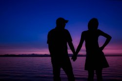
looking for love...
A 3-month old Baja mutt takes a hard look at me in the shadow of several palapa palms at an animal refuge near Todos Santos, Baja California Sur. I named her Cajeta.

A 3-month old Baja mutt takes a hard look at me in the shadow of several palapa palms at an animal refuge near Todos Santos, Baja California Sur. I named her Cajeta.
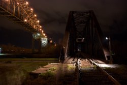
Ghost
I'm new to my D-80 DSLR. Just the other night, I finally figured out how to use the infrared remote while at a major bridge site in Sault Ste Marie, ON. This photo is similar to another I posted recently... but if you look carefully, you can see me, the "ghost", in the "Lights and Shadows".
BarryJ
I'm new to my D-80 DSLR. Just the other night, I finally figured out how to use the infrared remote while at a major bridge site in Sault Ste Marie, ON. This photo is similar to another I posted recently... but if you look carefully, you can see me, the "ghost", in the "Lights and Shadows".
BarryJ
Attachments
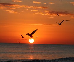
One of my favorites

With my Rebel XTi.
Dec 2007
Riverfront
Spokane, WA
Full Res at
http://www.flickr.com/photos/joeymendoza/2086918001/sizes/o/in/set-72157603324262958/
With my Rebel XTi.
Dec 2007
Riverfront
Spokane, WA
Full Res at
http://www.flickr.com/photos/joeymendoza/2086918001/sizes/o/in/set-72157603324262958/

Attachments


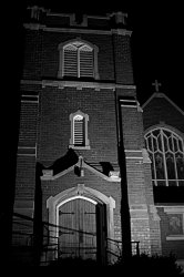
I've been wanting to take some pictures of this building at night for a couple weeks (it's right up the street from me) but I'm wasn't happy with the shots I got tonight. I want to go back (with my tripod this time) but I don't think I'll have time before this contest is over, so this is m favorite from the set I took.
Attachments

Alright, I'll take submissions for the rest of today (Nov 1) and then do judging and post the results on Nov 2.
BTW I don't know how the hell I'm going to pick a winner... I think judging is going to be a lot harder than I thought! Just about everyone is submitting gold.
BTW I don't know how the hell I'm going to pick a winner... I think judging is going to be a lot harder than I thought! Just about everyone is submitting gold.
First of all, I just wanted to say that the level of talent on these boards blows my mind. I think I get more inspiration from this web site and learn more from studying the photographs here than from any other web site or book I've read.
I've chosen 6 honorable mentions and 1 winner. Above all, I want to reiterate that it was a very difficult theme to judge due to how broad the interpretation of "light and shadow" is. I purposely made the theme broad to encourage as much participation as possible (everyone should have a photo that accentuates "light and shadow" in their personal photo library). Because of this, I don't want people who didn't get picked to think that their photo wasn't good... everyone's photos are amazing and the winners were picked because they looked good based on one person's (my) personal choice and how I chose to interpret the theme.
I mainly chose the winners based on how well they chose their exposure based on the lighting and dynamic range of the scene. I feel like the winners represent textbook examples of excellent exposure, blending light and shadow in the most artistic and pleasing ways.
OK!
Honorable mentions (in no particular order):
AlexH: Very nice architectural shot of a very high dynamic range scene. I really liked your choice of exposure here.
Phrasiakleia: I liked your shot because of its simplicity. The subject of your photo is the doorway into the room and the light pouring in from the doorway makes for a very dramataic photo. I also really liked your choice of exposure.
ipodtoucher: Not a whole lot to say except that the beauty of this photo is in its simplicity and your superb handling of the available natural light.
fett: Not sure if you were using studio lights with some kind of shutter or barn door, or if the lighting was fully natural... either way, your handling of the natural-looking light on the woman's face is excellent.
alt75: Another great example of using natural lighting. The shadows cast by the "wishes" give the photo a great amount of depth and realism, and I think it's easy for the viewer to connect with the subject and really feel it. I might have preferred for this image to have about a stop less exposure. This would have artfully accentuated the subject even more. The background would have been less visible but isn't as important as the foreground anyway.
PeteB: Great example of a beautiful interior architectural photo. It's really just beautiful. Art gallery quality.
And the winner is:
andrew050703 for the great photo of the war memorial statue. This one edged out the rest for matching underexposure with its solemn and somber subject. Another art gallery quality photo.
Congratulations to andrew050703, the honorable mentions, and everyone else who participated in this week's photo contest.
Congratulations andrew050703, that is a very nice shot. Definitely a lot of of great shots this week, I love seeing everyone's interpretations on the different themes.
Congrats to andrew050703, and thanks to Anubis for the timely judging. Your job sure wasn't easy! Oh and thanks for the honorable mention. ")
Register on MacRumors! This sidebar will go away, and you'll see fewer ads.