Got a tip for us?
Let us know
Become a MacRumors Supporter for $50/year with no ads, ability to filter front page stories, and private forums.
Weekly Photo Contest: Oct 2nd - Oct 9th - Backlit
- Thread starter acearchie
- Start date
- Sort by reaction score
You are using an out of date browser. It may not display this or other websites correctly.
You should upgrade or use an alternative browser.
You should upgrade or use an alternative browser.
Couple weeks ago pulled over on a freeway overpass cause I couldn't resist taking a photo of this sunrise.

EXIF Summary: Olympus E-PL3 1/160s f/11.0 ISO200 14mm
EXIF Summary: Olympus E-PL3 1/160s f/11.0 ISO200 14mm
EDIT: It seems I've broken Macrumors. I can't post all the results in one post as I've written too much! Adding additional replies just bunches it back into the same post and then half the post disappears. If someone could just comment below this post with anything I can then post the other half of the feedback!
Wow, a lot of entries! I fear writing this might take up a chunk of my morning!
Anyway, I'll get started now and see what I can come up with. I'm by no means a professional photographer so take everything I say with a pinch of salt as I have nothing but my own experience to back up what I say.
I might sound a bit harsh but I am not here to massage your egos! Hopefully we are all here to improve?
I'm not the best when it comes to product shots. For this type of shot, I like to know that everything is perfect. I see what you are going for with the composition but the big thing that puts me off initially is the fact that it isn't level. I would have maybe gone for a dark grey or black BG as the clear bottle facing us is a little bit lost as everything else around it is white too.
Nice shot and a fun composition. I like that you have the subject off in the top right but the curve of the hill is actually striking the cross points in the rule of thirds. Black and white is a good choice for this image. I like the fact as well that there is no detail in the subject so it can leave us to guess who they are and what their thoughts are.
A bit too heavily vignetted for me. Overall I think there could be a boost to the exposure as well. It's tricky though as the sky is close to blowing but the subjects are under. In this situation I think it's important to pick which one you are going to expose properly. There are a lot of nice colours in the sky so I would have probably gone with that.
I take shots like this all the time. I love having my iPhone on me and knowing that I can just whip it out and remember the moment! Composition wise I would have given more headroom for the tree as it's right on the top of the frame and there is little detail at the bottom which is worth any attention. The tree works nicely as a dabbled silhouette.
A nice shot with very surreal colours. I like the fact that long exposures can show us colours and scenes that we can't see with our own eyes. Framing is pretty good. My only gripe are the wooden bits at the bottom. I feel like we have too much space on the top right and not enough at the bottom where one cuts the bottom of the frame. I think there is a bit of lens distortion going on due to the low angle?
Really nice shot. I think you could easily lose that lens flare in LR with a bit of spot removal! The close position of the chair does make the composition feel off though and no longer level! I recently had a couple of experiments myself shooting the sunrise on South Beach and trying to mix in some of the lifeguard bits and bobs. It's a lot harder than you think as you'll know!
Unfortunately the blown out sun just kills this a bit for me. The silhouette of the car isn't particularly important so retaining detail in the highlights would have been my priority. Not sure if it's the cloud formation but it doesn't feel level.
Great scene but the centre framing isn't working for me. Content wise I had to take a double take to realise that she is painting nothing to do with the scene in front of her? Seems a bit odd but then again if you know you are going to be painting might as well do it in a great location. The lighting can't be great for picking the right colours though? The blooming from the sun is a little off putting so I might have hidden it behind the head of the subject or adjusted my position to make sure the sun was still in the frame but not jarring with the subject.
Welcome! Everyone submitting these huge images is crippling my internet in the countryside! Anyway I'll be back in a few minutes once it's loaded...
Ah brilliant, now I can see it! A nice shot and you've nailed the theme of getting a backlit subject. For me the framing is a bit in-between what I would have gone with. I would have either got taller and have the BG all bright well exposed grass or come much lower and had the chicken backlit against the dark background. Currently we are splitting the two. There's a nice amount of detail in the shadows as well.
Great shot and really nice silhouettes. I like the fact that you have caught one in flight but I am wondering framing wise if it would have been nice to have a line of them all standing and a clean top half? My pesky retina display doesn’t work well with embedded images but is there a bit of CA around the edges of some of the puffins? Colours are interesting and unusual too.
Think I caught this picture in POTD. It’s great being very busy but in all the right places. So many competing lines that it is actually quite easy to lose the subject in the middle. I would have boosted the exposure a little. Nothing is blowing and overall it feels a little dark. The lighting is also not quite hitting the subject from the right angle to help him stand out completely from the shadows. Maybe some added exposure and contrast might help him pop a little.
Wow, a lot of entries! I fear writing this might take up a chunk of my morning!
Anyway, I'll get started now and see what I can come up with. I'm by no means a professional photographer so take everything I say with a pinch of salt as I have nothing but my own experience to back up what I say.
I might sound a bit harsh but I am not here to massage your egos! Hopefully we are all here to improve?
I don't generally backlight people shots, but I love the effect of backlighting transparent objects.

I'm not the best when it comes to product shots. For this type of shot, I like to know that everything is perfect. I see what you are going for with the composition but the big thing that puts me off initially is the fact that it isn't level. I would have maybe gone for a dark grey or black BG as the clear bottle facing us is a little bit lost as everything else around it is white too.
Still-hot lava from the "Krafla fires" fissure eruption in Iceland, 1975-84.
Iceland 2014 by Melissa.O.Anderson, on Flickr

Nice shot and a fun composition. I like that you have the subject off in the top right but the curve of the hill is actually striking the cross points in the rule of thirds. Black and white is a good choice for this image. I like the fact as well that there is no detail in the subject so it can leave us to guess who they are and what their thoughts are.
Had to use the version I edited with my iPad because I couldn't find the original.

A bit too heavily vignetted for me. Overall I think there could be a boost to the exposure as well. It's tricky though as the sky is close to blowing but the subjects are under. In this situation I think it's important to pick which one you are going to expose properly. There are a lot of nice colours in the sky so I would have probably gone with that.
Not even a proper "sunset" shot - I just loved the lighting right then. The bright, just-starting-to-tint clouds, the blue sky behind, the darkness of the foreground. My good camera went missing last week, so this was just an iPhone shot (cropped to remove some visual distraction in the foreground.)
And now I realize the one that's still on my iPhone was the HDR one, not the even more starkly contrasted one with the deeper blues in the sky... Must have synced it then deleted it. I'll replace the picture when I get home tonight.
I take shots like this all the time. I love having my iPhone on me and knowing that I can just whip it out and remember the moment! Composition wise I would have given more headroom for the tree as it's right on the top of the frame and there is little detail at the bottom which is worth any attention. The tree works nicely as a dabbled silhouette.
A morning sunrise. The Bay Bridge in front of the sun/clouds. San Francisco, CA
day 26/365 || jan 26 - Bay Bridge Sunrise by Bhupesh Patel Photography, on Flickr
A nice shot with very surreal colours. I like the fact that long exposures can show us colours and scenes that we can't see with our own eyes. Framing is pretty good. My only gripe are the wooden bits at the bottom. I feel like we have too much space on the top right and not enough at the bottom where one cuts the bottom of the frame. I think there is a bit of lens distortion going on due to the low angle?
ignore the excessive lens flare....
Really nice shot. I think you could easily lose that lens flare in LR with a bit of spot removal! The close position of the chair does make the composition feel off though and no longer level! I recently had a couple of experiments myself shooting the sunrise on South Beach and trying to mix in some of the lifeguard bits and bobs. It's a lot harder than you think as you'll know!
Sunset at work.

Unfortunately the blown out sun just kills this a bit for me. The silhouette of the car isn't particularly important so retaining detail in the highlights would have been my priority. Not sure if it's the cloud formation but it doesn't feel level.
[url=https://flic.kr/p/nVKe5R]
Summer Sunrise 3 by pmxperience, on Flickr
Great scene but the centre framing isn't working for me. Content wise I had to take a double take to realise that she is painting nothing to do with the scene in front of her? Seems a bit odd but then again if you know you are going to be painting might as well do it in a great location. The lighting can't be great for picking the right colours though? The blooming from the sun is a little off putting so I might have hidden it behind the head of the subject or adjusted my position to make sure the sun was still in the frame but not jarring with the subject.
long time lurker, first time submitting a pic.... and a shameless effort to win, my pic is a hot little bird, nicely back-lit ( in my opinion )
Welcome! Everyone submitting these huge images is crippling my internet in the countryside! Anyway I'll be back in a few minutes once it's loaded...
Ah brilliant, now I can see it! A nice shot and you've nailed the theme of getting a backlit subject. For me the framing is a bit in-between what I would have gone with. I would have either got taller and have the BG all bright well exposed grass or come much lower and had the chicken backlit against the dark background. Currently we are splitting the two. There's a nice amount of detail in the shadows as well.
Puffins:

Great shot and really nice silhouettes. I like the fact that you have caught one in flight but I am wondering framing wise if it would have been nice to have a line of them all standing and a clean top half? My pesky retina display doesn’t work well with embedded images but is there a bit of CA around the edges of some of the puffins? Colours are interesting and unusual too.

Think I caught this picture in POTD. It’s great being very busy but in all the right places. So many competing lines that it is actually quite easy to lose the subject in the middle. I would have boosted the exposure a little. Nothing is blowing and overall it feels a little dark. The lighting is also not quite hitting the subject from the right angle to help him stand out completely from the shadows. Maybe some added exposure and contrast might help him pop a little.
Last edited:
EDIT: Phew it seems to have all worked!
Nice shot on the beach but a little too hot! Detail is gone in the highlights and the shadows add nothing of importance that we need to see in the frame. Centre framing is also quite straightforward especially as the sun is right in the centre as well. The water, beach and sky offer a nice way to separate the frame.
Great shot. I understand they are important to some people but the water mark takes me ‘out of it’ a little bit. I know you had your issue with one of your previous photos going walkabouts but I would have preferred it to be in an outer frame. The back light is really nice and gives a nice amount of detail in all the parts that matter. My only criticism would be that I would like more story with the image. What is being made, is it late at night, is this a hobby or a profession. The image strikes me as quite documentary and therefore I would like a story to go along with it.
I mentioned to one of the posters that product photography is definitely not my forte so I’ll try my best. The product feels a bit small in the frame with a lot of empty space around it. I like the OOF elements and the colours work well together. Mixed colour temperature lighting doesn’t sit so well and comes off as more of an oversight rather than being intentional. It does work though and I could imagine seeing it as an ad with the right copy around it.
Bonus point for being the only person to submit ‘one’ as I asked. You did catch me out as I reloaded the page a couple of times waiting for the picture to load…
Very interesting subject. Lots of great little reflections flying around which works nicely. Quite a bit of dead space top right which doesn’t have the effect of drawing me into the subject. Slightly distracting bright element just catching the frame on the left too. Well done for shooting wide open too as circles for the OOF elements works better than a pentagon, hexagon or other. Have you tried B&W as the colours are a bit odd for me.
Have to say straight off that it’s a pity that we are losing bits of the umbrella. Personally I think we could have lost more detail towards the camera (ear and jacket) as it already seems like you are going for a bit of a silhouette feel. The grittiness to the texture of the skin doesn’t work for me either but this is a totally subjective point. I assume the black marks at the bottom are a bit of remnants from the PS clean up on a dirty backdrop? With the processing in general I’m not to set on what the intentions are. It’s gritty and dark (sin-cityesque) but the posing implies cute young girl yet the props imply stuck in the rain!
Don’t you just love clouds? Every day they are different and occasionally you can get brief moments like this were they just offer up something that you’ll never see again!
I really like the processing on this. The purpley tones work really nicely with the dark blues.
I’ve seen a bit of a growing trend in this thread of people putting the sun right behind the subject which can cause the blooming around the head. If you offset the sun in your frame over to the left or right a bit I think you would have the same effect but without drawing too much attention to specifically the head of the subject. Just some thoughts for next time but if you’d come much lower you could have had your subject silhouetted against the sky rather than losing a bit of the torso in the darker areas.
I appreciate your dedication to the cause! Actually going and trying to get a shot that you haven’t attempted previously.
My main issue with this frame is the business, there is a lot going on and I’m not sure where my eyes are meant to go. I think the deep depth of field doesn’t help as everything is as sharp as everything else. Whilst the man is backlit (tick off that checkbox!) his head unfortunately cuts just on the line of the banking in the background. It’s nice to hide the sun behind the light giving light even when it’s not lit! It’s the light that keeps on giving!
Whilst cloud formations like this are great to look at I always find that when you capture them in a picture they have a habit of tugging the frame in a certain direction and making it feel off balanced! I’ve double checked the horizon line and your spot on! I love the rays on the right just breaking through. Bit of a shame about the blown out areas but high dynamic contrast scenes like this are tricky ones to capture.
Not sure if this one does count as backlit as most of the light seems to be coming from the front! With structures like this I think it’s important to hit them head on with the composition which hasn’t quite been done in this frame. I don’t know what’s surround the sign but perhaps go a little wider next time and make sure you can get the whole thing in and always crop in if needed.
Wow! Thumbs up on this one. Great backlight and just enough shutter (must have been a lot of shutter!) to freeze the body but give us a bit of wing motion to keep the action of the shot alive. All the different elements work well together and the red popping out from the green is great. My only gripe would be that maybe the OOF elements top left are just a tad too bright, and therefore distracting a little, in the frame.
To create backlight the sun doesn’t have to be directly behind the subject. You could have got away with having it just a tad out of the frame and still had the the flowers all back lit. In this scenario the sun is a little to distracting and does take away from the image a little. CA is a little distracting too. I think you could afford to crop into this and come out with some nice results.
Not a bad effort. Portraits are all about connecting with the subject so as long as you have got an expression that you are happy with then you’ve done your job!
In this situation, technically, the elements that put me off are the distracting BG bits and bobs and the mixed colour lighting. I assume you popped a little flash from the front. This had two effects on the image, it has made the skin a little shiny and has overall cooled the face a little colour temperature wise. These factors can be corrected by bouncing the flash so it’s softer and by gelling it to match the rest of the scene.
It looks like the BG is completely blown so one thing to bare in mind is that a light source doens’t have to be completely behind the subject to back lit it. If you came off axis you would see that your subject would still have a rim light but you would be able to pick and choose a different background. Either way I hope it’s not your last portrait!
Straight off it’s a bit too bright for me. The blooming around the subject is a bit too intense. I don’t know if it was possible to step back a little and get the whole port hole in but that would have been quite nice. Posing-wise I’m not sure what the subject is thinking and I’m struggling a little to engage with her emotions. Were you going with anything in particular when you were shooting?
You’ve done the right thing converting to B&W to deal with the low light, it hides the noise well! In fact, it hides it so well I would say that you could afford to push it a bit further and really make those highlights pop. Framing is a little off with not quite enough headroom and the feet being chopped off a tad. I agree though, it’s a cute inquisitive face and definitely worth sharing!
Great intense colours. My only question though is what relevance does the plank of wood and nails have? It slightly takes me out of the scene and makes me wonder what’s going on!
The framing is a bit iffy but I think that’s a factor of the shaping and design of the overpass rather than your shot. Vignette is quite strong but I think it’s good that you’ve ‘hid’ the details at the side which are of less importance.
Wow. Phew. Finally done.
I hope some of what I have written is useful. Take everything with a pinch of salt as I’ve only shared what I think and obviously not what others may think!
So, onto the winners.
Third Place: mtbdudex
Second Place: kingalexthe1st
First Place: MCH-1138
It was pretty tough when it came to the top but I went with my gut feeling! Hope others can agree.

Nice shot on the beach but a little too hot! Detail is gone in the highlights and the shadows add nothing of importance that we need to see in the frame. Centre framing is also quite straightforward especially as the sun is right in the centre as well. The water, beach and sky offer a nice way to separate the frame.

Great shot. I understand they are important to some people but the water mark takes me ‘out of it’ a little bit. I know you had your issue with one of your previous photos going walkabouts but I would have preferred it to be in an outer frame. The back light is really nice and gives a nice amount of detail in all the parts that matter. My only criticism would be that I would like more story with the image. What is being made, is it late at night, is this a hobby or a profession. The image strikes me as quite documentary and therefore I would like a story to go along with it.
I mentioned to one of the posters that product photography is definitely not my forte so I’ll try my best. The product feels a bit small in the frame with a lot of empty space around it. I like the OOF elements and the colours work well together. Mixed colour temperature lighting doesn’t sit so well and comes off as more of an oversight rather than being intentional. It does work though and I could imagine seeing it as an ad with the right copy around it.
Bonus point for being the only person to submit ‘one’ as I asked. You did catch me out as I reloaded the page a couple of times waiting for the picture to load…
backlit micro magnets ... retro shot
Very interesting subject. Lots of great little reflections flying around which works nicely. Quite a bit of dead space top right which doesn’t have the effect of drawing me into the subject. Slightly distracting bright element just catching the frame on the left too. Well done for shooting wide open too as circles for the OOF elements works better than a pentagon, hexagon or other. Have you tried B&W as the colours are a bit odd for me.

Have to say straight off that it’s a pity that we are losing bits of the umbrella. Personally I think we could have lost more detail towards the camera (ear and jacket) as it already seems like you are going for a bit of a silhouette feel. The grittiness to the texture of the skin doesn’t work for me either but this is a totally subjective point. I assume the black marks at the bottom are a bit of remnants from the PS clean up on a dirty backdrop? With the processing in general I’m not to set on what the intentions are. It’s gritty and dark (sin-cityesque) but the posing implies cute young girl yet the props imply stuck in the rain!

Don’t you just love clouds? Every day they are different and occasionally you can get brief moments like this were they just offer up something that you’ll never see again!
I really like the processing on this. The purpley tones work really nicely with the dark blues.
I was wondering if I'd have anything for this contest...and then there it was in front of me. Some early morning fishing at the campsite today.

I’ve seen a bit of a growing trend in this thread of people putting the sun right behind the subject which can cause the blooming around the head. If you offset the sun in your frame over to the left or right a bit I think you would have the same effect but without drawing too much attention to specifically the head of the subject. Just some thoughts for next time but if you’d come much lower you could have had your subject silhouetted against the sky rather than losing a bit of the torso in the darker areas.
Well time has almost run out, and it looks like I'll have to go with this. Not quite a backlit person, but as close as I've got.
_DSC7463 by apple fanboy1, on Flickr
I appreciate your dedication to the cause! Actually going and trying to get a shot that you haven’t attempted previously.
My main issue with this frame is the business, there is a lot going on and I’m not sure where my eyes are meant to go. I think the deep depth of field doesn’t help as everything is as sharp as everything else. Whilst the man is backlit (tick off that checkbox!) his head unfortunately cuts just on the line of the banking in the background. It’s nice to hide the sun behind the light giving light even when it’s not lit! It’s the light that keeps on giving!
The last few weeks have been somewhat unpredictable in the Parkin household, with barely a moment to use the camera. So back to the archives - a floating village in Cambodia - the construction in the centre is a floating basketball court.
Floating Village by Parkin Pig, on Flickr
Whilst cloud formations like this are great to look at I always find that when you capture them in a picture they have a habit of tugging the frame in a certain direction and making it feel off balanced! I’ve double checked the horizon line and your spot on! I love the rays on the right just breaking through. Bit of a shame about the blown out areas but high dynamic contrast scenes like this are tricky ones to capture.
Not sure if this one does count as backlit as most of the light seems to be coming from the front! With structures like this I think it’s important to hit them head on with the composition which hasn’t quite been done in this frame. I don’t know what’s surround the sign but perhaps go a little wider next time and make sure you can get the whole thing in and always crop in if needed.

Wow! Thumbs up on this one. Great backlight and just enough shutter (must have been a lot of shutter!) to freeze the body but give us a bit of wing motion to keep the action of the shot alive. All the different elements work well together and the red popping out from the green is great. My only gripe would be that maybe the OOF elements top left are just a tad too bright, and therefore distracting a little, in the frame.
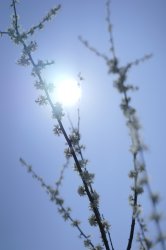
Amateur attempt at a dreamy plant picture.
To create backlight the sun doesn’t have to be directly behind the subject. You could have got away with having it just a tad out of the frame and still had the the flowers all back lit. In this scenario the sun is a little to distracting and does take away from the image a little. CA is a little distracting too. I think you could afford to crop into this and come out with some nice results.
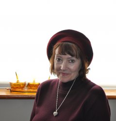
Super panic last minute photo ... my first try at a portrait
Cheers
Hugh
Not a bad effort. Portraits are all about connecting with the subject so as long as you have got an expression that you are happy with then you’ve done your job!
In this situation, technically, the elements that put me off are the distracting BG bits and bobs and the mixed colour lighting. I assume you popped a little flash from the front. This had two effects on the image, it has made the skin a little shiny and has overall cooled the face a little colour temperature wise. These factors can be corrected by bouncing the flash so it’s softer and by gelling it to match the rest of the scene.
It looks like the BG is completely blown so one thing to bare in mind is that a light source doens’t have to be completely behind the subject to back lit it. If you came off axis you would see that your subject would still have a rim light but you would be able to pick and choose a different background. Either way I hope it’s not your last portrait!
Ship port holes make a great back light.

Straight off it’s a bit too bright for me. The blooming around the subject is a bit too intense. I don’t know if it was possible to step back a little and get the whole port hole in but that would have been quite nice. Posing-wise I’m not sure what the subject is thinking and I’m struggling a little to engage with her emotions. Were you going with anything in particular when you were shooting?
The light levels were really very low in this scene and I had to use a high ISO so it's rather noisy. I nearly didn't submit it but she's so cute I couldn't resist!

You’ve done the right thing converting to B&W to deal with the low light, it hides the noise well! In fact, it hides it so well I would say that you could afford to push it a bit further and really make those highlights pop. Framing is a little off with not quite enough headroom and the feet being chopped off a tad. I agree though, it’s a cute inquisitive face and definitely worth sharing!
Couple weeks ago pulled over on a freeway overpass cause I couldn't resist taking a photo of this sunrise.
EXIF Summary: Olympus E-PL3 1/160s f/11.0 ISO200 14mm
Great intense colours. My only question though is what relevance does the plank of wood and nails have? It slightly takes me out of the scene and makes me wonder what’s going on!
The framing is a bit iffy but I think that’s a factor of the shaping and design of the overpass rather than your shot. Vignette is quite strong but I think it’s good that you’ve ‘hid’ the details at the side which are of less importance.
Wow. Phew. Finally done.
I hope some of what I have written is useful. Take everything with a pinch of salt as I’ve only shared what I think and obviously not what others may think!
So, onto the winners.
Third Place: mtbdudex
Second Place: kingalexthe1st
First Place: MCH-1138
It was pretty tough when it came to the top but I went with my gut feeling! Hope others can agree.
Wow, thanks for the critique and advice, and congratulations to the worthy winners.
With the short time I had available to submit, I plonked my wife on a bar stool against the dining room window with the sun streaming in, but the background of other houses and their cars was just too much, even out of focus.
So we pulled the blind down and went with that lighting.
Without a little flash from the front Lyn was just too dark, and it was my idea to place the distracting orange glass jewel boxes on the window sill to add a little to the picture.
I'm very much a learner, so I was quite pleased to have got what I thought was an all right result.
Thanks again, it's honest comments that help the most !
Cheers")
Hugh
With the short time I had available to submit, I plonked my wife on a bar stool against the dining room window with the sun streaming in, but the background of other houses and their cars was just too much, even out of focus.
So we pulled the blind down and went with that lighting.
Without a little flash from the front Lyn was just too dark, and it was my idea to place the distracting orange glass jewel boxes on the window sill to add a little to the picture.
I'm very much a learner, so I was quite pleased to have got what I thought was an all right result.
Thanks again, it's honest comments that help the most !
Cheers
Hugh
Lots of great entries this week. I picked the same 1st place as you Archie as it was a cracking shot.
Lots of useful critique for verbose which is great.
Makes me want to grab the camera and try some things out.
Looking forward to the next.
Lots of useful critique for verbose which is great.
Makes me want to grab the camera and try some things out.
Looking forward to the next.
Great job Ace and thanks for the critique and effort doing the judging. There were a bunch of great entries. I'm not much of a portrait or people guy so admittedly it's a weak point and something I should try to get better at. I actually have some shots with the sun off to the side but I never really looked at them. I'll go back and take a look. Congrats to the winners!
Another collection of high quality entries this week.
Thanks for the feedback acearchie, and congrats to the winners. MCH-1138 - your hummingbird pics are just wonderful.
Thanks for the feedback acearchie, and congrats to the winners. MCH-1138 - your hummingbird pics are just wonderful.

Thanks for taking the time to write up the critiques.I mentioned to one of the posters that product photography is definitely not my forte so I’ll try my best. The product feels a bit small in the frame with a lot of empty space around it. I like the OOF elements and the colours work well together. Mixed colour temperature lighting doesn’t sit so well and comes off as more of an oversight rather than being intentional. It does work though and I could imagine seeing it as an ad with the right copy around it.
Part of the reason for the space is just that - it is a product shot. However, this particular shot was for an assignment called "photo clone." We were tasked with taking a product photo and figuring out how to recreate it in the studio. I picked an ad for Pink Pigeon Rum. The original I was working off of didn't have the logo on the left, it was just the bottle shown on the right.

What I liked about this shoot was the setup. If you take out the purple lights in the background there is only a single strobe lighting this shot. The strobe was under the table and pointing at a large piece of white seamless about ten feet behind the bottle. There was a black card positioned between the bottle and the seamless. This gives the black background and creates the rim light.
I then surrounded the entire set with 4' x 8' black cards to cut any reflections. I clamped a long (18" x 48") piece of white foam core to the left of the camera. This bounce card is what creates the highlight on the left side of the bottle. I then used two smaller bounce cards to fill in the logo and writing on the right side. Otherwise the chrome lettering went dark.
I shot some purple Christmas lights using a piece of card stock cut to shape the bokeh. I added the lights in post but really wanted to do that in the original shot but I ran out of time.
I really enjoyed challenging myself to get the shot done with a single light. Product photography isn't my typical thing but the technical aspects of it can be a real challenge.
Well you did say to sneak it in there.Bonus point for being the only person to submit ‘one’ as I asked. You did catch me out as I reloaded the page a couple of times waiting for the picture to load…
Edit:
Thanks, Archie, for your effort on the critiques and for the first-place nod. This was a natural-light shot, so I used a relatively quick shutter speed (1/1000) in order to freeze most of the motion (other than the wings, as you note).
Thanks, also, to Parkin Pig and Ish for the kind comments.
Great work by everyone -- lots of excellent submissions this week. The next one is up now.
Thanks, also, to Parkin Pig and Ish for the kind comments.
Great work by everyone -- lots of excellent submissions this week. The next one is up now.
Last edited:
Many thanks for your comments - much appreciated given the monster number of high quality submissions this week and the variety of approaches taken. Reflects the skill and imagination of the mac rumours photo group.
Outstanding effort and critique and a good call on the winners. Well done Archie...thank you very much for the work you put into this.
Love this hummingbird shot of yours MCH-1138 -a real beauty.
~ Peter
Love this hummingbird shot of yours MCH-1138 -a real beauty.
~ Peter
Echoing everyone else - fantastic critique and very much appreciated, your time and effort isn't lost on us.
And I got 2nd place! Woop! Thanks, that's pretty much the first time I've been on the podium for anything. Cheers!
Alex
And I got 2nd place! Woop! Thanks, that's pretty much the first time I've been on the podium for anything. Cheers!
Alex
acearchie - fantastic C&C given to all who competed.
I've been gone from this forum a long time, come back every so often, hopefully with craziness of summer behind can post more often.
Lot's of talent here, these competitions teach all of us.
I've been gone from this forum a long time, come back every so often, hopefully with craziness of summer behind can post more often.
Lot's of talent here, these competitions teach all of us.
Register on MacRumors! This sidebar will go away, and you'll see fewer ads.