First off, I have to agree with the two comments directly above ^^^^
-------------------------
Okay, time is up on this one.
A fabulous week of entries this round! Thanks go to you all for participating.
Heres my thoughts
needfx
I love the touch of mystery and slight air of intrigue to this, with my mind having to fill the blanks to make it fully recognisable. This is definitely all about the form of this vehicle, with a good range of light showing that off nicely. There is a nice tension created with the long diagonals across the image. I reckon a step to the right and re-composing may have gotten rid of the crescent of window on the top right, but I dont know if that would have managed to keep the form of this thoroughbred a highlight anymore.
jodelli
The clouds have fabulous tones and detail to them. I like the line of silhouetted trees across the base of the frame. Overall, it still lacks the oomph of dimension I was after, which is a tall ask even for an experienced/professional to harness. Choosing a challenging subject like clouds to show dimension really requires some magic light to lift them out of the 2D as we see them on a monitor.
DirtySocks85
Damn, dude! You really are one lucky puppy with access to amazing creatures like this through your summer job. I got all I asked for and more in this one! It really has a great 3D feel to it, with superb depth, definition of form and some cool texture to boot. My only criticism would be the lower right of frame being slightly distracting. I would have been tempted to mask around the straw and darken it off.
someoldguy
I dont do air travel any more, my days of adding to the pollution problems of the world are many years behind me, so I thank you for the ability to live vicariously through your lens! I love the tonality of those rocky outcrops and their shadows helping add dimension to them. This is classic imagery to my eyes, with gorgeous silver tones throughout and a slight softness to the focus that is really nice. Im not sure if you had time there, but waiting for the clouds to be further over on the right of frame may have counterbalanced the large outcrop on the left nicely. Compositionally, I keep wanting to see some more off to the left too, for some reason.
Hughmac
Lovely, lovely tones. An intriguing mix of light and shadow, wonderful depth of imagery with the leaves going off into the background. I really would have loved to see some of the water droplets in tack-sharp focus and for the light background in the top right to have been darkened down a touch, so the flower became the main thing my eye looked at. I wonder if compositionally you could have gone to the left and lower a tad to keep the flower as the lightest part of this image? The glow in the centre of the flower is magic!
bwhli
Selective colour is something you either love or not. Ive done it twice out of just over 60,000 images I have taken since starting photography, just over two years ago! The clouds are rendered nicely, not to take away from the scene, which to my eyes is too dark in finish, nearly all the shadow detail is gone from this scene as a consequence. Was that tuna?
cornydiego
Great clouds, with a real sense of dimension to them, even with the blown out highlights! The hill to the right and the foreground blend together in a tonal sense. The faded appearance of the mountain range in the distance has created a compression to the image, instead of adding a sense of distance, even though in my mind I know its way off in the distance. For imagery like this, darker rear sections and lighter foregrounds generally help our eye interpret distance. I would have been tempted to have omitted the hill on the right altogether with this image and then to have focused on its texture and shadow/contrast as an image of its own.
NeGRitO
I loved this when you shared this with us ages ago when you were doing that photography course and I still do! Magic tones, fabulous dimension, shape and form, set off with the great contrast of the shadows on and underneath the cracked and curled pieces of mud.
TheBeastman13
I was initially really intrigued by the curved appearance of this as a thumbnail, but that disappears when viewed larger. The two darker sections on the bottom left and right of the frame make that section appear curved in the thumbnail. If you had gone slightly darker in those corners, you could have kept that illusion when viewing larger. Pulling off geometry like this is harder than it seems. Look at the top of frame and see how the portions arent precise across the image? They are small on the left and larger on the right. I do love the dimension of the pointing work being shown off with the shadows of it all. I also love the gradation of light across this scene. Nicely spotted!
AlexH
Im a sucker for a nice selenium finish! Whilst the clouds are relatively flat and dimensionless, there is a nice and subtle radiance of light up there. Its all about the dimension and depth brought to life in the reflections across the water for me. I like the difference of lack of contrast in the sky as compared to the way it leaps to life down lower in frame and the way that silhouetted line of trees gives a distinct and hard break between the two.
Laird Knox
I always love seeing your explorations, they are quite inspirational to me. Talk about thinking outside the square. The dimension that is built up with what I am presuming are all those throws of liquid, layered upon each other is something I have never seen before. Its not harsh like a Jackson Pollock piece, there is a softness and great subtle dimension to it! Very clever to insert a dark foreground item (reads: hand) as a foil that has a sense of movement to it. Its the subtlety of the variance with the liquid throws that really intrigues me the most in this. So, spill the beans, how did you make this?
deep diver
Congratulations on a bird in flight! Some around here make it seem effortless. I know that there is dimension to the wing, but it is minimised with the tones across the wing being so uniform. Some subtle dodging and burning in post production could have lifted and exaggerated that to a wonderful end. There is a nice separation and contrast of the seagull from the sand. Having the bird flying towards us is always so much more rewarding as a viewer. If it is flying into frame, instead of out it also eases our minds. Congrats once again, I remember how chuffed I was with my first BIF!
Parkin Pig
Dark, moody, soulful. Great eye candy for me! This speaks to me on so many levels. I love the dimension of all those candle holders, with the reflections on them really bringing them to life and out of the flat 2D into the 3D. Wonderful tones, this is something Id love to spend time staring into for ages as a large print. I would have been tempted to leave a tad of breathing space on left and right of frame, maybe trimming a touch from the top too. I like that you have provided a foreground for us to journey into the image with. Those subtle reflections/illuminations at the rear and right are fabulous.
Jacksonc
I like the antique tones to this and the repetition of subject in the background and foreground. I would have loved to see this cropped to a 1:1 (square) format, which would have eliminated the shed on the back left and the light thing on the top right creeping into frame. I do feel the foremost drum needs to make contact with the earth and to have its shadow be included also. I love the logo on the drum and its aged and weathered appearance. The sunlight is providing a nice dimension to the drums, which could have been further strengthened with a touch of dodging and burning, which also would have helped the foremost drum to separate from the ground-cover. The left edge of that drum is very similar in a tonal sense to the ground-cover. The eye loves contrast and it works well at the areas of the barrel that have the shadow on the left side, under those rims. I like the inclusion of the fence in the background to set a context of place.
Apple fanboy
Wow! I wanted dimension and form in B&W, youve delivered big-time, buddy! Your front path I presume? The dimension added to those topiarised hedges is perfect with the rim light added by the sun on the right of the path. I particularly like the difference created with that, as the hedges on either side of the path have a completely different look and feel to them. There is a yin/Yang thing going on there, that pleases my eye. Who says you cant photograph in the mid-day sunlight? The use of symmetry is great and I dont need a focal point at the end of the path, the hedges are the rightful standouts here! Lovely tones, with your B&W rendering choices in PP. This could be a scene from Alice In Wonderland, with that famous croquet match being held on the lawns here.
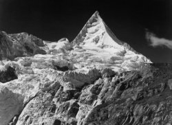
imac wannabe
A wonderful scene, that has great tones in the finishing. I would have loved to have had more shadow detail and the snow to have held its highlight details. A huge ask of any digital camera, due to the huge dynamic range present. This is something I have become quite aware of with my printing, not that I still dont go to full black or white for web presenting though. There is great dimension to the centre mountain, with those shadows on its right really making it take a 3D form! A bit of dodging and burning could have added yet more dimension and depth to this through the trees in the middle of frame and over on the front right, by the water as they all blend together and have a lack of separation. Gorgeous reflections.
JDDavis
This really needs to be seen larger to be fully appreciated! Fantastic dimension and forms at play here. Nice, subtle detail in the snow, pity the shadows have gone to back, only from a printing point of view though. Id maybe take the sky just a tad lighter. Great contrast throughout this image, which pleases my eyes no end! Id be well chuffed if this was mine.
rx7dude
I actually thought there may have been more architecture in this weeks round. I love the symmetry and the people adding a real sense of scale to this grand arched structured. The light flooding the place is nice and those patterned shadows are great. I get a sense of being there, with this having a 3D feel to it. Contrast of the shadows on the walls and floor are a touch soft for my eye, but would have required masking sections in post-production and I dont know if you have that sort of ability or not. See how the tones in the middle of the image are so similar to the tones on the wall to the left and the floor? With a structure/place like this, symmetry is the key to making it lift another level again. It all has to do with where you take the image from and being absolutely centred and level within the structure, but thats me being a pedant.
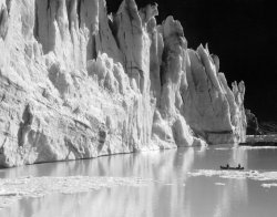
TheReef
I love the composition of this, with the sky up high and the great contrasts of light, milky water against dark sculptural rock, soft against jagged/sharp. As normal for you, its wonderfully edited, particularly to highlight the middle rocks. The low POV works really well too, you have no idea how big or small those rocks are as a consequence of you nestling down in amongst them for this image. Thanks for making the decision even harder!
Thank you all for playing, its been a great week for entries and another wonderful range of images from you all.
After much pondering, being torn between six images in particular, here are my final three selections:
1st. Parkin Pig
2nd. Laird Knox
3rd. NeGRitO
Over to you, Parkin Pig, for next weeks round.
-------------------------
Okay, time is up on this one.
A fabulous week of entries this round! Thanks go to you all for participating.
Heres my thoughts
needfx
I love the touch of mystery and slight air of intrigue to this, with my mind having to fill the blanks to make it fully recognisable. This is definitely all about the form of this vehicle, with a good range of light showing that off nicely. There is a nice tension created with the long diagonals across the image. I reckon a step to the right and re-composing may have gotten rid of the crescent of window on the top right, but I dont know if that would have managed to keep the form of this thoroughbred a highlight anymore.
jodelli
The clouds have fabulous tones and detail to them. I like the line of silhouetted trees across the base of the frame. Overall, it still lacks the oomph of dimension I was after, which is a tall ask even for an experienced/professional to harness. Choosing a challenging subject like clouds to show dimension really requires some magic light to lift them out of the 2D as we see them on a monitor.
DirtySocks85
Damn, dude! You really are one lucky puppy with access to amazing creatures like this through your summer job. I got all I asked for and more in this one! It really has a great 3D feel to it, with superb depth, definition of form and some cool texture to boot. My only criticism would be the lower right of frame being slightly distracting. I would have been tempted to mask around the straw and darken it off.
someoldguy
I dont do air travel any more, my days of adding to the pollution problems of the world are many years behind me, so I thank you for the ability to live vicariously through your lens! I love the tonality of those rocky outcrops and their shadows helping add dimension to them. This is classic imagery to my eyes, with gorgeous silver tones throughout and a slight softness to the focus that is really nice. Im not sure if you had time there, but waiting for the clouds to be further over on the right of frame may have counterbalanced the large outcrop on the left nicely. Compositionally, I keep wanting to see some more off to the left too, for some reason.
Hughmac
Lovely, lovely tones. An intriguing mix of light and shadow, wonderful depth of imagery with the leaves going off into the background. I really would have loved to see some of the water droplets in tack-sharp focus and for the light background in the top right to have been darkened down a touch, so the flower became the main thing my eye looked at. I wonder if compositionally you could have gone to the left and lower a tad to keep the flower as the lightest part of this image? The glow in the centre of the flower is magic!
bwhli
Selective colour is something you either love or not. Ive done it twice out of just over 60,000 images I have taken since starting photography, just over two years ago! The clouds are rendered nicely, not to take away from the scene, which to my eyes is too dark in finish, nearly all the shadow detail is gone from this scene as a consequence. Was that tuna?
cornydiego
Great clouds, with a real sense of dimension to them, even with the blown out highlights! The hill to the right and the foreground blend together in a tonal sense. The faded appearance of the mountain range in the distance has created a compression to the image, instead of adding a sense of distance, even though in my mind I know its way off in the distance. For imagery like this, darker rear sections and lighter foregrounds generally help our eye interpret distance. I would have been tempted to have omitted the hill on the right altogether with this image and then to have focused on its texture and shadow/contrast as an image of its own.
NeGRitO
I loved this when you shared this with us ages ago when you were doing that photography course and I still do! Magic tones, fabulous dimension, shape and form, set off with the great contrast of the shadows on and underneath the cracked and curled pieces of mud.
TheBeastman13
I was initially really intrigued by the curved appearance of this as a thumbnail, but that disappears when viewed larger. The two darker sections on the bottom left and right of the frame make that section appear curved in the thumbnail. If you had gone slightly darker in those corners, you could have kept that illusion when viewing larger. Pulling off geometry like this is harder than it seems. Look at the top of frame and see how the portions arent precise across the image? They are small on the left and larger on the right. I do love the dimension of the pointing work being shown off with the shadows of it all. I also love the gradation of light across this scene. Nicely spotted!
AlexH
Im a sucker for a nice selenium finish! Whilst the clouds are relatively flat and dimensionless, there is a nice and subtle radiance of light up there. Its all about the dimension and depth brought to life in the reflections across the water for me. I like the difference of lack of contrast in the sky as compared to the way it leaps to life down lower in frame and the way that silhouetted line of trees gives a distinct and hard break between the two.
Laird Knox
I always love seeing your explorations, they are quite inspirational to me. Talk about thinking outside the square. The dimension that is built up with what I am presuming are all those throws of liquid, layered upon each other is something I have never seen before. Its not harsh like a Jackson Pollock piece, there is a softness and great subtle dimension to it! Very clever to insert a dark foreground item (reads: hand) as a foil that has a sense of movement to it. Its the subtlety of the variance with the liquid throws that really intrigues me the most in this. So, spill the beans, how did you make this?
deep diver
Congratulations on a bird in flight! Some around here make it seem effortless. I know that there is dimension to the wing, but it is minimised with the tones across the wing being so uniform. Some subtle dodging and burning in post production could have lifted and exaggerated that to a wonderful end. There is a nice separation and contrast of the seagull from the sand. Having the bird flying towards us is always so much more rewarding as a viewer. If it is flying into frame, instead of out it also eases our minds. Congrats once again, I remember how chuffed I was with my first BIF!
Parkin Pig
Dark, moody, soulful. Great eye candy for me! This speaks to me on so many levels. I love the dimension of all those candle holders, with the reflections on them really bringing them to life and out of the flat 2D into the 3D. Wonderful tones, this is something Id love to spend time staring into for ages as a large print. I would have been tempted to leave a tad of breathing space on left and right of frame, maybe trimming a touch from the top too. I like that you have provided a foreground for us to journey into the image with. Those subtle reflections/illuminations at the rear and right are fabulous.
Jacksonc
I like the antique tones to this and the repetition of subject in the background and foreground. I would have loved to see this cropped to a 1:1 (square) format, which would have eliminated the shed on the back left and the light thing on the top right creeping into frame. I do feel the foremost drum needs to make contact with the earth and to have its shadow be included also. I love the logo on the drum and its aged and weathered appearance. The sunlight is providing a nice dimension to the drums, which could have been further strengthened with a touch of dodging and burning, which also would have helped the foremost drum to separate from the ground-cover. The left edge of that drum is very similar in a tonal sense to the ground-cover. The eye loves contrast and it works well at the areas of the barrel that have the shadow on the left side, under those rims. I like the inclusion of the fence in the background to set a context of place.
Apple fanboy
Wow! I wanted dimension and form in B&W, youve delivered big-time, buddy! Your front path I presume? The dimension added to those topiarised hedges is perfect with the rim light added by the sun on the right of the path. I particularly like the difference created with that, as the hedges on either side of the path have a completely different look and feel to them. There is a yin/Yang thing going on there, that pleases my eye. Who says you cant photograph in the mid-day sunlight? The use of symmetry is great and I dont need a focal point at the end of the path, the hedges are the rightful standouts here! Lovely tones, with your B&W rendering choices in PP. This could be a scene from Alice In Wonderland, with that famous croquet match being held on the lawns here.
imac wannabe
A wonderful scene, that has great tones in the finishing. I would have loved to have had more shadow detail and the snow to have held its highlight details. A huge ask of any digital camera, due to the huge dynamic range present. This is something I have become quite aware of with my printing, not that I still dont go to full black or white for web presenting though. There is great dimension to the centre mountain, with those shadows on its right really making it take a 3D form! A bit of dodging and burning could have added yet more dimension and depth to this through the trees in the middle of frame and over on the front right, by the water as they all blend together and have a lack of separation. Gorgeous reflections.
JDDavis
This really needs to be seen larger to be fully appreciated! Fantastic dimension and forms at play here. Nice, subtle detail in the snow, pity the shadows have gone to back, only from a printing point of view though. Id maybe take the sky just a tad lighter. Great contrast throughout this image, which pleases my eyes no end! Id be well chuffed if this was mine.
rx7dude
I actually thought there may have been more architecture in this weeks round. I love the symmetry and the people adding a real sense of scale to this grand arched structured. The light flooding the place is nice and those patterned shadows are great. I get a sense of being there, with this having a 3D feel to it. Contrast of the shadows on the walls and floor are a touch soft for my eye, but would have required masking sections in post-production and I dont know if you have that sort of ability or not. See how the tones in the middle of the image are so similar to the tones on the wall to the left and the floor? With a structure/place like this, symmetry is the key to making it lift another level again. It all has to do with where you take the image from and being absolutely centred and level within the structure, but thats me being a pedant.
TheReef
I love the composition of this, with the sky up high and the great contrasts of light, milky water against dark sculptural rock, soft against jagged/sharp. As normal for you, its wonderfully edited, particularly to highlight the middle rocks. The low POV works really well too, you have no idea how big or small those rocks are as a consequence of you nestling down in amongst them for this image. Thanks for making the decision even harder!
Thank you all for playing, its been a great week for entries and another wonderful range of images from you all.
After much pondering, being torn between six images in particular, here are my final three selections:
1st. Parkin Pig
2nd. Laird Knox
3rd. NeGRitO
Over to you, Parkin Pig, for next weeks round.
")