I truly love good B&W photos. Im personally not very good at composing them and feel just a bit under-qualified to judge but I guess its not like this is for real prizes so my opinion will just have to do.
My opinion? A good photo does not necessarily = good black and white by just some quick PS convert to B&W viola! A good B&W must utilize light, contrast, composition and show a clear subject where I think a color photo may be able to get away with heavy emphasis on just one or two of these and still be considered a good photo. With Black and White, a photo lacking in one way may still look very good at first look but something in the back of your mind or gut just says... nope sorry even if you cant put your finger on it.
Im going to continue where PDXflint left off and give a C&C of every photo and then announce my choice. If you are not interested in the ramblings of an amateur judge and just want to know the winner scroll to the end.
There were plenty I just loved and for a variety of reasons.
Post #2 k.love, what a way to start the contest. I wondered if anyone would mis-interpret black and white to mean opposites or contrasting subjects well oil and water make for a lovely contrast literally and metaphorically. Though my wife found it disturbing, I find the lighting the contrast and the composition to be just stunning.
Post #3 bootedbear, I think this had potential. I like the framing and the subject is a good one for B&W, but would have preferred better bokeh. Im not to sure how much you could have opened up and still had the pillar in focus but could have added for sure to isolate the subject. Also it needs more contrast and light and shadow play. I think the sun is just too high to do this one justice. A very distinct line of shadow that complemented the geometry of the pillar would do wonders from a light source closer to horizontal.
Post #4 jodelli, Im not sure, just too much going on I think there is no subject and my eyes get tired running around the picture. Also the ghost on the bench, not sure if you were going for more motion with the long exposure or if it was an unintended subject that got in frame but it catches too much attention and distracts from the geometry.
Post #5 Edge100, another one to love. powerful clouds seem so much more important in a B&W shot than color. The black and white really brings out and emphasizes the texture in the pillars and the building. Wonderful shot that I keep coming back to look at.
Post #6 gnd, one of the things I think about B&W in the age of digital is that you need to be able to add to the power of the photo by taking the color out of it. I dont think that is done here. I like the composition, there is good contrast between the white flowers and the dark pond, but there is also something missing. I keep thinking its color. Its not bad, and I keep coming back to try and figure out why, because I think I should like it more but dont.
Post #7 Essjay, well this shot was on my mind as I crossed the bridge today coming home. I thought about cruising up to near this spot for a similar shot around sunset, though more of the bridge was obscured by fog today. I almost made the mistake of not looking at this full size, the thumbnail doesnt do it justice. bootedbear if you are reading this far this shows a bit what I meant about the light and shadows complimenting the geometry of the structure how the shadow brings depth to the ridges on the towers. A timeless photo of a near timeless subject.
Post #8 Phatpat, hmmm... has good light and contrast but also has a big but... in my mind. Not sure, but it could be that it is too centered, rule of 1/3s is a rule for a reason. Also not sure B&W is best for these flowers at this angle I keep looking at the petals trying to figure out if they are sun burned on the edges, it may just be grayscale and shadow but it kinda detracts.
Post #9 Rower CPU, wow great shot. I dont know what else to say about it, but it just has an "it" that is very good. Cats are such tough subjects sometimes they never cooperate and I have to think this was manual focus and so sharp. Another that I love.
Post #10 hector, even without the sign (which really makes the photo) there are so many people that like and appreciate this sort of B&W photo. That the clothes everyone are wearing contrast so light and dark, and the motion of busy people while the one guy just passes time motionless makes for good photography. A good shot indeed.
Post #11 balofagus, I did like this one. The light seemed good but I still was hoping they were both in focus, or that I could see the eyes better.
Post #12 techie4life, again with the rule of thirds. Not sure if it would have been possible but I think moving off to one side so the subjects were moving somewhat across the field of view. As it is my eyes just move in little circles around the middle of the photo and the flag on the left and the out of focus post on the right become distractions. The wrinkles and folds in the robes are brought out nicely in the B&W more so than I think they would have been in color, so I think the subject was good, but the composition just isnt there.
Post #13 mrgreen4242, is very cute of course, the light I think is great and I love the contrast in the ?grand-fathers? shirt against the babys. However, some things could be improved. I think if this was framed so the subjects were more to the right side of the photo, as it is they act as a line splitting the photo into a dark half and light half rather than as a subject, less than half the photo in the shadow I think would be a good thing... maybe about a 1/3
")
Also, Im not sure if it would make a better photo or not, but I keep wondering so it keeps it hard to appreciate the image here, I want to see both faces, I want to see the proud expression on the grand father.
As I write this I dont see a photo in post #14? was it deleted? I dont remember the subject. sorry.
Post #15 blade1139, This is another one I feel im supposed to like but cant figure out what it is that doesnt quite do it for me. The lines are a good subject and really stand out, but the whole of the buildings is so neutral and light gray. It also might be the rounded corner on the rounded bar in the middle of the photo. All these sharp, straight lines wtih 90 degree intersections and this one soft curved line. If that was intentional i guess it is just artistic disagreement I could be in the minority here.
Post #16 seattle, wow. This is just a frame-able for sure. It has everything, and I think a prime example of adding power by subtracting color (if this were originally a color photo from a digital camera that is) the subject POPS out from the mountains in the background, which are beautiful on their own, bits of clouds ad some depth to the sky and really I think just the right amount of lawn/space in front of the subject wow.
Post #17 Plymouthbreezer, my first reaction is that I think its kind of neat, but the more I look at it the more it seems not right. Almost as if it were two photos. A park at night with bright lights and erie shadows that with a shorter exposure might be cool, then the ghost train. I think if the people were turned the other direction it would add something. They are looking off the photo rather than into it and the eye wants to go where they are looking, right off out of frame, then is ripped back to the bright lights on the other side where the motion in the bottom of the shot is distracting rather than an addition. I would think about going back there and playing around with the framing more. Try similar shots from some different angles and see what happens.
Post #18 Fuzzy14, the awwww... shot. who doesnt love baby feet? I dont have much to say, I like it. The simplicity and cuteness of the subject is great.
Post #19 volvoben, what is there to say, I also wanted to ask if this was HDR but didnt want to discourage other potential posters by openly admiring this photo while the contest was open. As my wife said wow, id put that on my wall. I have to think the light and clouds were already powerful before your editing but this is one I just keep studying and liking more and more as I look over it.
Post #20 ipodtoucher, I actually love this photo. I really cant give much constructive critique other than to say I think it has a target audience like many photos and art and this one found its target with me.
Post #21 MaddMacs, it took me a long time to figure out what was wrong with this photo and I think it is the light source(s). My eye, and mind want that entryway at the top of the stairs to be *THE* light source, but my subconscious sees the light from the ?flash? and doesnt like it. It would probably have been impossible to expose this shot from just the one source, and maybe there were fixed lights behind you as well, but it just seems like a conflict within the shot. Otherwise I do like the composure and the textures brought out by the black and white.
Post #22 Chappers, probably due to early life exposures to big photo books of portraits and Americana and what not, but when someone says black and white portrait to me I dont think wedding shot or babies or senior high school, I think of a shot like this. Again one I dont think I would care for in color, but B&W? Wonderful. The lines in the his face, the texture and contrast within the cigarette, the depth and soul in the eyes, the exposure and light are perfect. I love this shot.
Post #23 Nadav, I think this photo would benefit from some cropping... ok I just saved it to my desktop and cropped it to see and yes it would do huge things for it. Zoom in, isolate the subject(s). Move the player to the left third of the photo so the motion is in the center and the ball is toward the right third but still has space in the frame for the eye to anticipate the path it is going to take and not be pulled out of the frame. The putter and the houses, the sky all distract and detract from whats important here. The white of the ball, the glove and the shoes make for very good composition, but the bright sky and white chimneys dont let you see it. I like the way the texture of the sand stands out and I think the spray might be washed out if this were a color shot. A good shot and use of B&W. *edit* ok I attached my quick crop, let me know if you think I was right.
Post #23 Phrasikleia, another shot I have to say I love. I love the clouds and the framing, the composition, the location of the island and the contrast of the white tower and the dark water is really powerful. I could frame this and put it up somewhere it would complement the Prince of Whales Hotel. For those who I have mentioned the rule of thirds phatpat, mrgreen, techie4life, nadav, if any of you are still reading this, this is a great example. If that island and its ?church? were centered it would still be a beautiful picture, but what happens is the mountains, the water the shoreline all would distract and take away from the subject rather than complement it and enhance the overall photo and make it art.
Post #25 wheezy, love it. The focus is perfect, so much emotion from such a simple shot. the awe factor is also way high here. Not much I can say its great, and shes beautiful.
Post #26 Martin C, not for everyone, but i guess I am the target audience. Like many of the earlier posts it seemed like I should like the photo, but didnt this had the opposite effect on me. As if I should find something wrong here but I dont. I dont mind the washed out floor the distortion around the edges of the not quite fisheye look. I think the position of the subject in the frame is perfect, maybe not where it should be, but I think it is where it needs to be. All in all I like it and cant explain why.
Post #27 firstapple, My wife was looking over my shoulder as I examined the whole list and as I (I guess too quickly) scrolled past this photo, she said hey go back. I like this one. I didnt know why. She likes the lines and the way the light emphasizes the deep texture. Something intangible there just didnt do it for me. As seems like the case some here a plenty good photo, but just not to my taste, and my wife isnt the judge... of this contest.
Post #28 apearlman, lovely. I love it for the subject, if id been around this forum enough that people knew how much I loved track and my two daughters theyd be crying foul at this shot. I really really like it but not just for that. As photo goes it also seems to be B&W added a lot here. Same shot in color isnt the same shot, the shadow the light almost forming a halo around the girl, wonderful.
Post #29 ghostguts, beautiful shot, again this is not the same shot if it were in color, this is better. The light is great, I think the extreme-white of the shirt and dead-black of the back ground work to highlight the face and there is emotion that comes through, not just the eyes, but they really make the shot. Another one I just love.
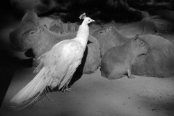
Post #30 EugeneA, im not sure what to say here. It seems close, but I dont know what to say is not sitting well with me. The capybera since they are sleeping I dont know, i guess it is what I was going to say earlier, without the eyes animals are like fruit in a picture. The bird (is that an albino peacock?) with the blur at its head is very distracting. It is an interesting shot, but just not for me i guess.
Post #32 Im glad you pointed out those are paintball marks on the columns not lens/sensor dust, as it is though they do kind of distract from the composition. Not sure I fully like the angle of the shot, or maybe id like to see a different exposure, some more extreme shadows, getting in a spot the light really lit up parts of the columns and the shade areas got darker not just this neutral gray. I think more contrast would add to the depth and complexity of the structure.
So as you can see there were a tremendous number of photos here I really loved, I think very highly of and could easily proclaim winner, but alas only one can be named.
for best use of B&W and because it ended up being the shot I kept comparing the others to this weeks winner is
k.love with the first entry and his oil and grease hands. Congratulations!
For great Black and White shots I have to give some more attention to Edge100, Rower CPU, Seattle, vovlobean, Chappers, Phrasikleia, wheezy, and ghostguts, not only great photos but shots that really bring out why even in a digital world moving toward better color recognition and rendering, B&W makes timeless art.
Thanks everyone for participating.