Jony just ran out of Braun products to be 'influenced' by 

Got a tip for us?
Let us know
Become a MacRumors Supporter for $50/year with no ads, ability to filter front page stories, and private forums.
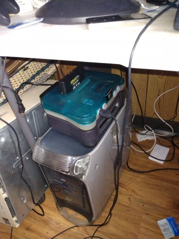
What if Apple had released the PowerMac in other colors?
- Thread starter Rikintosh
- Start date
-
- Tags
- powermac
- Sort by reaction score
You are using an out of date browser. It may not display this or other websites correctly.
You should upgrade or use an alternative browser.
You should upgrade or use an alternative browser.
And that’s no lie!
When I was at the Desert Sun, the production manager received an ad for print from the advertising manager. The advertising manager (in 1999) was being paid $20/hr to both design and manage her design department (major customers, like GM, Ford, etc).One of the most infuriating reasons why I got brought in so many places as a contractor and not as a perm hire was because I “lacked the papers” — and yet, I’d walk into places, bringing in twice the applied experience, working twice as long, and working at least thrice the pace od the university/college-accredited perm hires, but I was only getting paid, at best, a third of what they were. Of course, I knew part of the pay penalty was due of structures and biases therefrom which were well beyond my control, but a sizeable chunk was that “no papers” quagmire.
The ad was nice, done in Photoshop at…72dpi.
The production manager went ballistic!
I know this because the entire production department (we were on the second floor) heard her yelling at the ad manager (on the first floor).
The ad manager later became MY manager out at the satellite office.
On another note, I learned how to make a .ps file and generate a PDF from that from a temp who'd been hired to run the newspaper at my second job. He was from one of those temp agencies but I'd never known until then that they employed graphic designers.
That's ok as long as the pixel count is correct.The ad was nice, done in Photoshop at…72dpi.
I had to explain in painful detail to my Art Director that a 5 megapixel image is still 5 megapixels whether it's 72 or 300DPI...not that she took any notice
True, but it also costs less than $3000 even paying apple for the RAM and 2TB SSD, which is less than half the price of the base MacPro, which is the huge gap I was talking about.Trying to be fair, a maxed out Intel mini (6-core, 64 GB RAM) paired with a beefy eGPU still packs a punch, even if it’s not as “neat” as a tower.
The ideal "Mac regular" is a small tower that starts around $1000 with a single MPX Slot (but unpopulated unless you buy a GPU) and one or two normal PCI-e slots, 4 desktop sized RAM slots, and used socketed full Desktop CPU. Basically equivalent to base ~$1200 G4 towers 20 years ago, and something we haven't seen since.
Totally.That's ok as long as the pixel count is correct.
I had to explain in painful detail to my Art Director that a 5 megapixel image is still 5 megapixels whether it's 72 or 300DPI...not that she took any notice
Only this was 1999 and the ad was built to the ad size at 72dpi. Screen resolution.
Why fun colours died:
1: Power Mac G3 B&W poor reception (and also the original iBook Clamshells)
2: The massive success of the first graphite iMac SE in late-1999 (Jobs mentioned its strong sales on stage many times), leading to the graphite iBook, the more muted iMac colours in 2000, and finally the end of colour altogether.
3: 9/11 (but looking at Apple's website, by mid-2001 they were already 99% colour-less and minimalist. 9/11 probably kept them firmly on that path – there were no more colours in Apple products until the iPod Mini in 2004 – and iPods were of course a market where they wanted to grab people's attention.)
4: “Progress”. Apple had achieved what it wanted with its colourful products – attention and success from the consumer market. But now other manufacturers were copying them, with colours/ decals/ electric appliances. And, the consumer market was saturated by 2000-2001 (there was a major tech slowdown at this point). Apple needed to stand out from the crowd again, and this time through high-quality materials (aluminium, titanium, stainless steel) and minimalist designs. And, the 'graphite'-professional look made noob consumers feel special
What I lament most about the shift in design was the loss of fun, and the loss of creative, bold designs. I guarantee that 1999-2000 was the only time in history where even a printer was designed to be optimistic and beautiful:
Why fun colours died:
1: Power Mac G3 B&W poor reception (and also the original iBook Clamshells)
2: The massive success of the first graphite iMac SE in late-1999 (Jobs mentioned its strong sales on stage many times), leading to the graphite iBook, the more muted iMac colours in 2000, and finally the end of colour altogether.
3: 9/11 (but looking at Apple's website, by mid-2001 they were already 99% colour-less and minimalist. 9/11 probably kept them firmly on that path – there were no more colours in Apple products until the iPod Mini in 2004 – and iPods were of course a market where they wanted to grab people's attention.)
4: “Progress”. Apple had achieved what it wanted with its colourful products – attention and success from the consumer market. But now other manufacturers were copying them, with colours/ decals/ electric appliances. And, the consumer market was saturated by 2000-2001 (there was a major tech slowdown at this point). Apple needed to stand out from the crowd again, and this time through high-quality materials (aluminium, titanium, stainless steel) and minimalist designs. And, the 'graphite'-professional look made noob consumers feel special
What I lament most about the shift in design was the loss of fun, and the loss of creative, bold designs. I guarantee that 1999-2000 was the only time in history where even a printer was designed to be optimistic and beautiful:
View attachment 1942205
I really like that! Transparent turquoise and white is such an OP combo for tech housing design, you can make a pencil sharpener look good with them.
There's a reason I swapped out my charcoal N64...
There's a reason I swapped out my charcoal N64...
Attachments
I don't believe that the graphite color was a success, I believe that what really caught my attention was the imac now being totally transparent, shiny, and without all that metal on the inside, it gave the impression of being an aquarium.
I like the first imac design, but for my taste, I find the Slot loader editions that are transparent and glossy much prettier.
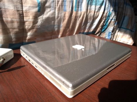
The ibook g3 and g4 ice are boring, but in the case of the G3 (some) you can still save them, disassembling the plastics and applying ethanol to the paint, they will lose their white color and become a piece of transparent acrylic, which you can reassemble and use, or dye it with stained glass varnish and make an ibook DV/SE
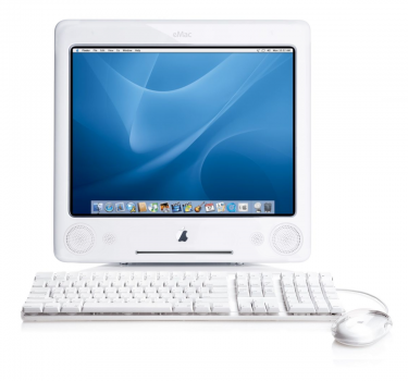
The emac would have been a great "successor to the g3 imac for poor people" or an imac 17", but apple put all the most horrible (for my taste) in it. I love its CRT and its chrome accents, but that straight front doesn't it matches, it doesn't match the back, it looks like the computer was hacked in half, the acrylic stand (optional) improves the look a bit, but again, those round speakers and a huge cdrom port, are very simplistic , its corners are too rounded, giving the impression that ive relied on fisher price toys to design it. The final sacrilege was to use a plain white on the entire case, which gives the impression of being a hospital reception equipment
Attachments
I don't understand people who like the look of the eMac. There's nothing for the eye to catch onto.
I got myself a slot-load and tray-load iMac last year, and I really like them both. But when it came down to it, I chose to keep the slot-loader. You're right that the increased transparency was a nice touch compared to the matte of the tray-loaders.
In defence of the tray-loaders though, because they are much more 'chunky', they assert themselves as being a computer for work. The slot-loaders are some kind of weird alien head, or a piece for an art gallery.
The main reason I didn't like the tray-loader ultimately was because of the loud fans which never turn off. Yuck. You can really tell it wasn't Steve's desired outcome. I think Jobs himself was using NeXT computers until the slot-loaders were released.
the problem is that when they removed the fan they started to suffer from overheating, from cold soldering to even frequent flyback problems. But I believe that this could have been easily solved using a fan with a larger diameter, smaller rotation and mainly better quality. At that time, Delta was already producing excellent fansI don't understand people who like the look of the eMac. There's nothing for the eye to catch onto.
I got myself a slot-load and tray-load iMac last year, and I really like them both. But when it came down to it, I chose to keep the slot-loader. You're right that the increased transparency was a nice touch compared to the matte of the tray-loaders.
In defence of the tray-loaders though, because they are much more 'chunky', they assert themselves as being a computer for work. The slot-loaders are some kind of weird alien head, or a piece for an art gallery.
The main reason I didn't like the tray-loader ultimately was because of the loud fans which never turn off. Yuck. You can really tell it wasn't Steve's desired outcome. I think Jobs himself was using NeXT computers until the slot-loaders were released.
I think emac could have been a little more pleasing to the eye if it went something like this:
Attachments
I don't understand people who like the look of the eMac. There's nothing for the eye to catch onto.
I can't empathize with the love for the iMac G4 or the clamshell iBook, but different people like different things. My tastes were formed with more "boring business" sorts of computers, and to this day I still think the Beige G3 desktop with a nice, squared-edges CRT on top is the nicest looking computer system I can think of.


The main reason I didn't like the tray-loader ultimately was because of the loud fans which never turn off. Yuck.
Same thing with my iMac G5. I can't tell if that's impressive on the G5's part (even if it's laughable objectively) or pathetic on the G3's, but I suspect it's the latter considering the 6w power draw.
Last edited:
After my first iMac G5 died, I was more than happy to get a practically-silent Intel iMac. Same looks, much, much better internals.
What if Apple had released the PowerMac in other colors?
Then we would have had a Powermac in other colors…I love the eMac design and the opaque iBooks - reason, I think they look like they belong tn the retro future of 2001 and especially, Space 1999 - which was my dream universe aged 5I don't understand people who like the look of the eMac. There's nothing for the eye to catch onto.
I like white in general. It means “clean, bright, friendly”to me. Just have to make sure it doesn’t get dirty or starts yellowing because that quickly looks gross.I love the eMac design and the opaque iBooks
Last edited:
I just love the beige design, they are well proportioned, aesthetic, discreet, I believe they were the pinnacle of beige computer industrial design.I can't empathize with the love for the iMac G4 or the clamshell iBook, but different people like different things. My tastes were formed with more "boring business" sorts of computers, and to this day I still think the Beige G3 desktop with a nice, squared-edges CRT on top is the nicest looking computer system I can think of.

Same thing with my iMac G5. I can't tell if that's impressive on the G5's part (even if it's laughable objectively) or pathetic on the G3's, but I suspect it's the latter considering the 6w power draw.
I also love flat panel monitors like the sony trinitron.
I live in Brazil, and temperatures here can be quite hot towards the end of the year, and I remember hearing my iMac G5 1.8ghz screaming all the time, and even turning itself off due to overheating. I believe there is some design issue with the imac g5 in the cooling system, I regularly kept it clean and with high quality thermal compound every 6 months. Things only got better when I made the drastic decision to drill a big hole in his case with a hole saw, I think this allowed him to suck in more fresh air. The same solution I used in an aluminum powerbook 1.67. On my Macbook white 2009, I just loosened the screws on the bottom cover and put some rubber spacers between the laptop and the cover, to create a gap for air circulation, I used longer screws, and it works all these years.
Why fun colours died:
1: Power Mac G3 B&W poor reception (and also the original iBook Clamshells)
Its poor reception was a mix of insufficient improvements over the beige predecessor to rationalize the cost for development and that, unlike a conventional tower, which could be fitted with adapters to shove into a colo rack, the curves of the blue & white G3 made that task difficult to impossible — at least for a time, by which time the Xserve came into being. It was also the teething pains of being the first New World Mac (and all the issues which came with that) which made it a higher risk to buy in quantity for a department.
What the B&W G3 delivered was a successful effort by Apple to get people who’d written off Apple by 1996–97 to “look again” — and with the B&W G3 case, it was impossible to ignore them.
2: The massive success of the first graphite iMac SE in late-1999 (Jobs mentioned its strong sales on stage many times), leading to the graphite iBook, the more muted iMac colours in 2000, and finally the end of colour altogether.
The graphite SE was successful because it bundled the fastest of everything offered in a Mac consumer desktop — everything the fruit slot-load iMac models offered, but with more OEM RAM and HDD storage (which, lest anyone forget, was still a massive premium in 1999). As folks buying these Macs were typically just interested in the final outcome, things like cracking one open and doing a DIY upgrade wasn’t worth the risk that $200 more could buy.
And whereas the fruit coloured iMacs (and subsequent jewel tones of indigo, ruby, and sage) were marketed to everyone, there was an implicit understanding that the graphite iMacs were being marketed to a very specific demographic with, generally, a) more discretionary spending power, and which b) were “uncomfortable” with bright colours because ::flails arms in the air like kermit:: reasons.
The “end of colour” and the end of curves arrived, in earnest, by the sunset of 2001. If anything, the events from earlier that year (dot-crash included) severed any path to continuing a line of other curved, bright hues in products for at least a few years, because fear sends people inward and into hesitancy about anything novel to the eyes and palpably different.
3: 9/11 (but looking at Apple's website, by mid-2001 they were already 99% colour-less and minimalist. 9/11 probably kept them firmly on that path – there were no more colours in Apple products until the iPod Mini in 2004 – and iPods were of course a market where they wanted to grab people's attention.)
When I note historical events with the end of colours and non-rigid industrial design shapes, this wasn’t just Ive at Apple, but it occurred throughout the design and merchandising of products across many sectors. We discuss Apple in particular here because, well, :
4: “Progress”. Apple had achieved what it wanted with its colourful products – attention and success from the consumer market. But now other manufacturers were copying them, with colours/ decals/ electric appliances. And, the consumer market was saturated by 2000-2001 (there was a major tech slowdown at this point). Apple needed to stand out from the crowd again, and this time through high-quality materials (aluminium, titanium, stainless steel) and minimalist designs. And, the 'graphite'-professional look made noob consumers feel special
Eventually, Apple learnt to use this trendsetting power to its advantage, rather than to abandon or jettison it. And now we have Samsung phones without headphone jacks and nameless copycat manufacturers helping to enrich dwindling landfills with bluetooth airbuds whose batteries are irreplaceable.
What I lament most about the shift in design was the loss of fun, and the loss of creative, bold designs. I guarantee that 1999-2000 was the only time in history where even a printer was designed to be optimistic and beautiful:
View attachment 1942205
I owned the tangerine version of that Epson inkjet!
The ibook g3 and g4 ice are boring, but in the case of the G3 (some) you can still save them, disassembling the plastics and applying ethanol to the paint, they will lose their white color and become a piece of transparent acrylic, which you can reassemble and use, or dye it with stained glass varnish and make an ibook DV/SE
mhd59michel Polka Dot Guy, is that you?
What if Apple had released the PowerMac in other colors?
Then we would have had a Powermac in other colors…
I love the eMac design and the opaque iBooks - reason, I think they look like they belong tn the retro future of 2001 and especially, Space 1999 - which was my dream universe aged 5
1980
(sorry, that was UFO)
(sorry, that was UFO)
Last edited:
I met a guy from Russia who modified a powerbook g4 17", he took the processor out of a cisco router, I think it was this 7448, and he just replaced the original powerbook processor with this one, without further hardware modifications. So he did something in openfirmware, and managed to reach great speeds. The annoying part of the job is that the processors were soldered directly to the boards, so he had to redo the spheres, but it was not a big problem, as the processor had few connections, and used large spheres.
Do you recall his name? I can ask in a Russian Mac group – some olden folks are still there.
I don't know, it's been a few years, and it was on a Russian forum, even if I remember, I wouldn't know how to write with Russian characters, I used google translator. At the time I turned the internet upside down looking for improvements to my beloved powerbook, so I happened to find that, so I started a search to find routers to take the chip, but I ended up putting it aside in favor of other projectsDo you recall his name? I can ask in a Russian Mac group – some olden folks are still there.
The Russian guys are very smart, I think they are a kind of combination of eastern intelligence, added to the precarious conditions of the third world, resulted in a super creative and persevering people, like those guys in Cuba that there is no brake fluid factory , so they make brake fluid for their cars out of shampoo, vinegar, sugar and stuff...
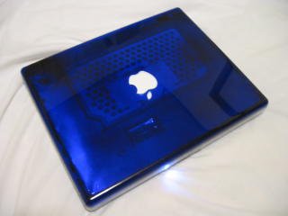
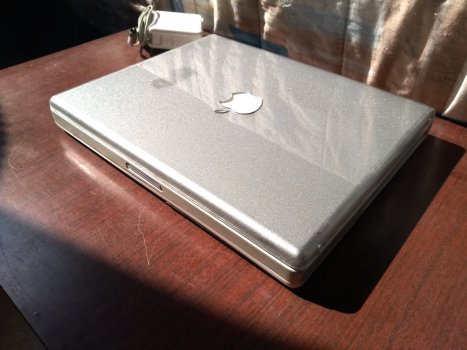
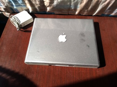
I modified some ibooks, but I think I only have pictures of the last one I made a few years ago. Unfortunately I put my fingers in while the paint was wet, and I'll have to live with the aesthetic defect.mhd59michel Polka Dot Guy, is that you?
Attachments
I modified some ibooks, but I think I only have pictures of the last one I made a few years ago. Unfortunately I put my fingers in while the paint was wet, and I'll have to live with the aesthetic defect.
iBook G4 Sparkle Motion special edition
And yet here we are in the most dystopian time and Apple has the most colorful product line in their history. (iMac, Apple Watch, iPhone, iPad)I replied that the age of organic shapes and colours we’d come to know after about 1996 was dead and over; that industrial design would get more rigid and cold; and colours would become more muted, if not absent altogether. She asked why that was. I remember saying it was because during times of crisis, people become afraid, by instinct, and are less emboldened to experiment outside of their comfort zone. I said, “Stuff like your iMac, or my Visor here, won’t look like that anymore. You’re going to see a lot more muted colours, especially bare metals and colours like grey, white, and black. People are now afraid to look toward optimism and curiosity, and this will bear out with forthcoming industrial design trends.” What I didn’t mention was this would be coincident with an adoption of design ideas borrowed from militarism and military gear. Another thing I didn’t say, but had been on my mind for at least a month, was I’d just witnessed a golden age of design die in real time.
Register on MacRumors! This sidebar will go away, and you'll see fewer ads.


