Become a MacRumors Supporter for $50/year with no ads, ability to filter front page stories, and private forums.
What is the set for? Is there a particular message?
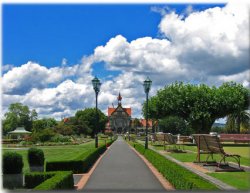
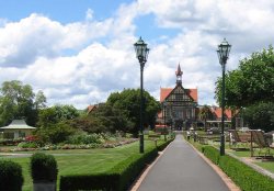
I feel the photo is rather boring even though it is dramatic. Having the side walk go right up the middle cuts the photo in half. so much so, that your eyes go right off the photo leaving you to wonder what the picture is about. Context is going to be really important.

As for editing...get rid of the the crane.
I have been out of the design and photo editing world for a while now...thinking about what this photo needs brings back memories...:eek:
 
another way

I really don't like all the walkway and nothingness in front. Nice picture otherwise, though, and thanks for posting it and being nice about so many opinions. Guess I'm feeling croppy.
 

Attachments

  • cropme.jpg
    cropme.jpg
    37.8 KB · Views: 135
I think the cropping helps a lot. I know the symmetry was the point, but I'd be tempted to crop off centre like so:

 
Lau said:
I think the cropping helps a lot. I know the symmetry was the point, but I'd be tempted to crop off centre like so:
Nice. I like the non-centered placement/crop. Rule of thirds does make an image look good.

Well, back to studying for my test :rolleyes:
 
Rule of thirds

I echo joepunk...

cropping off center makes a huge improvement. I think that makes it a whole lot more appealing.

I guess someone was onto somthing with that rule of thirds stuff, huh?!?
 
I'm left handed. I kinda like the line created by the benches in the right hand crop, but I think your eye tends to follow that instead of focusing on the building.
 

Attachments

  • rerevised.jpg
    rerevised.jpg
    97.2 KB · Views: 136
Another take on cropping

Here's another take on cropping. Here, I've tried to retain your walkway perspective, and in pulling things in, I first decided to pull in enough to kill the break in the hedges on the left ... and then saw that the light posts could be used to frame the building.

Not sure if your original has the resolution to pop this up in size, but the resolution here provides the general intent:

mr_crop1.jpg


-hh
 
-hh said:
Here's another take on cropping. Here, I've tried to retain your walkway perspective, and in pulling things in, I first decided to pull in enough to kill the break in the hedges on the left ... and then saw that the light posts could be used to frame the building.

Not sure if your original has the resolution to pop this up in size, but the resolution here provides the general intent:

mr_crop1.jpg


-hh

Yeah, that's what I would have done, as I mentioned in my previous post (but didn't even think of cropping your photo myself to show you :eek: ), but I do like Lau's the best anyway. ;)
 
I like the Lau's crop, as well. But as someone coming to photography from the point of view of a journalist, I (personally) would rarely use the clone tool to do anything except fix errors involving the camera, lens, etc. (And never use it at all when the end result will be published in a newspaper or magazine. It violates the rules many papers have -- even when used innocently.)

Obviously, advertising, abstract art, etc. means anything goes. Nonetheless, I prefer to use Photoshop to try and make adjustments to the picture so they reflect reality more, not less.

(But I'm just weird that way, I guess. For instance, eliminating the shadow on the asphalt walkway seems strange seeing as the sun is coming from the left hand side of the picture and there are hard shadows against the hedgerow.)
 
numediaman said:
I (personally) would rarely use the clone tool to do anything except fix errors involving the camera, lens, etc.

Obviously, advertising, abstract art, etc. means anything goes. Nonetheless, I prefer to use Photoshop to try and make adjustments to the picture so they reflect reality more, not less.

(But I'm just weird that way, I guess.)

No, I agree - I don't think I've ever cloned something out of a photo before, it just seems wrong to me. Each to their own though. :) I'll happily crop away, adjust colours and stuff, but it kind of seems wrong (if not from a journalistic point of view, a cheating point of view!) to me to change what actually happened. But that's a whole other discussion, I think!
 
I like Lau's left hand thirds crop the best.

The benches, not being the focal point, add some interest to the foreground.

The shot's a study in one point perspective, and Lau's crop just makes it more interesting by moving the vanishing point off to the left.
 
Register on MacRumors! This sidebar will go away, and you'll see fewer ads.