Become a MacRumors Supporter for $50/year with no ads, ability to filter front page stories, and private forums.

Andrew73875

macrumors regular
Original poster
Feb 1, 2022
225
599
As of recently, almost all latest Apple products have a notch: iPhones, MacBooks.

The question is whether it's actually necessary?

1. It doesn't provide more information on a screen. It provides less.

Apple-ios-13-home-screen-iphone-xs-06032019_big.jpg.large.jpg
Apple_new-iphone-se-app-store-screen_04152020_carousel.jpg.large.jpg


With a notch there's no space for battery percentage indicator, cellphone provider indicator etc. So yes, there's a bit more background photo and a screen real-estate. But it's not useful in any way. It actually provides less information.

Same point goes for MacBooks, where the top menu bar can become an issue in some apps.


2. It's the opposite of Apple design language.

"It's just display and then no display. That's it. You are just completely consumed by that image. There's no a detail there that doesn't need to be there. There are no visual interruptions, distractions. There's just no other noise. Everything is about display and therefore everything is about your content."

 
  • Like
Reactions: SkippyThorson

Boyd01

Moderator
Staff member
Feb 21, 2012
7,954
4,894
New Jersey Pine Barrens
I guess this has been debated to death here in the past but I never paid much attention. Then I replaced my iPhone 6s Plus with a 12 Pro Max and finally experienced it myself. I am not a fan of the notch and especially miss the battery percentage. Have gotten used to it since then, but still don't like it. I would be happier if they just left enough space for the camera, scanner, etc at the top of the phone and started the screen below it. Just don't see any advantage to having those two small areas to either side - but "whatever".

What really bothers me is the elimination of landscape mode on the home screen, I really liked that on my 6s Plus. Evidently this went away when they introduced the first phone with a notch and I fail to understand the logic. It's especially annoying when using the phone for video on a tripod, or as a GPS in an automotive mount. Everything is fine while you're using an app, but then it's all sideways if you need to return to the home screen.
 

Shirasaki

macrumors P6
May 16, 2015
16,271
11,768
I dont understand either, even that notch is for housing camera sensors and whatnot. It should be considered as a temporary solution until the camera can be put somewhere else or even under the screen. Or just a different case design.

The notch is pretty much my only reason to use iPad near full time and carry it around (yeah, even outside). Not having to worry about the notch cutting content is a game changer. Thankfully there are fake bezels on macOS to use, but still not ideal.

I have no idea why so many people can get away with the notch.
 

SouthernFried

macrumors member
Mar 29, 2022
48
62
It’s just a bad design choice. Proven so, since they are rumored to be getting rid of it in favor of the pill and punch-hole style. Apple gets most of their stuff right, but they failed with the notch.
 

Andrew73875

macrumors regular
Original poster
Feb 1, 2022
225
599
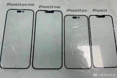
I barely notice the notch - now onto the Pill-and-Hole design.

iphone-14-front-glass-display-panels.jpeg

But it will have the same limitations.


But will they bring back landscape mode for the home screen? My guess is that they won't.

Probably not. It was a selling point when "Plus" iPhones were released (as an extra feature). And now their main selling point are cameras. But it would be great to see them bringing it back. Especially with these large displays on "Plus" iPhones.

It would also go along with the Apple design language.

"The face of a product is pretty much defined by a single piece of multitouch glass. And that's it. There's no pointing device. There isn't even a single orientation. There's no up, there's no down. There's no right or wrong way of holding it. I don't have to change myself to fit the product. It fits me."

 
Last edited:

StumpyBloke

macrumors 603
Apr 21, 2012
5,635
6,335
England
It’s just a bad design choice. Proven so, since they are rumored to be getting rid of it in favor of the pill and punch-hole style. Apple gets most of their stuff right, but they failed with the notch.

Completely incorrect in my opinion, and most definitely not “proven so”.

The notch was used as a positive design choice to facilitate space for the face ID sensor et cetera. It was a necessary “evil” until we get under screen sensors. This has been debated to death.
 

sracer

macrumors G4
Apr 9, 2010
10,408
13,291
where hip is spoken
Notch is a forced solution due to technical limitation, not the voluntary design choice.

I said many times to myself "do not answer to loaded questions", but here I am again...
Of course it was a voluntary design choice. A design choice that was influenced by higher priority design choices.

There was no technical requirement to push the visible screen into the area of the camera array that resulted in a notch. That was a design choice. Apple does what it has always done... change for the sake of change, but then back-filling that decision with explanations that attempt to imply that the change was driven by technical limitations.
 

zorinlynx

macrumors G3
May 31, 2007
8,354
18,580
Florida, USA
It’s just a bad design choice. Proven so, since they are rumored to be getting rid of it in favor of the pill and punch-hole style. Apple gets most of their stuff right, but they failed with the notch.
I don't see how the pill and hole punch is any better, really? The area it occupies and above it is still not useful for showing any information.

Better to just make a smaller notch at a lower cost.
 

Andrew73875

macrumors regular
Original poster
Feb 1, 2022
225
599
How so? It gives additional space that would otherwise just be black. In fact, you get a higher usable screen, with some of the auxiliary stuff moved up into otherwise dead black space.
But this space is not usable (I'm talking about left and right side of the notch). Thanks to the notch there's no space for many indicators that were always there (battery percentage etc).

For example, the battery percentage indicator was one of the features of the iPhone 3GS. Previous iPhones couldn't show it.

Making the upper bezel uniform would solve all these issues. It would be as Apple said about iMacs:

"It's just display and then no display. That's it. You are just completely consumed by that image. There's no a detail there that doesn't need to be there. There are no visual interruptions, distractions. There's just no other noise. Everything is about display and therefore everything is about your content."
Apple-ios-13-home-screen-iphone-xs-06032019_big.jpg.large.jpg
 

ThatsMeRight

macrumors 68020
Sep 12, 2009
2,377
412
It's so anybody can easily recognize it as an iPhone. While Apple makes some great products, they also rely heavily on their brand. They could literally copy the iPhone 13, only change the colour, and call it iPhone 14. It will still sell millions simply because it's got the Apple logo.

Remove the notch and people can mistake it for another phone. This type of notch is undeniably Apple.

Their iPhone 14 Pro punch-hole design is also unique. For the same reason: after a while, that type of punch-hole is instantly recognizable as an Apple device.
 
  • Like
Reactions: stinkhorn9

Madhatter32

macrumors 65816
Apr 17, 2020
1,479
2,951
It's so anybody can easily recognize it as an iPhone. While Apple makes some great products, they also rely heavily on their brand. They could literally copy the iPhone 13, only change the colour, and call it iPhone 14. It will still sell millions simply because it's got the Apple logo.

Remove the notch and people can mistake it for another phone. This type of notch is undeniably Apple.

Their iPhone 14 Pro punch-hole design is also unique. For the same reason: after a while, that type of punch-hole is instantly recognizable as an Apple device.
If this were true, Apple would redesign the notch to look like the Apple logo. It could put a sensor right were there is a bite out of the apple.
 

StumpyBloke

macrumors 603
Apr 21, 2012
5,635
6,335
England
It's so anybody can easily recognize it as an iPhone. While Apple makes some great products, they also rely heavily on their brand. They could literally copy the iPhone 13, only change the colour, and call it iPhone 14. It will still sell millions simply because it's got the Apple logo.

Remove the notch and people can mistake it for another phone. This type of notch is undeniably Apple.

Their iPhone 14 Pro punch-hole design is also unique. For the same reason: after a while, that type of punch-hole is instantly recognizable as an Apple device.

Absolutely don’t buy this for one second. If Apple could offer a full screen phone with no notch, no cut outs at all, with everything under the screen I guarantee you they would.
 

lostPod

macrumors 6502
May 9, 2022
349
264
I think I am one of the few that kinda misses thicker bezels -- especially holding the phone or tablet with one hand. SO many miss clicks.
 

Jimmy James

macrumors 603
Oct 26, 2008
5,489
4,067
Magicland
Another way of describing the notch is that the screen extends further up the sides than it otherwise would. In other words, it adds screen space.
 

Andrew73875

macrumors regular
Original poster
Feb 1, 2022
225
599
In other words, it adds screen space.
But the space is not usable. It shows a bit more wallpaper and that's it. There's no space for many indicators that were always there (battery percentage etc).

It's also a visual interruption and distraction.
 

Jimmy James

macrumors 603
Oct 26, 2008
5,489
4,067
Magicland
But the space is not usable. It shows a bit more wallpaper and that's it. There's no space for many indicators that were always there (battery percentage etc).

It's also a visual interruption and distraction.
It allows my shows to be a lot bigger. Yes, you have the notch. but otherwise full screen. Compare with Netflix that reduces the borders to inside the notch.
 
Register on MacRumors! This sidebar will go away, and you'll see fewer ads.